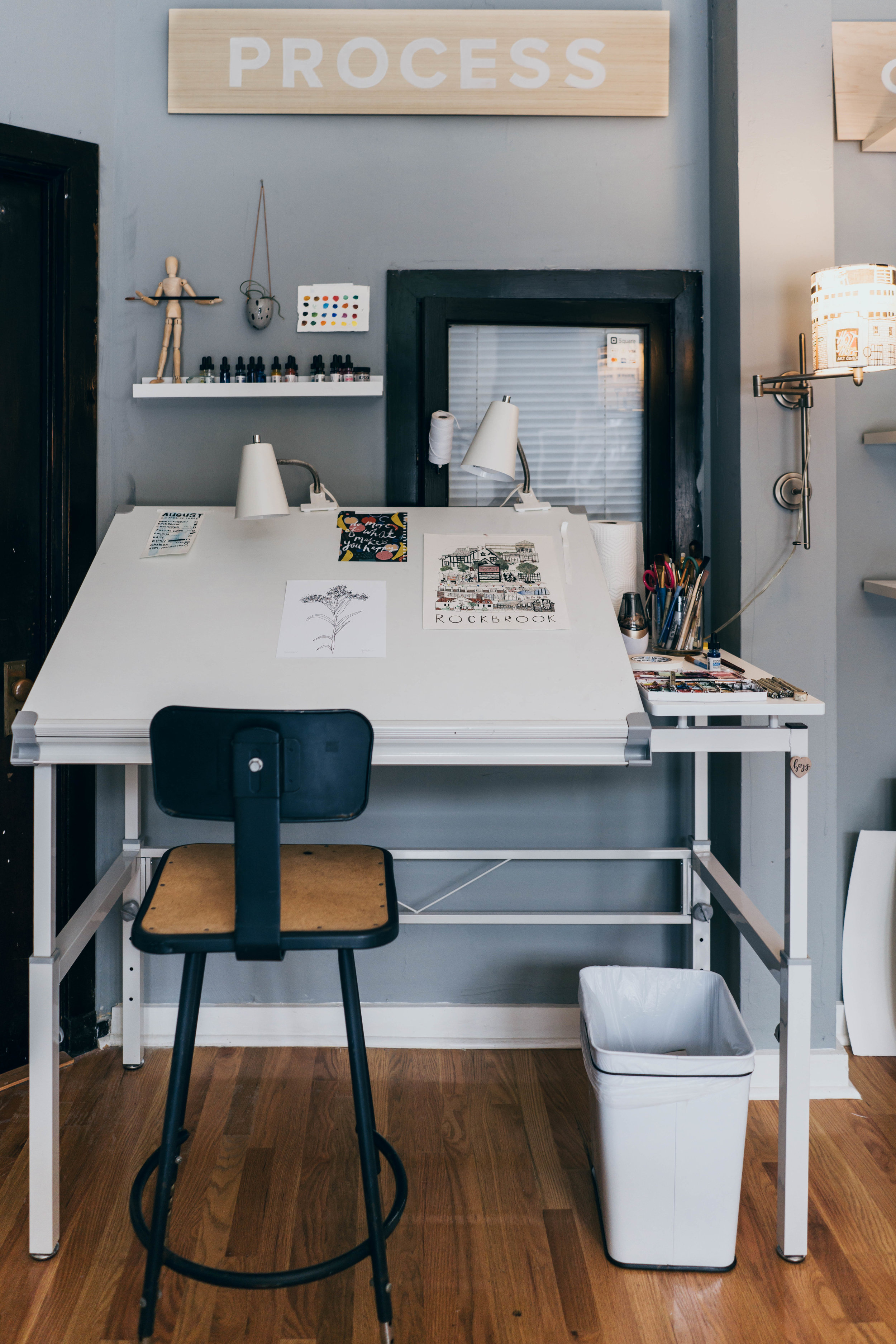
It was an incredible experience to be a part of the remodel for Sweet Magnolia’s Bake Shop. First of all, if you haven’t bought some of their baked goods, you are seriously missing out. My husband is a “sweets snob” and he stated that, “Sweet Magnolia’s Bake Shop is by far the best bakery in Nebraska.” When the owner Katina approached me for the remodel, I was ecstatic. I loved the vibrant website Sweet Magnolia’s Bake Shop had and I was drawn to how colorfully curated their social media presence was. I saw that the interior environment did not align with their digital image and knew we could help make the necessary changes to get them into alignment.
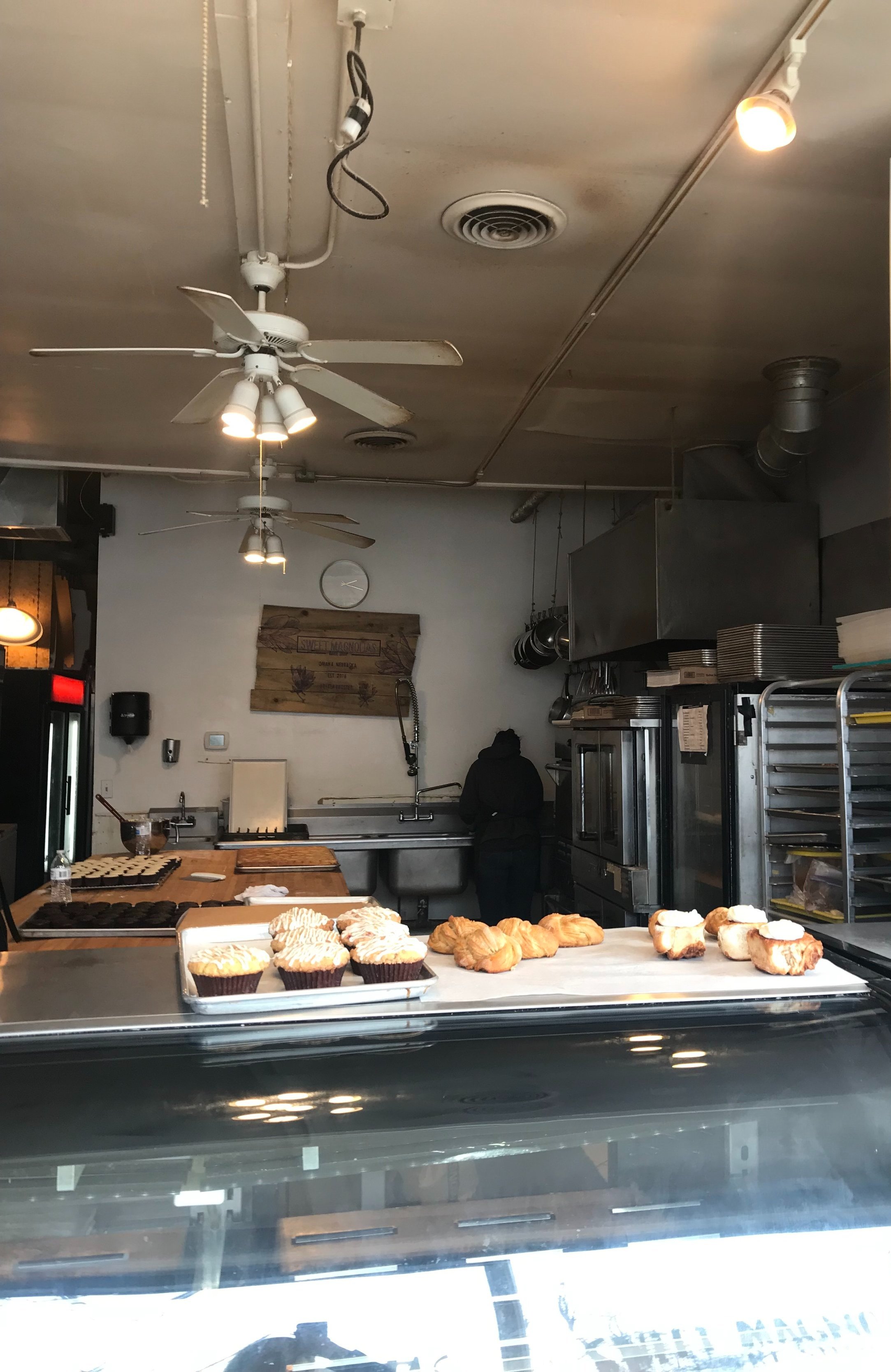
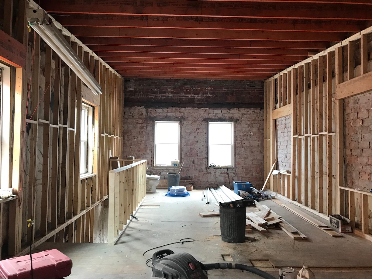
Before
AFTER
“Our goal was to design an interior environment that accurately reflected the brand’s existing identity as seen on their website and in their colorfully curated social media account.”
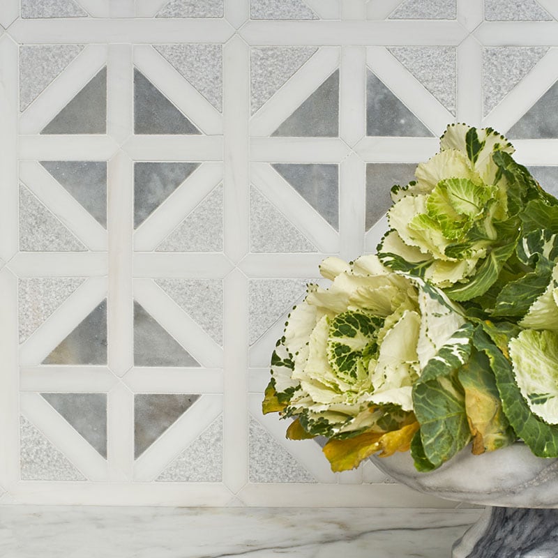
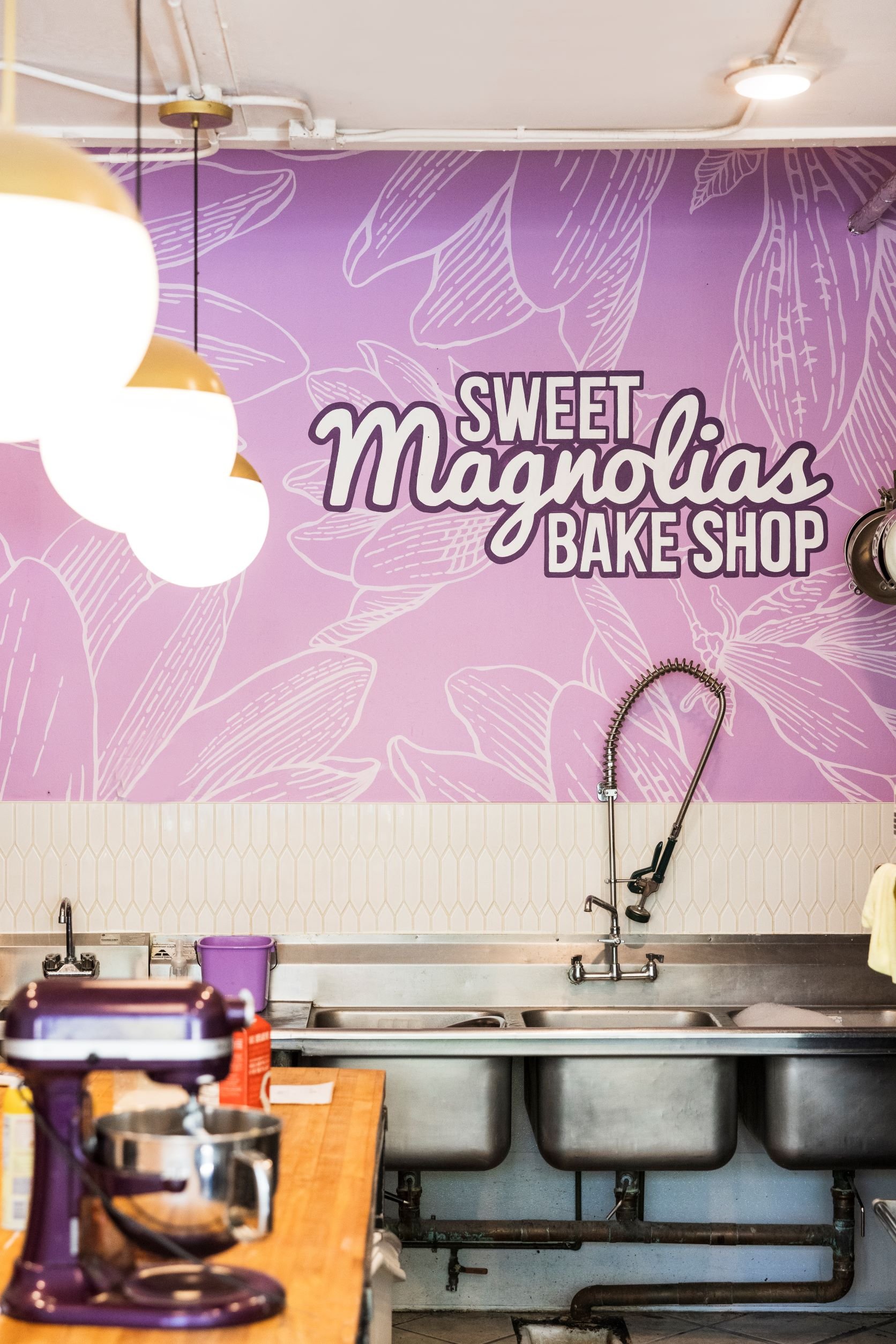
A few of the ways we accomplished this goal was through a hierarchy of focal points, both the addition and removal of color, and lighting. Let’s start with talking about the focal points. The original space had their old logon painted on some palette wood on the back wall. It was small and dark so it was hard to see. We wanted customers to immediately connect with the bold & colorful Sweet Magnolia’s they knew and loved as soon as they walked into the space. So we designed a HUGE feature wall that covers the ENTIRE back wall. We did a background of their magnolia petals, and overlaid their logo in white with a deep purple outline to make sure it was highly legible. We also scaled it appropriately for the large wall and large enough to be easily seen from the viewing distance upon entry. Then we had the extremely talented local muralist Sharon Manhart of Arbor Street Studios paint the mural. She was incredible to work with and did an amazing job. Below the mural there are multiple sinks that get used everyday. In order to protect the wall from any unwanted water splashes, we found a white picket tile and had it installed vertically just below the mural so it would block any moisture from getting onto the drywall. It is beautiful and highly functional.

Before

AFTER
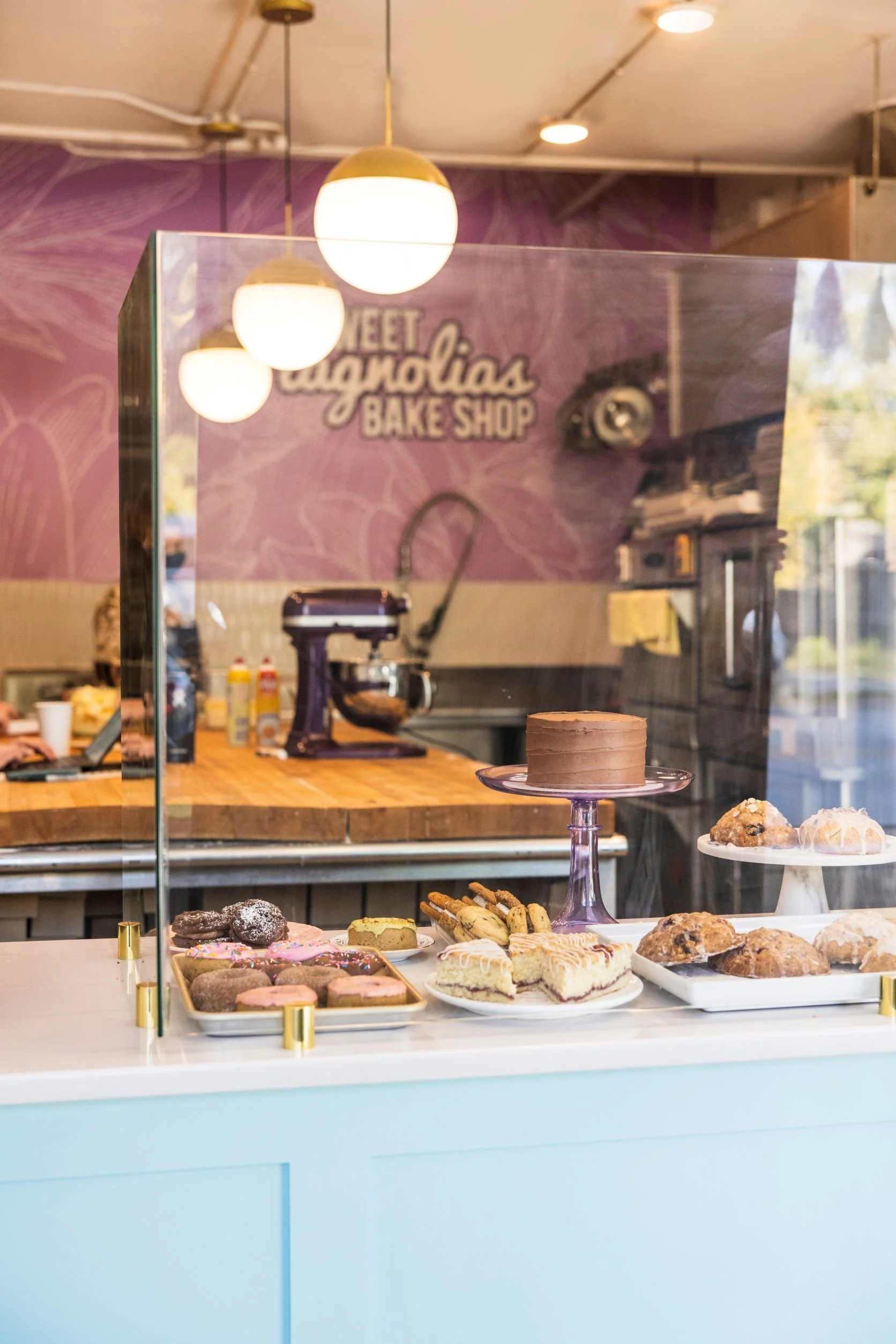
While the logo wall is the primary focal point, the baked goods & point of sale became our secondary focal point. The baked goods are so beautiful, they speak for themselves. We just wanted to give them a beautiful canvas to be displayed on. Katina wanted to consolidate her goods from two display cases into one. This gave us the opportunity to have a custom built “front desk” area that could also display goods on top of it. We went with a durable quartz countertop in a dusty gray color with subtle veining. This neutral backdrop really allowed the colorful baked goods to POP! Katina also wanted to bring in a Tiffany’s blue color into the space. We knew the front desk would be the perfect spot for this color so we had the base of the front desk made of paneled wood and painted in this vibrant color. We also made sure there was usable storage below the countertop and on the back side of the front desk so employees could store boxes and other miscellaneous items there.

Before
AFTER


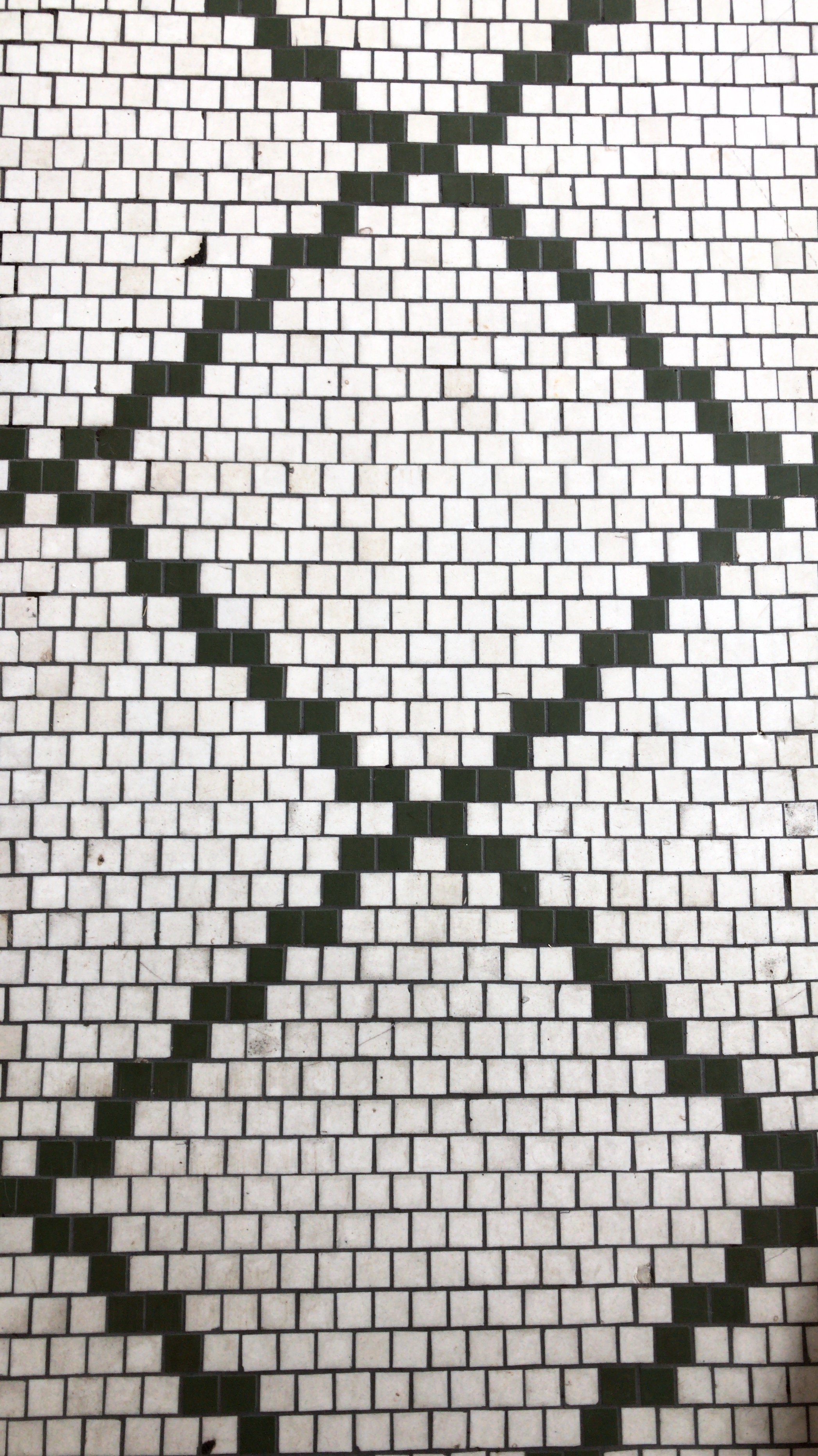
The tertiary focal point is… you guessed it: the “GET SCONED” wording on the floor. The old tile had to go. It was dark and did not add anything to the space. We had that removed and replaced with a bright white penny round mosaic tile. Sweet Magnolia’s Bake Shop is known for their epic scones. (My personal favorite is the Blueberry scone, and my husband loves the Spinach Feta scone.) We knew we wanted a tile quote on the floor and Katina had the idea to choose the words “GET SCONED,” in order to pay homage to their excellent scones. It was the perfect flooring solution! It’s much brighter, more fun and even more slip resistant than the original flooring because there is grout every 1” instead of every 18”.

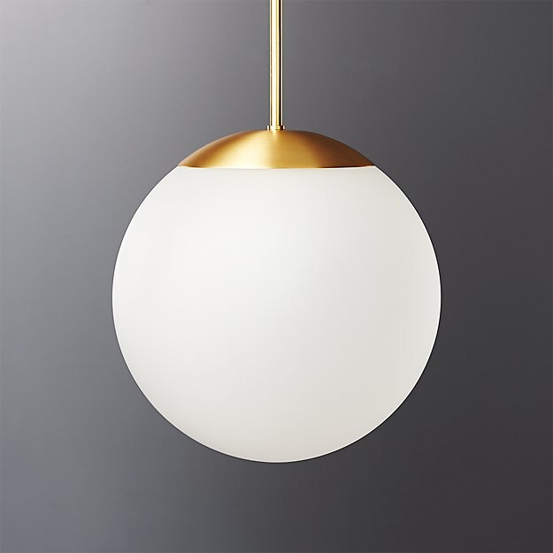
Now while focal points are super fun, they are pieces of the overall puzzle and need to be supported by the other puzzle pieces to be successful. The first thing we actually did in the space was give the walls and ceiling a face lift with a fresh coat of white paint. This helped give the space a bright and airy feeling and reflect the natural daylight from the windows back into the space. Next, we removed old fans that weren’t being used and had three pendants installed over their prep island. These brass fixtures have white enclosed shades on them so if a bulb ever went out (or God-forbid exploded) all the glass from the bulb would be contained in the white shade and no debris would find it’s way to the food-prep surface. #safetyfirst! This is one of the MANY reasons why it’s important to work with a professional commercial interior designer on your commercial space and NOT work with a decorator. Building Code knowledge saves you from being closed due to not passing building inspections. If you’re curious what the difference is between an Interior Designer and a Decorator, you can read the legal description as stated by the National Council for Interior Design Qualification found here.
All in all, we loved how the remodel turned out for Sweet Magnolia’s Bake Shop because it feels bright, colorful and lively. We feel that this accurately reflects their incredible website and social media presence. If you have any questions about our Interior Design Services, please go to our SERVICES page to read more! Thank you!