How to Make Your Home More Romantic...

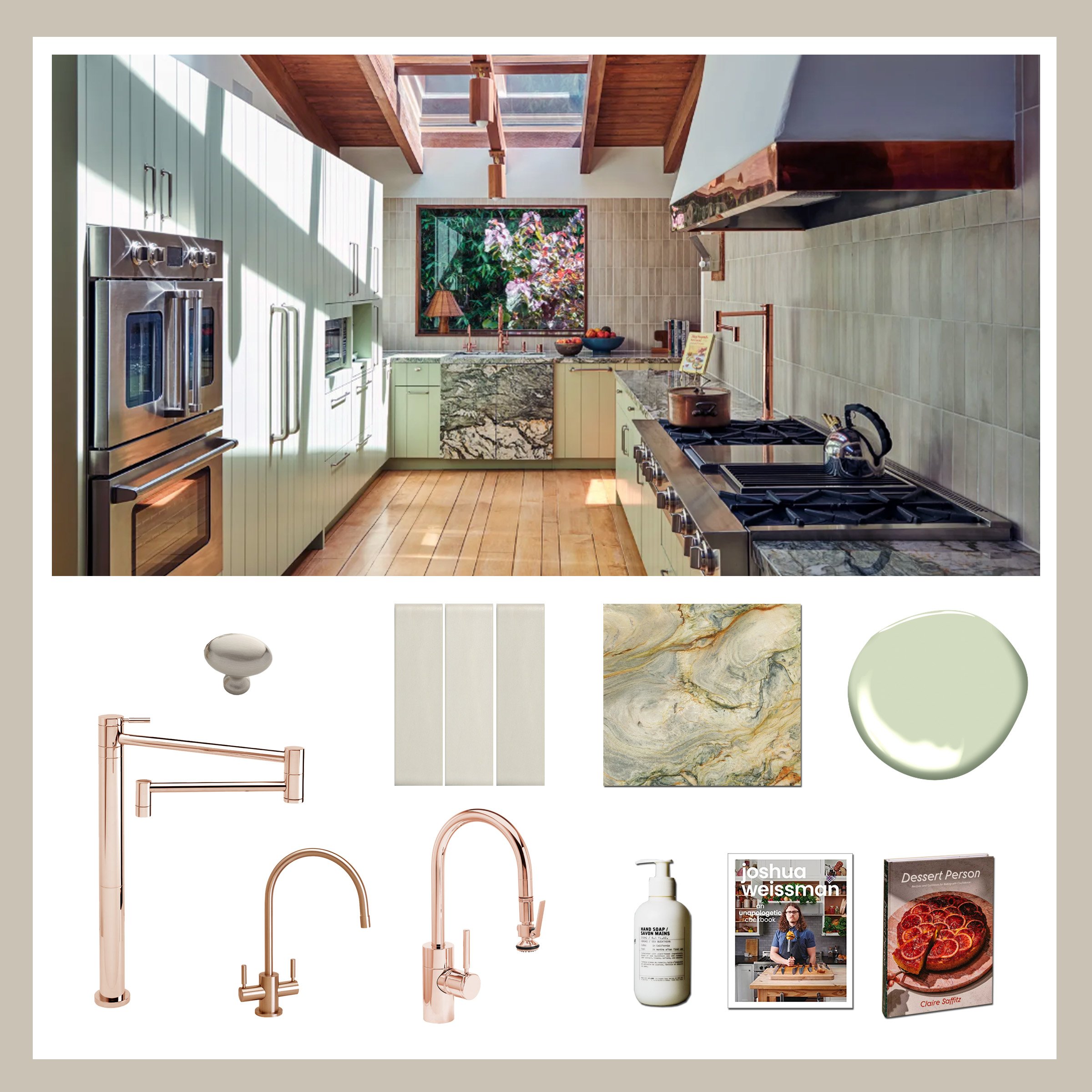
Ah, love is in the air! Valentine's Day is approaching, and it's time to turn up the heat. With this holiday in mind, we want to show you how to take your home from plain to passion with just a few simple tricks. Consider a sunken lounge for those cozy cuddles, a warm fireplace, a library, curved furniture, indirect lighting to set the mood, and soft fabrics to sink into.

Credits in photos linked below per section. Click photos in sections below to find the respective designer.
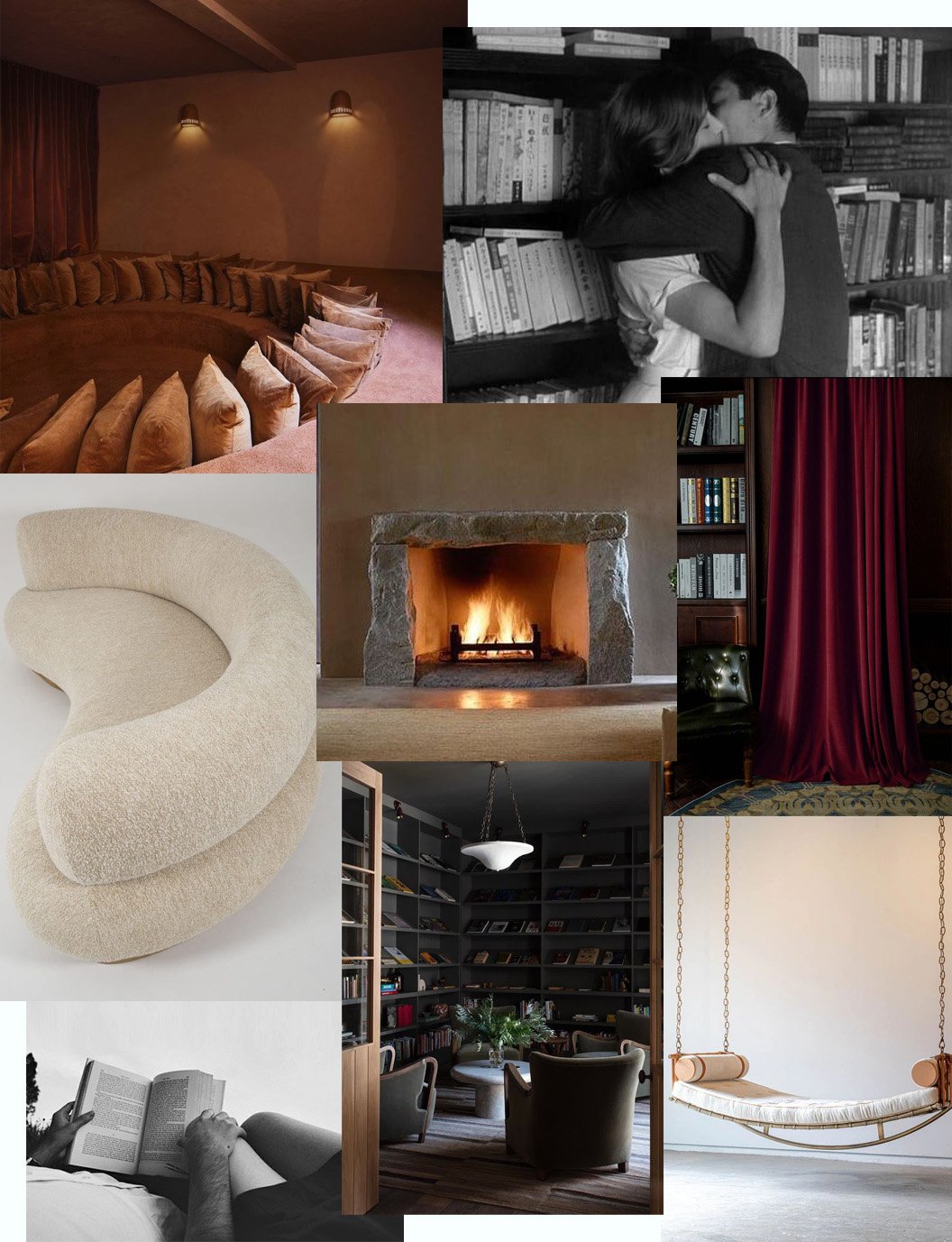
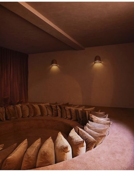
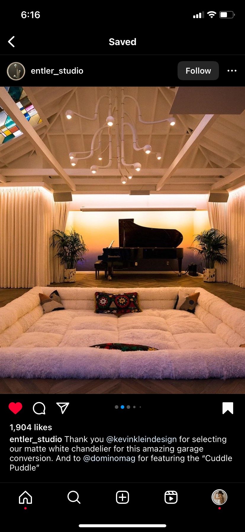
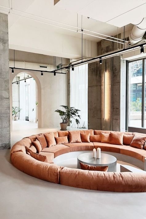
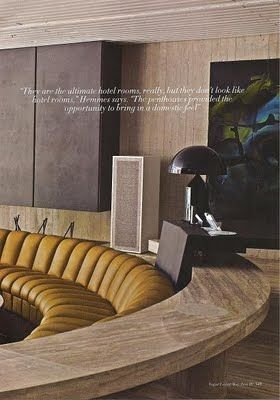
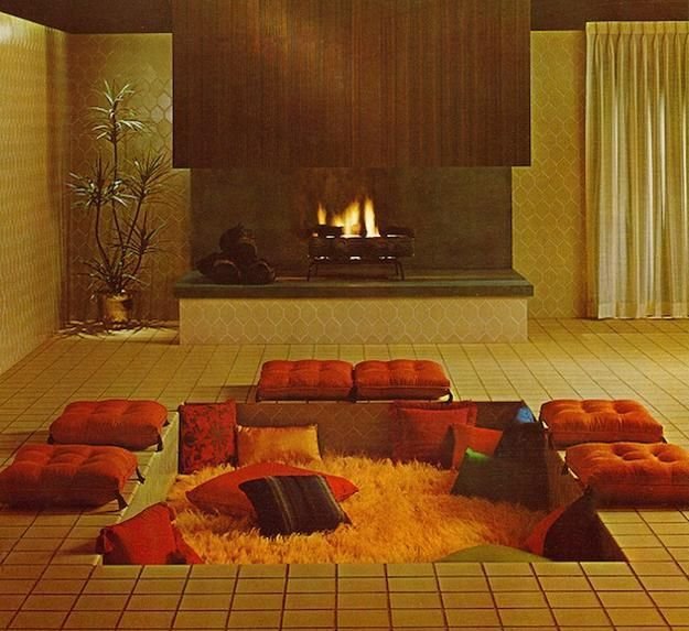
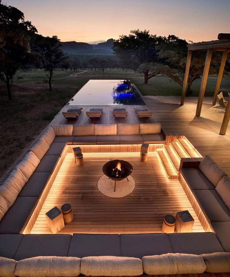
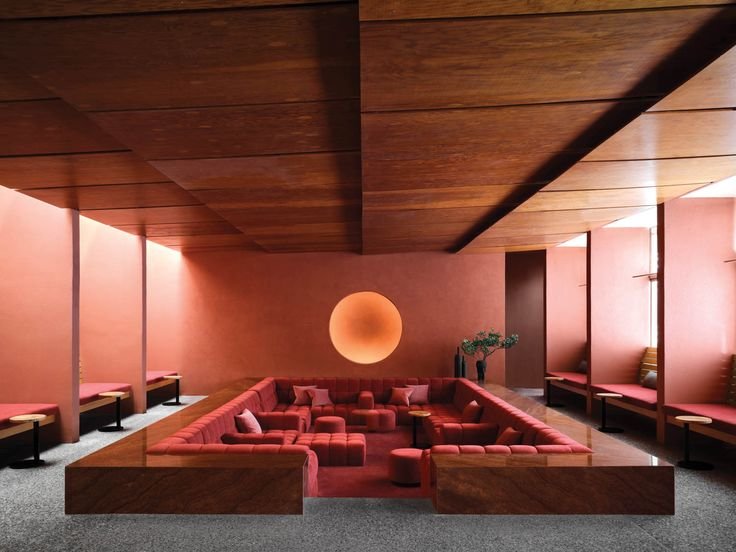
Sunken Lounge…

Having a sunken lounge in your space instantly adds a romantic and playful vibe, but you do have to plan ahead with this one. It’s easiest to implement a sunken lounge when you’re building a new construction project and it’s slightly more difficult to add into a renovation, but it is still possible. Be sure to plan ahead and hire a designer if you want to include a seductive sunken lounge in your next project. You can play with the level changes, the materiality and the sheer number of seats. Don’t forget important things like the view, surround sound and mood lighting as well. (More on mood lighting later in this post.) Sunken lounges are also known as ‘conversation pits’ and we love that this retro trend is booming again.
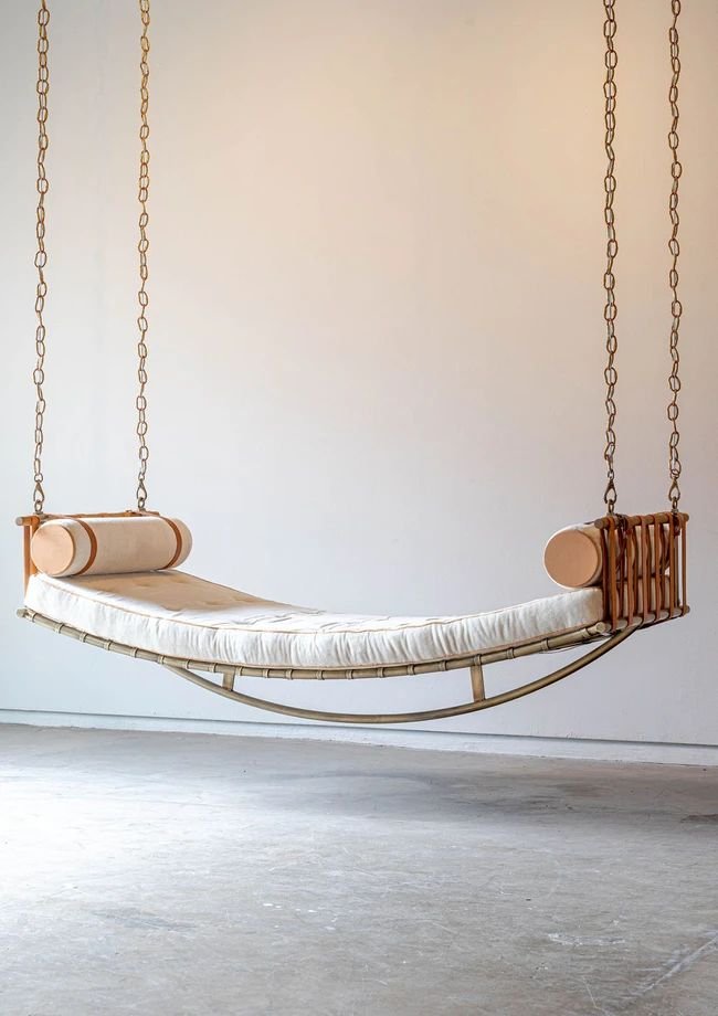
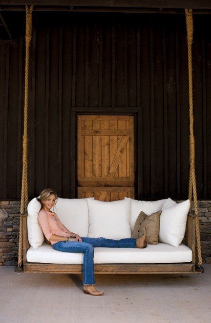
Swings…

Indoor swings and hanging daybeds are a great way to add some romance to your home. Not only do they create a playful and whimsical atmosphere, but they also provide a cozy spot for relaxation. Imagine curling up on a hanging daybed with a good book, or a mid-day nap with a loved one. These unique pieces of furniture are not only functional, but they also add a touch of sexiness to any room. Playfulness is an important element to consider in lasting relationships.

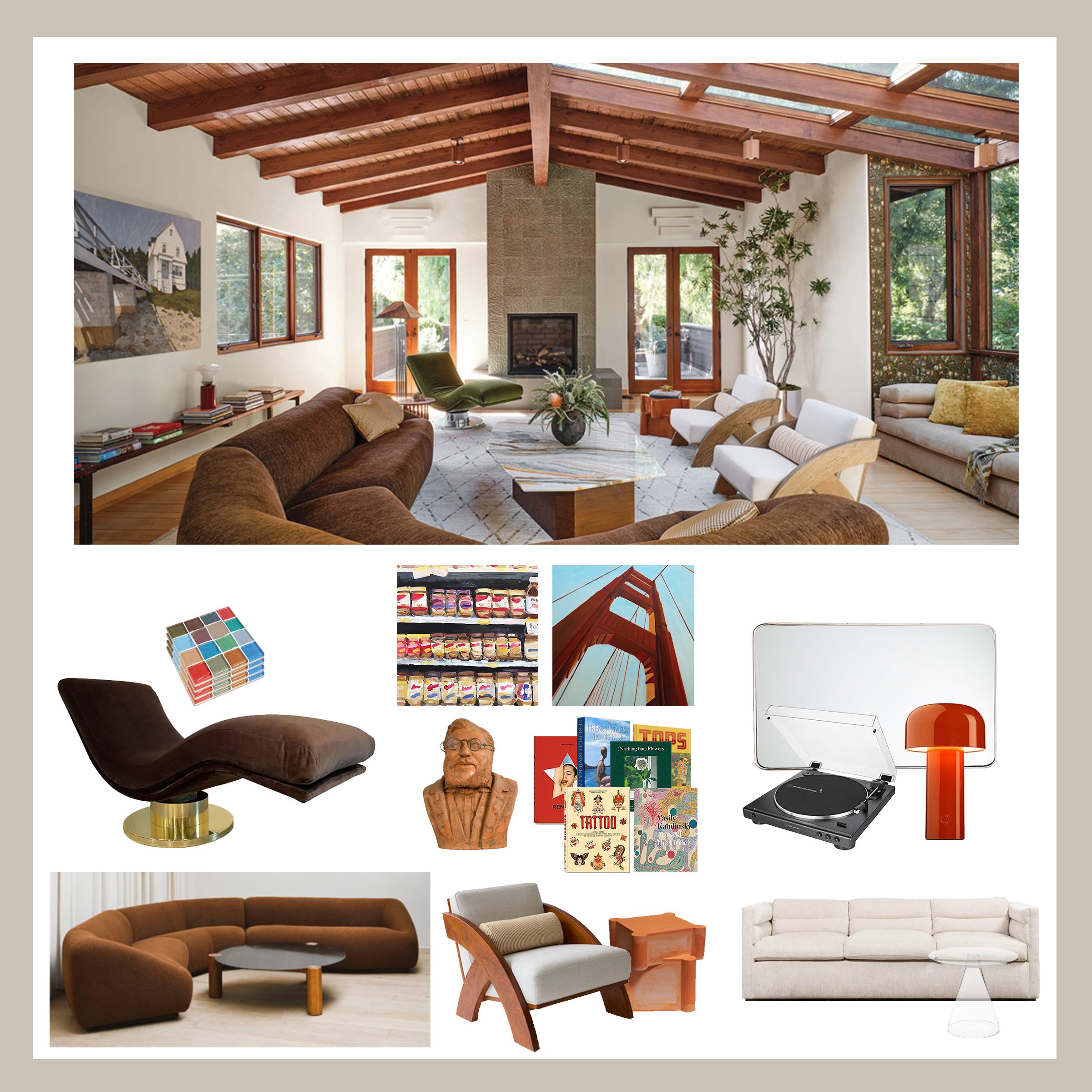
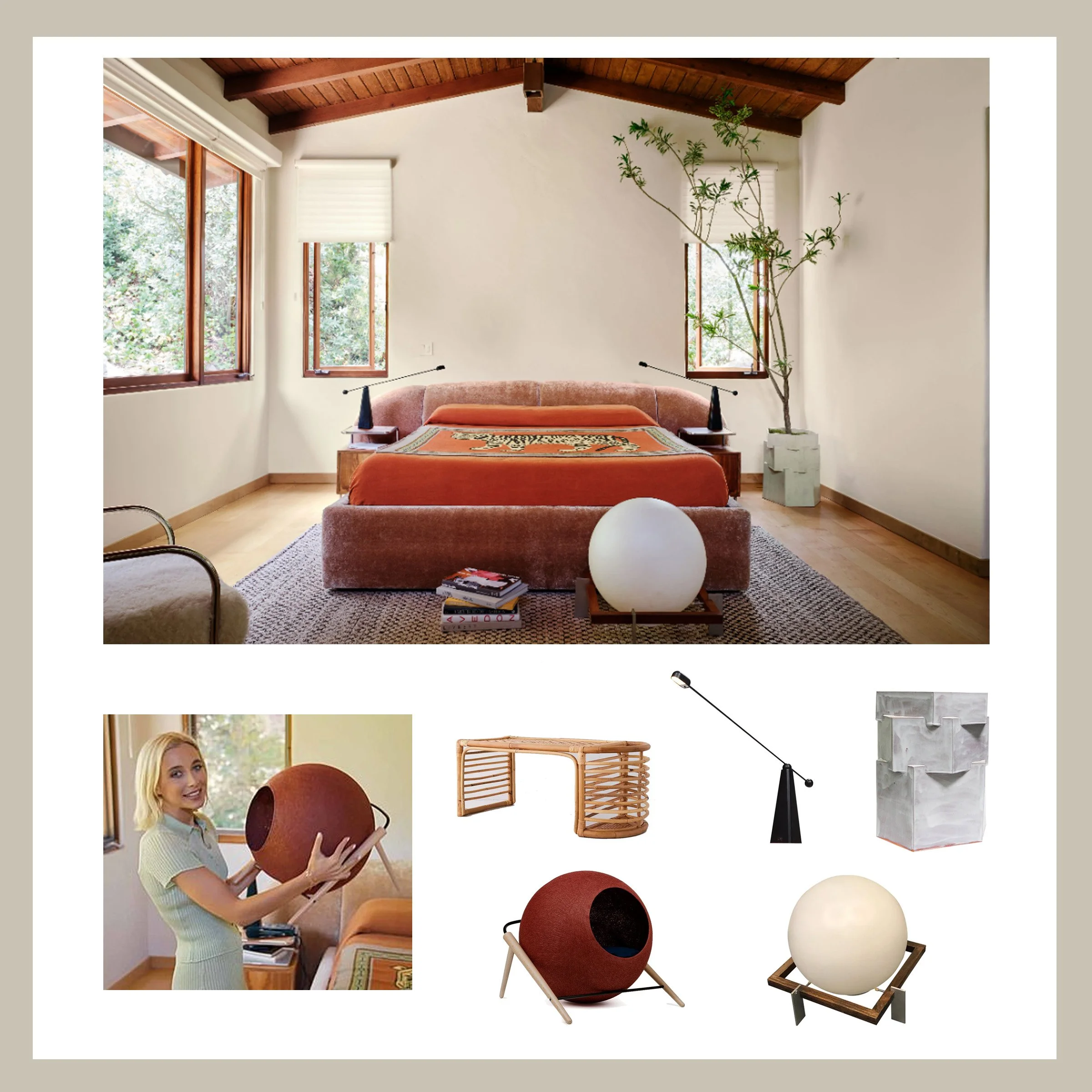
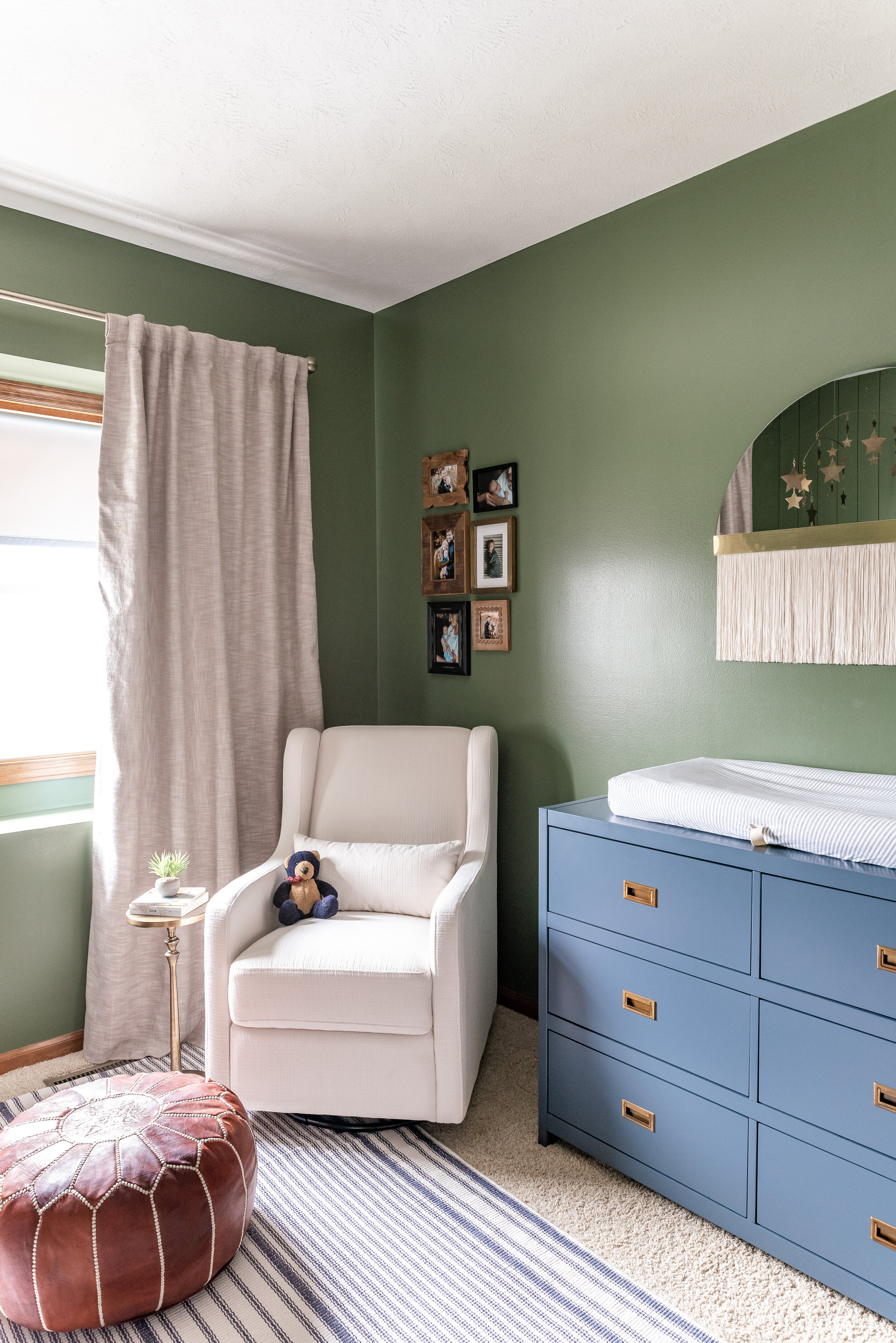
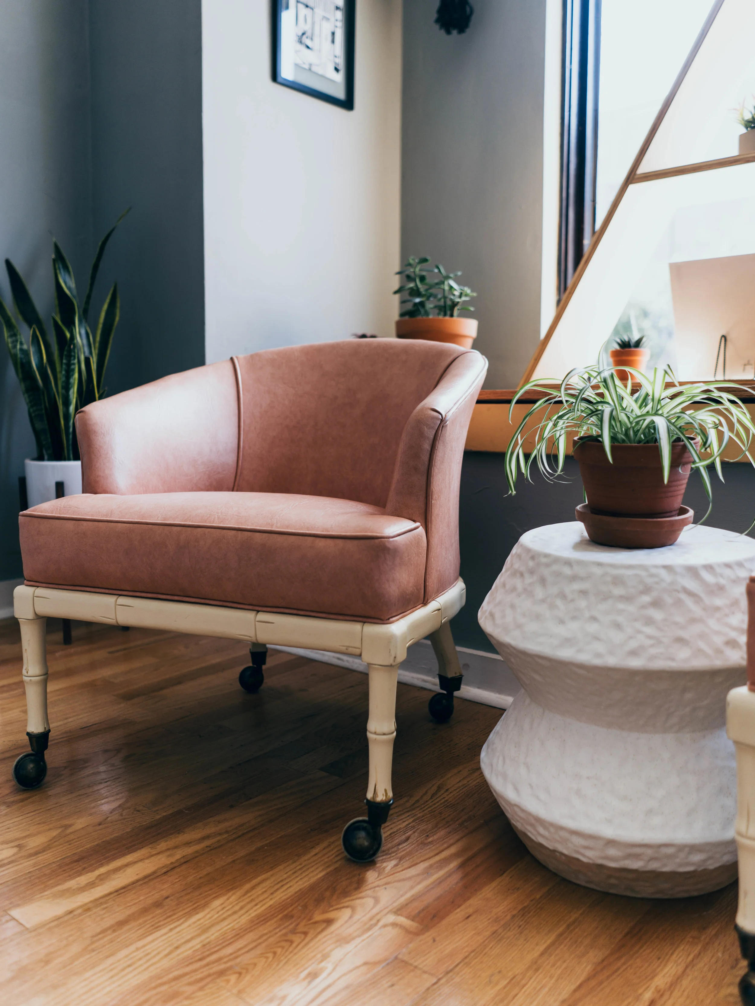
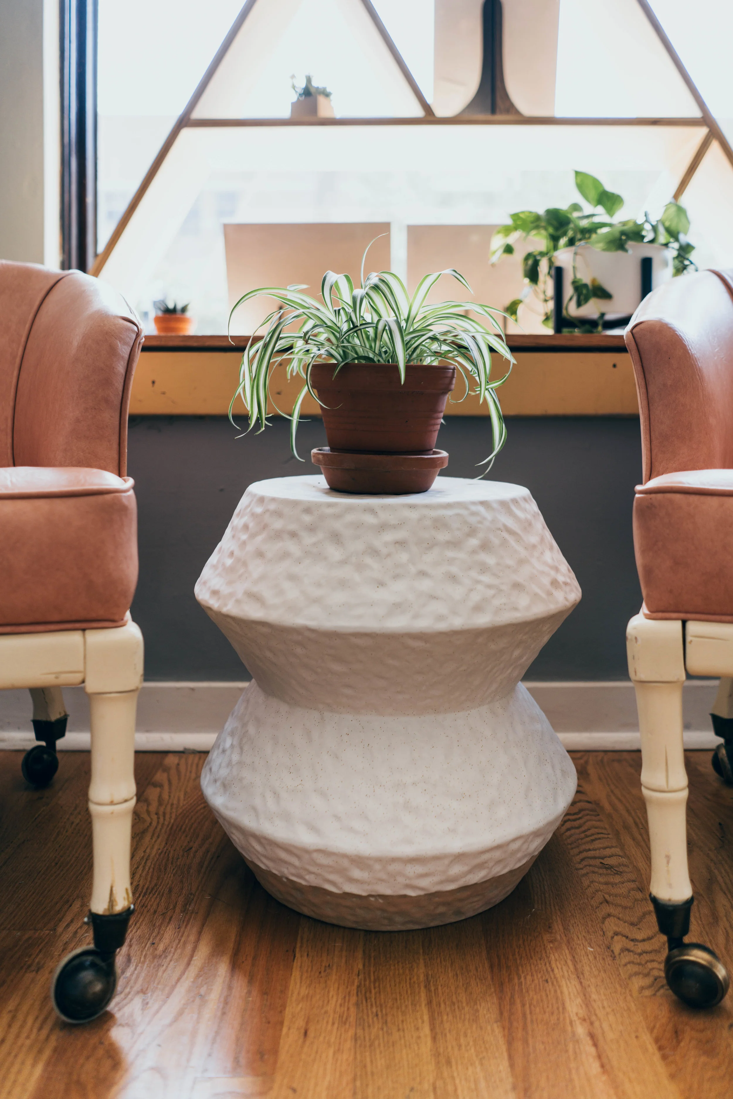
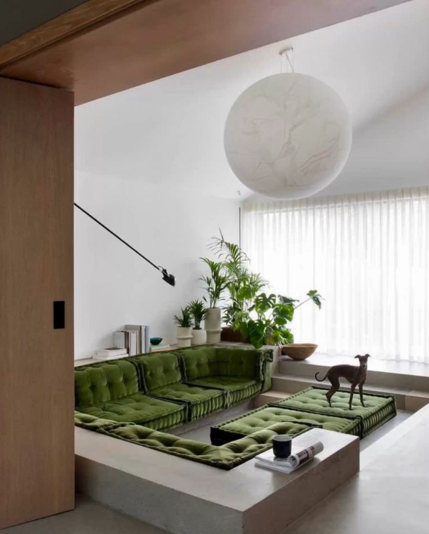
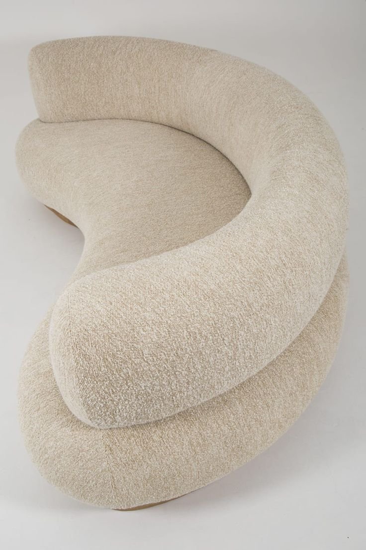
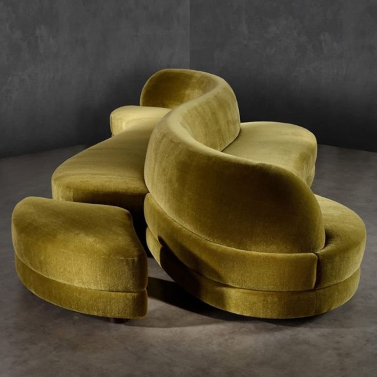
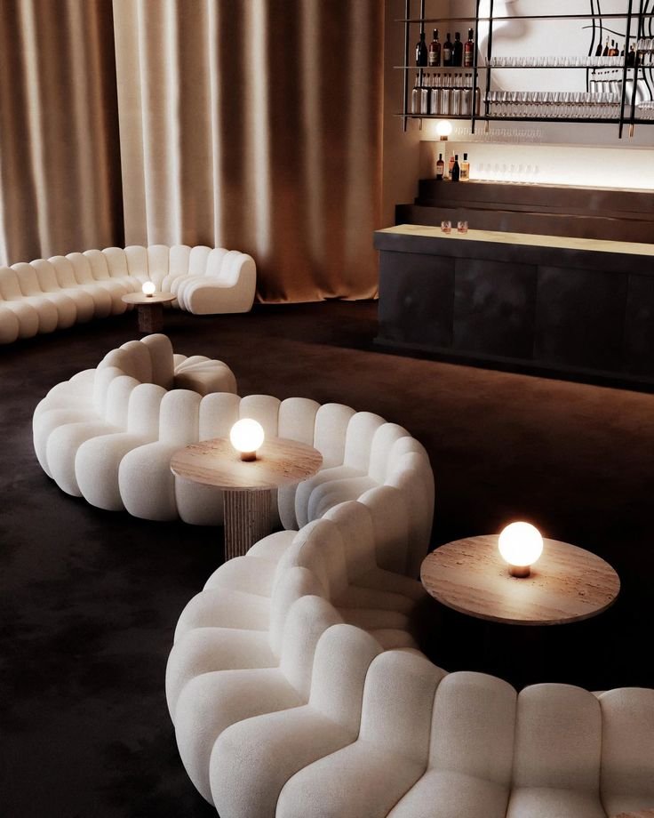
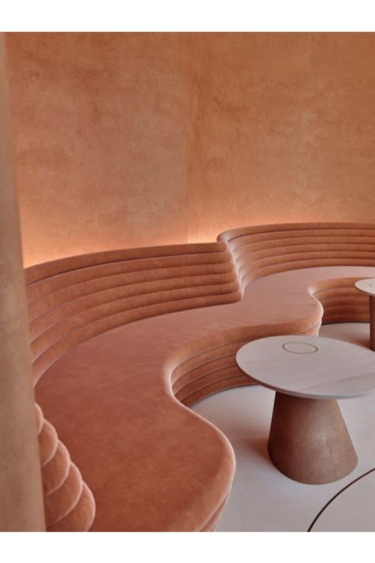
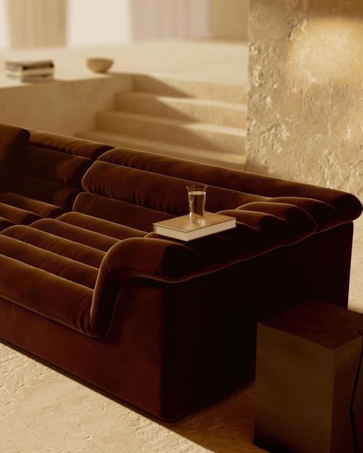
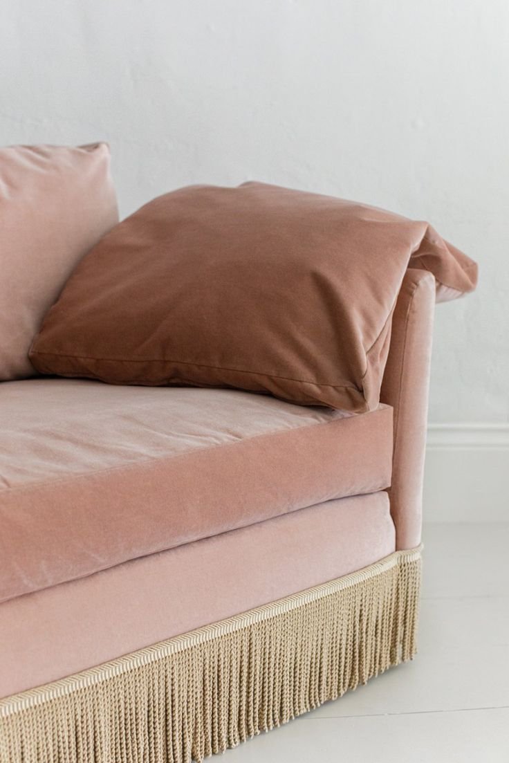
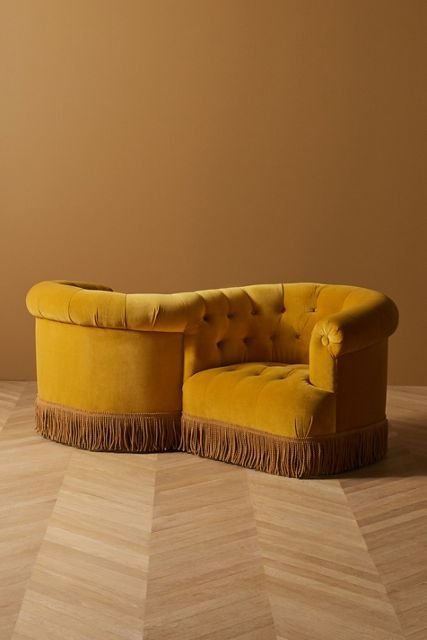
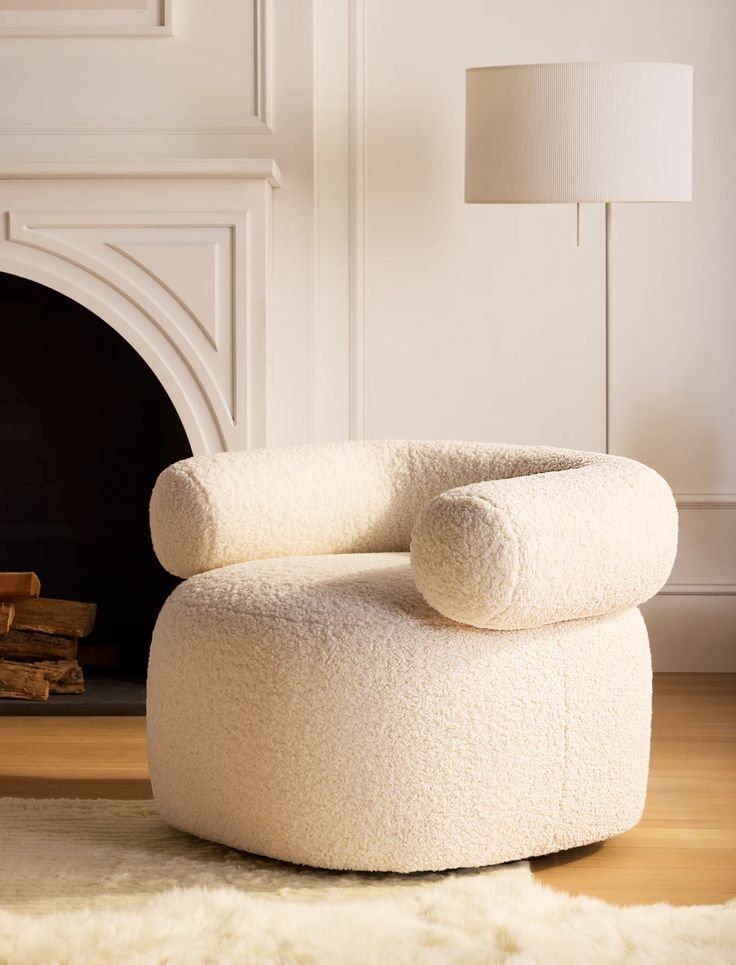
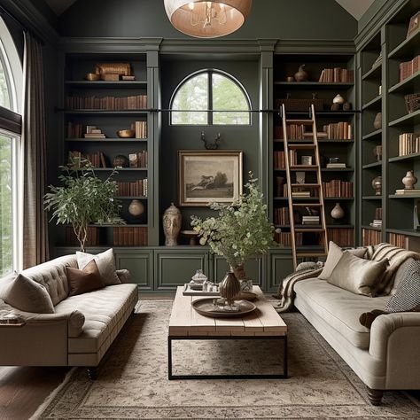
Curvy Furniture & Ultra Soft Fabrics…

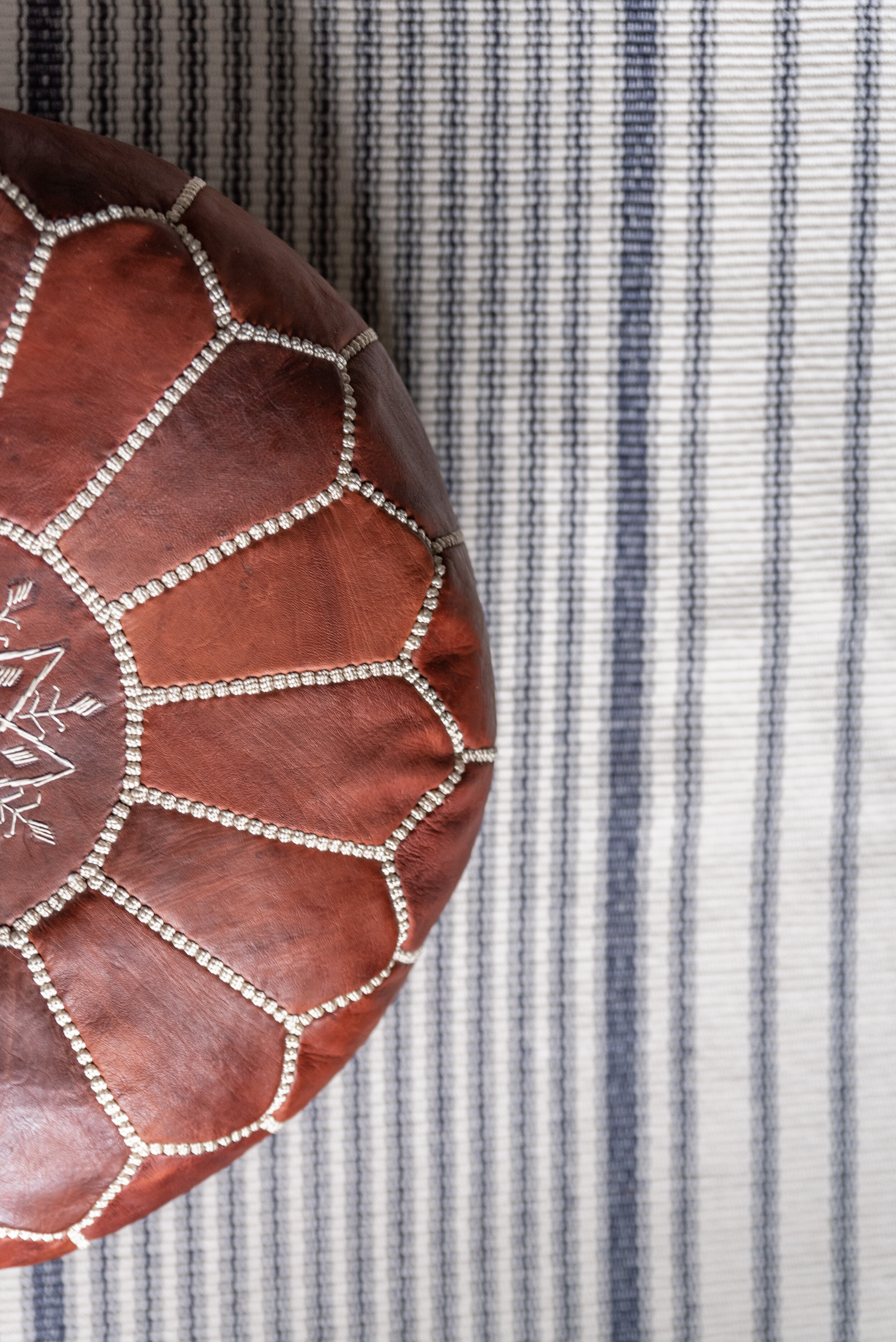
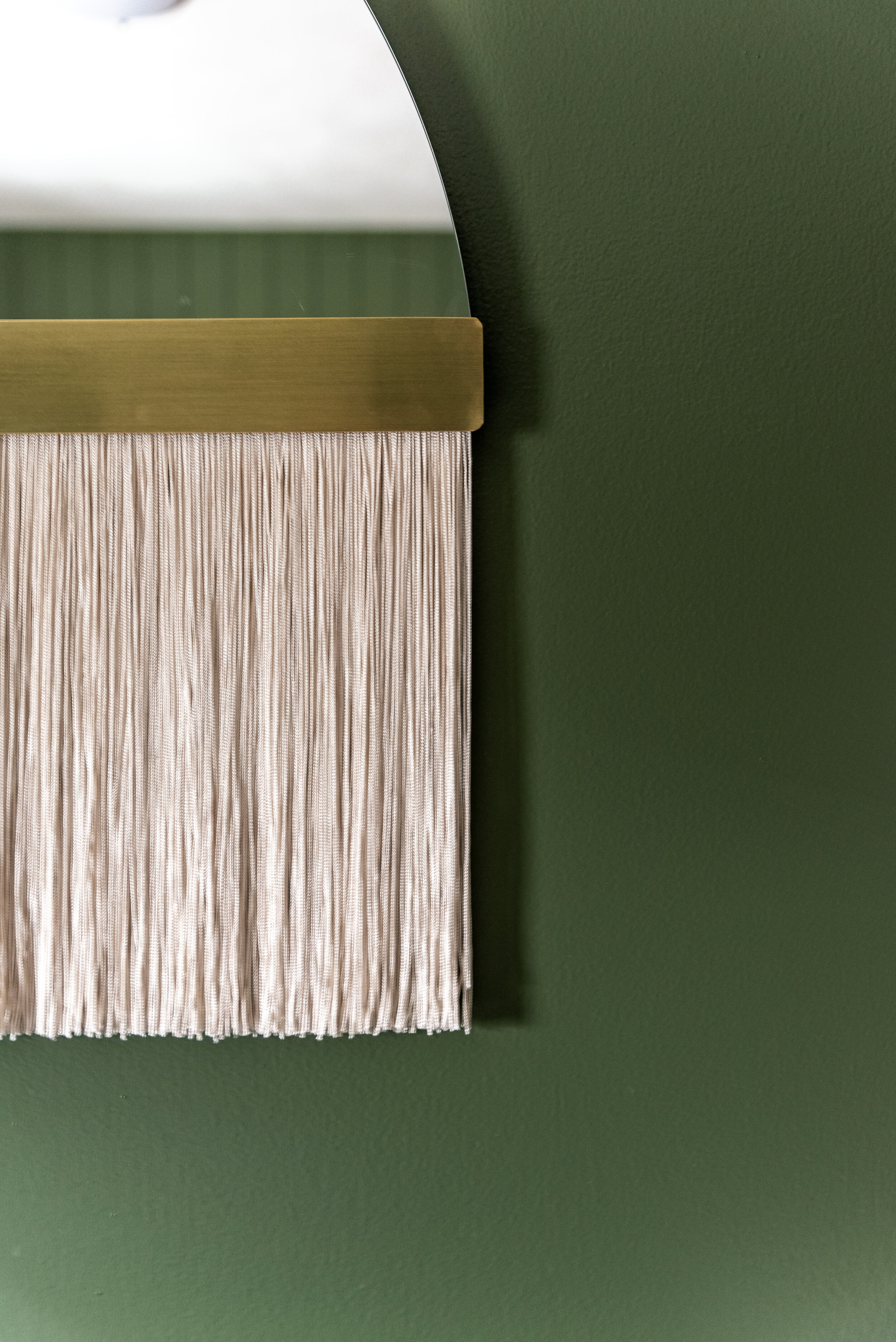
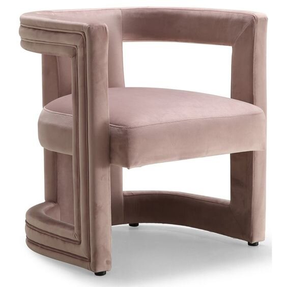
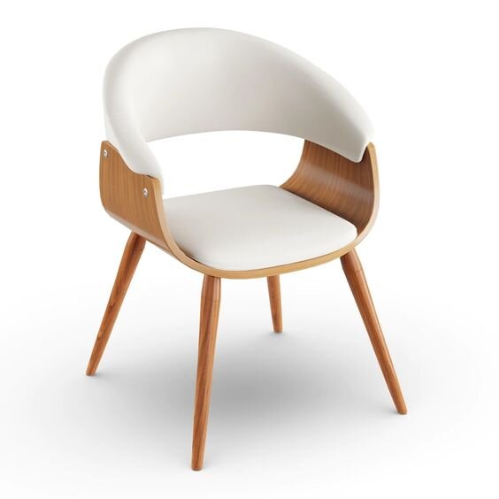
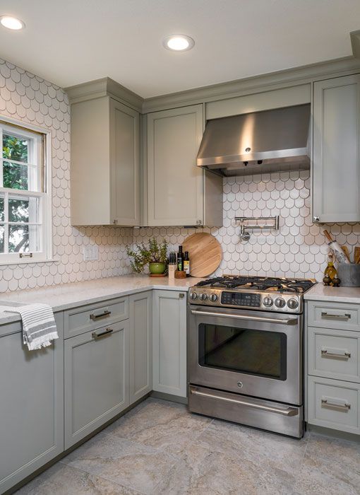
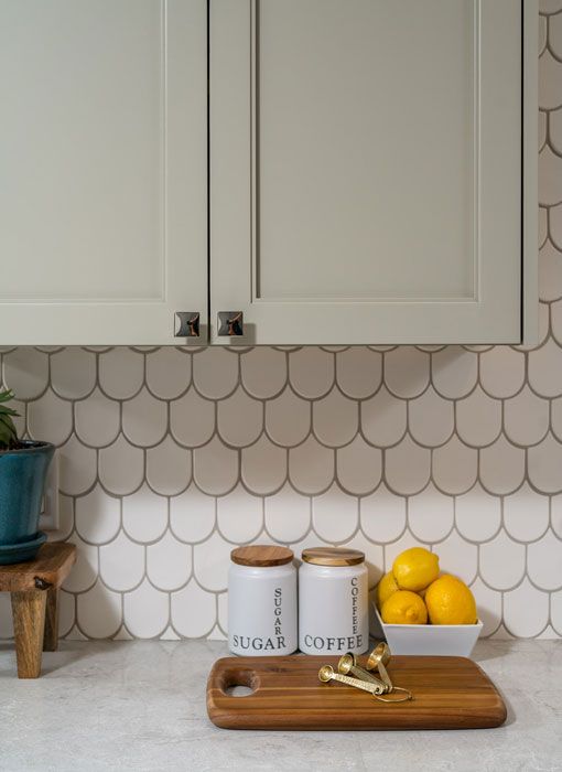
When it comes to creating a romantic atmosphere in your home, choosing the right furniture is key. Selecting the right fabrics is equally as important. Curvilinear furniture makes your space feel less strict and stuffy. It adds a hint of feminine softness that can help make a space feel more relaxing. Ultra-plush textiles, plush area rugs, velvet curtains, and silk bedding can give your home a luxurious and inviting feel. The combination of curved furniture and soft fabrics creates a cozy and intimate space that is perfect for curling up with a loved one or enjoying a romantic evening at home. So, if you want to add some romance to your home, consider incorporating curved furniture and soft fabrics into your decor.

“Everyone loves to explore with their sense of touch. Explore your space by layering different types of textiles throughout.” - Tara Miller
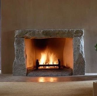
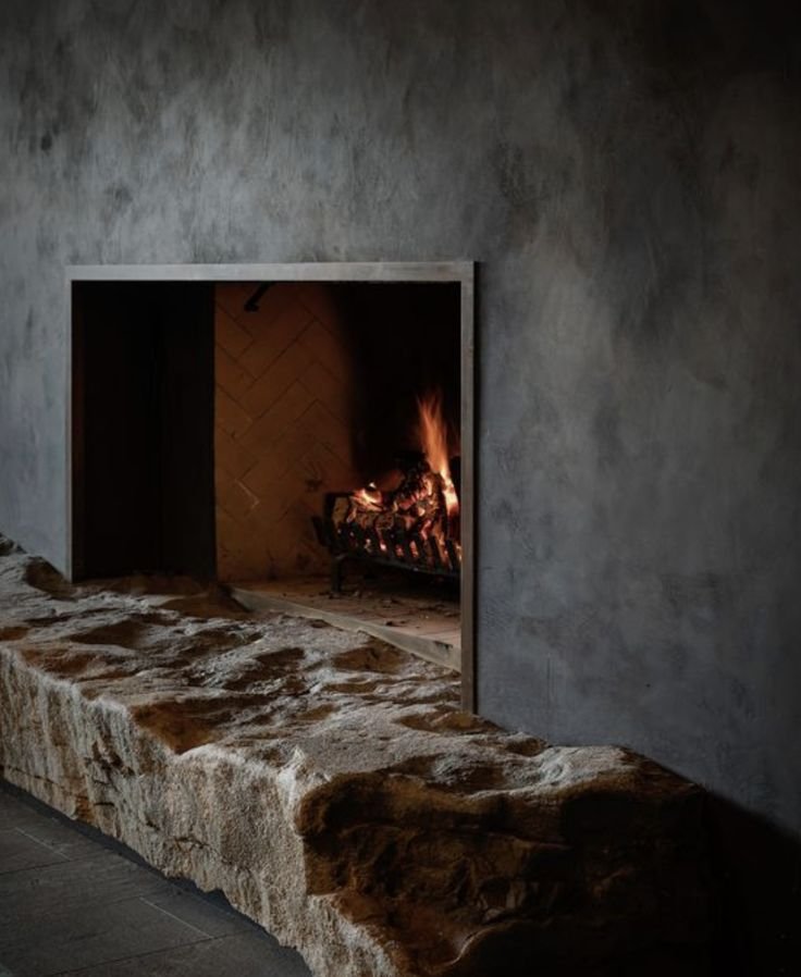
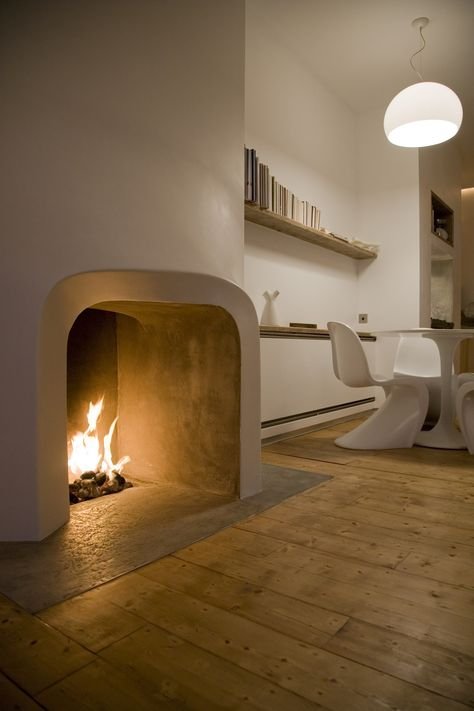
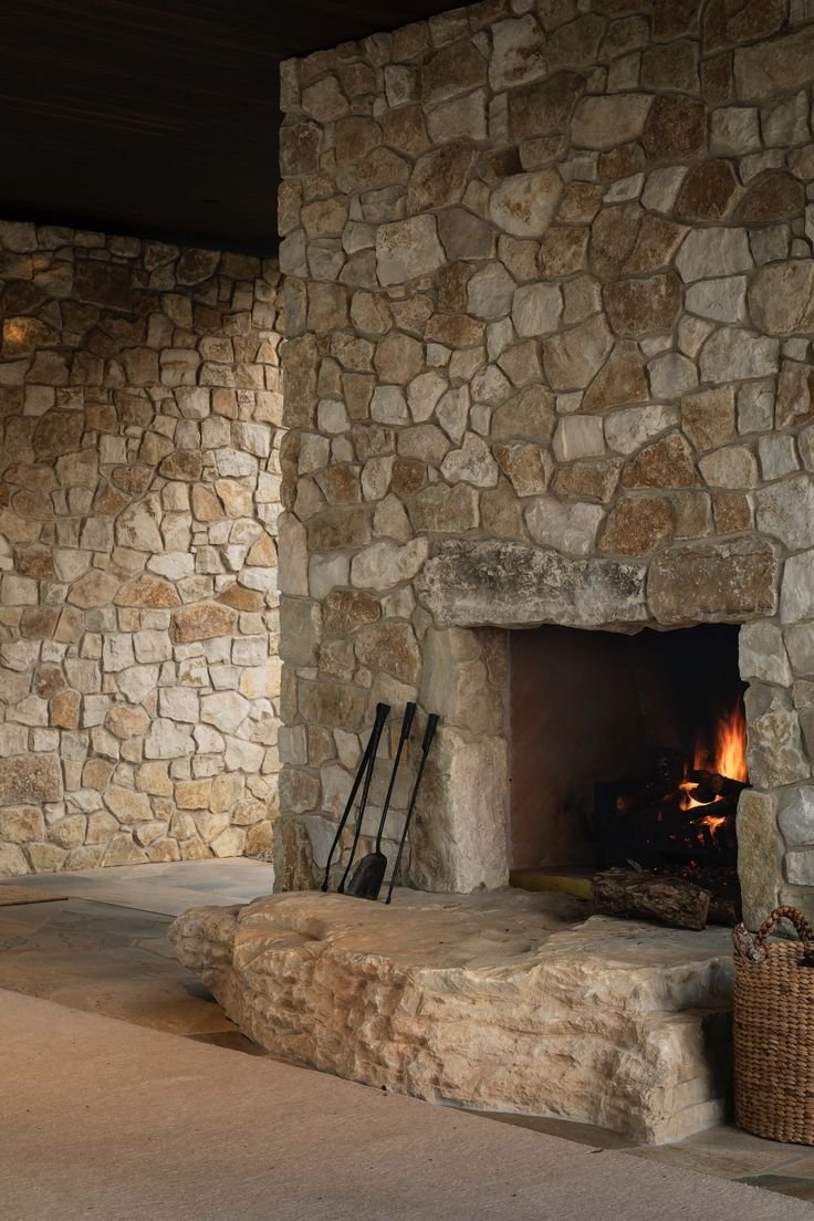
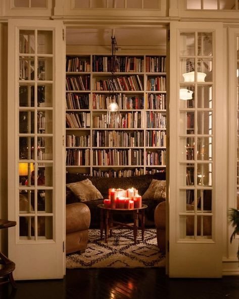
Cozy Fireplaces…

There is something undeniably alluring about the warm, flickering glow of a wood-burning fireplace. It has a way of transforming even the most mundane of living spaces into a space that is both romantic and intimate. Whether you're snuggled up with your significant other, enjoying a glass of wine and conversation, or simply basking in the quiet solitude of a crackling fire, a fireplace has a way of making you feel connected, grounded, and at peace.
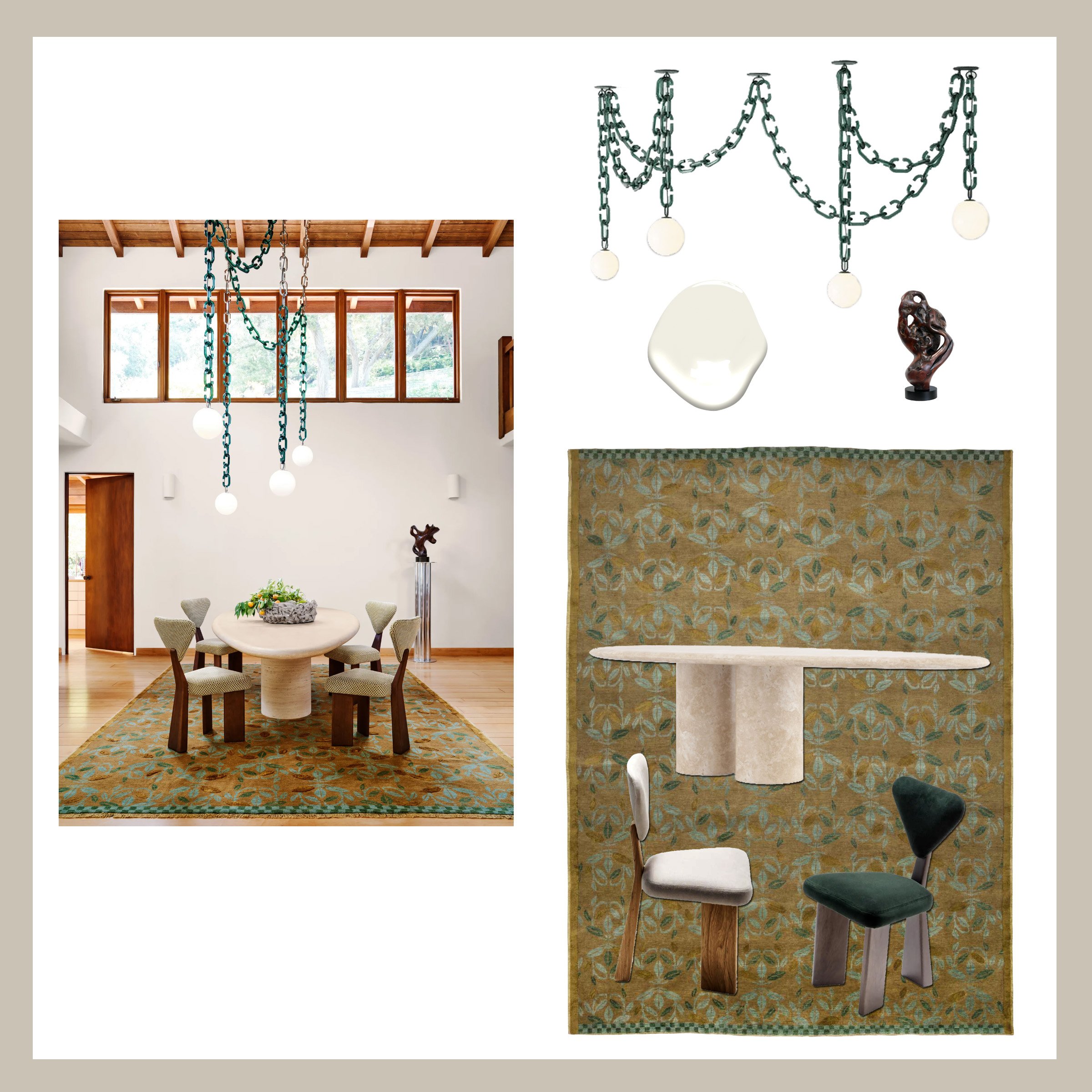
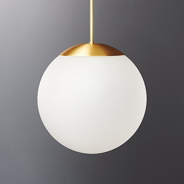
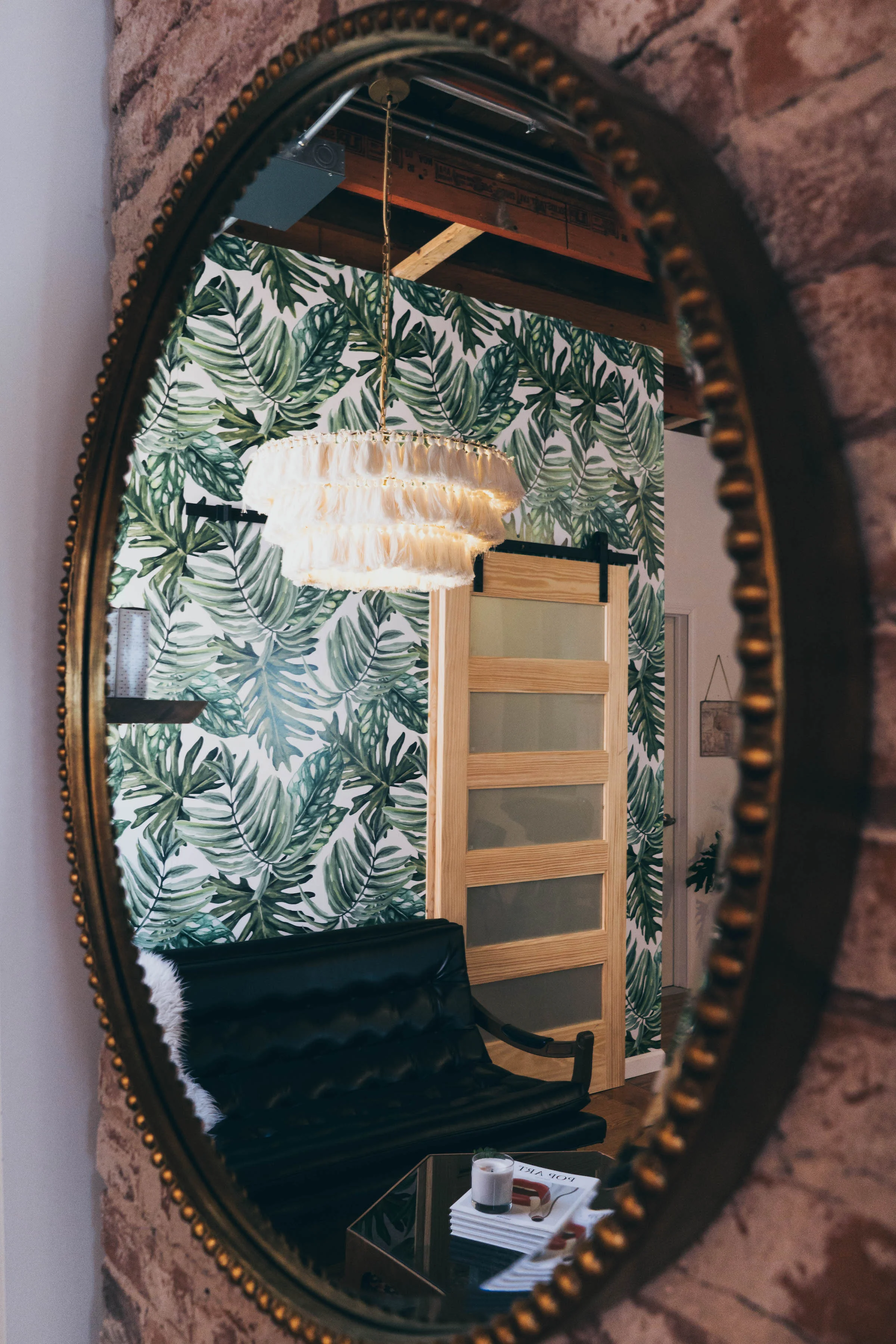
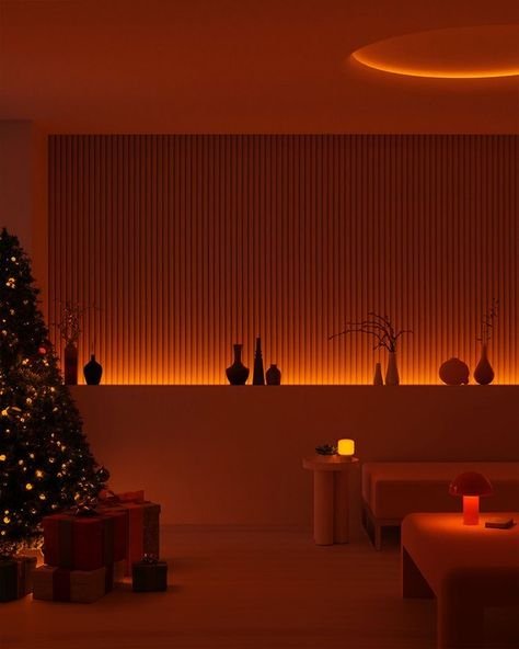
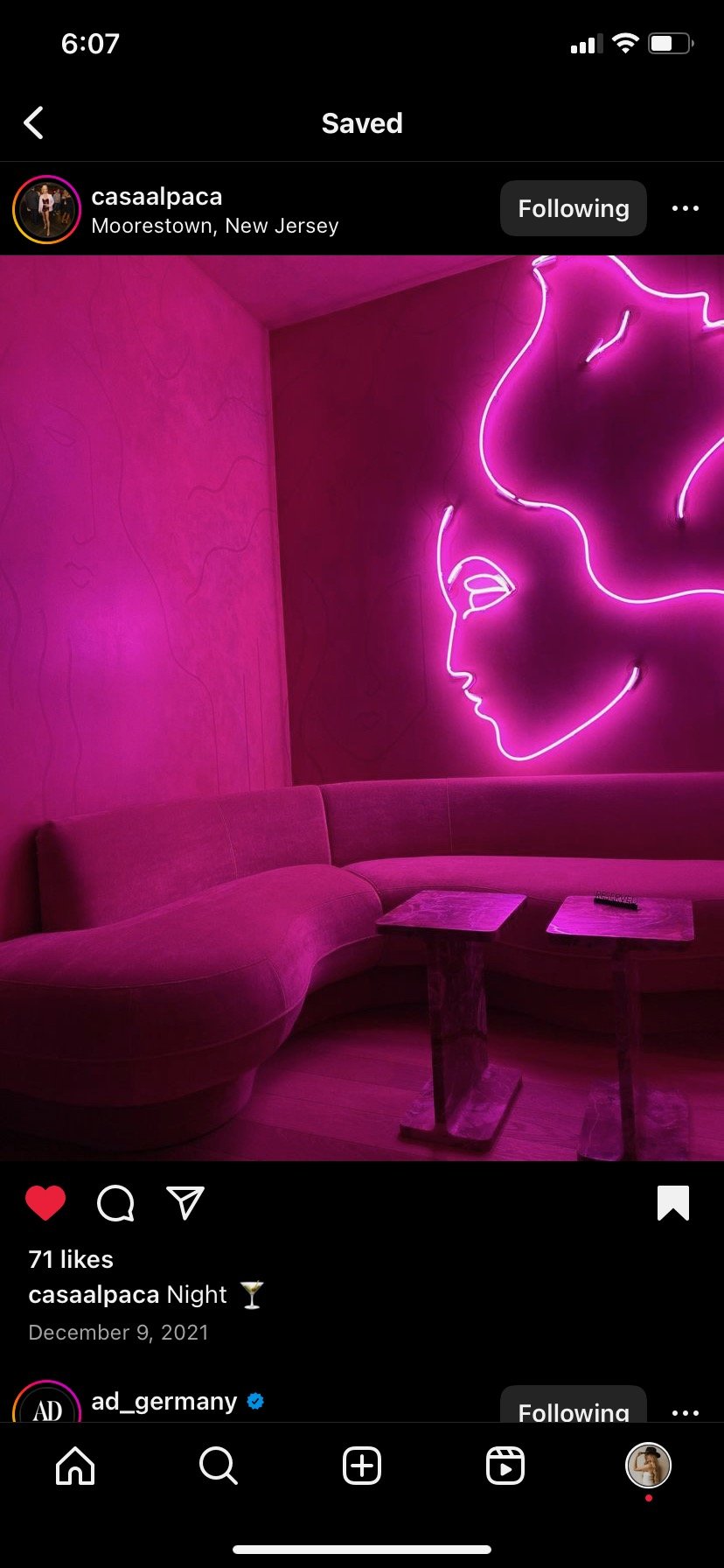
Mood Lighting…

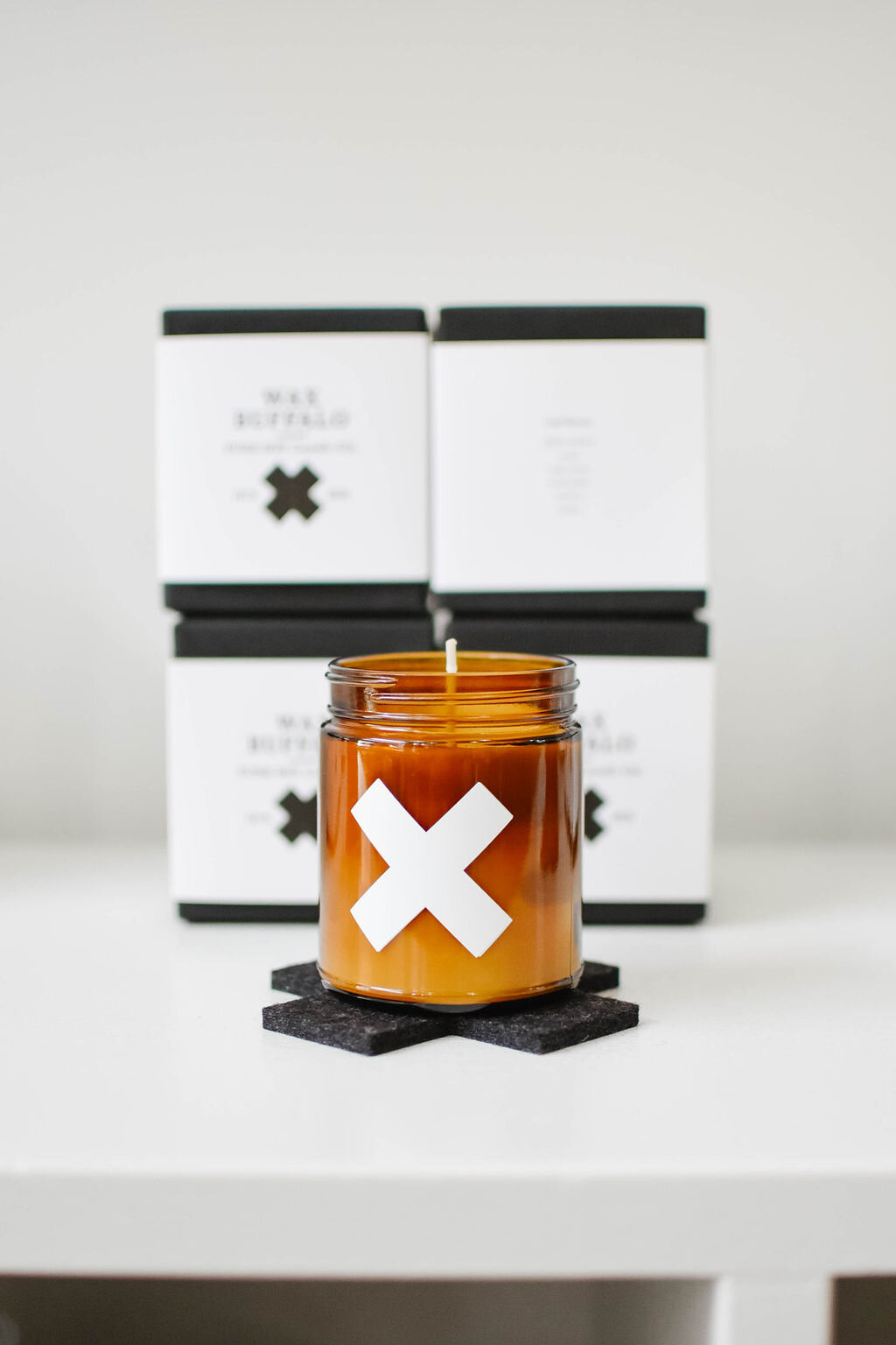
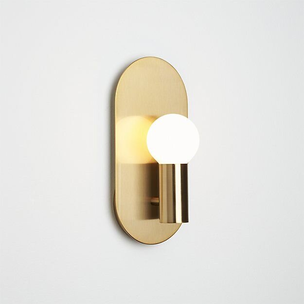
The right lighting can create an alluring and romantic atmosphere in any space. Indirect lighting softly illuminates the space, creating a cozy ambiance. Backlighting can highlight objects and add depth to a space, making it feel larger and more dramatic. Uplighting, on the other hand, can add a touch of elegance and sophistication, especially when used to highlight artwork or architectural features. And of course, there's nothing quite as romantic as the warm glow of candlelight. We suggest scentless candles and we prefer beeswax if possible.
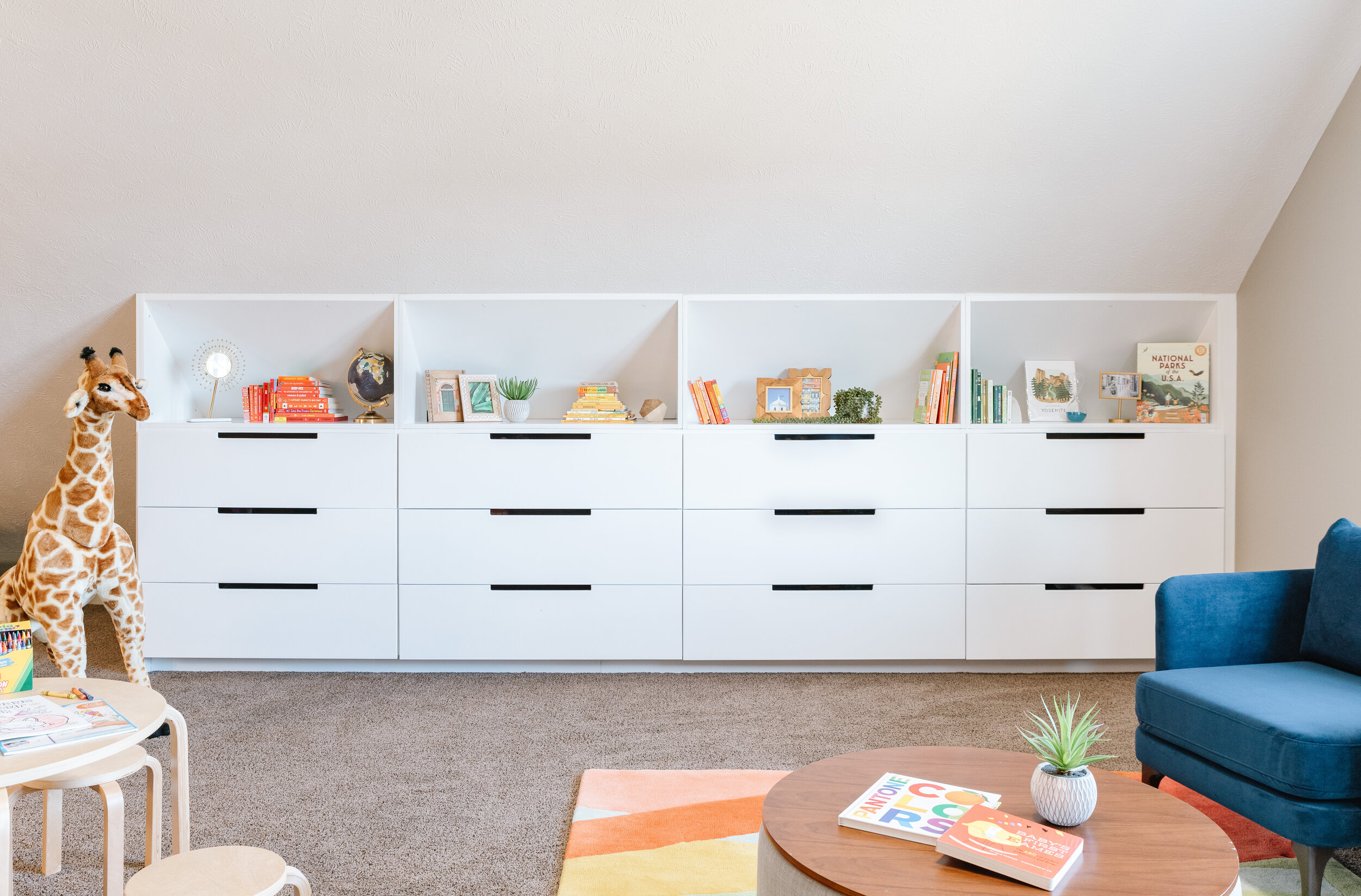
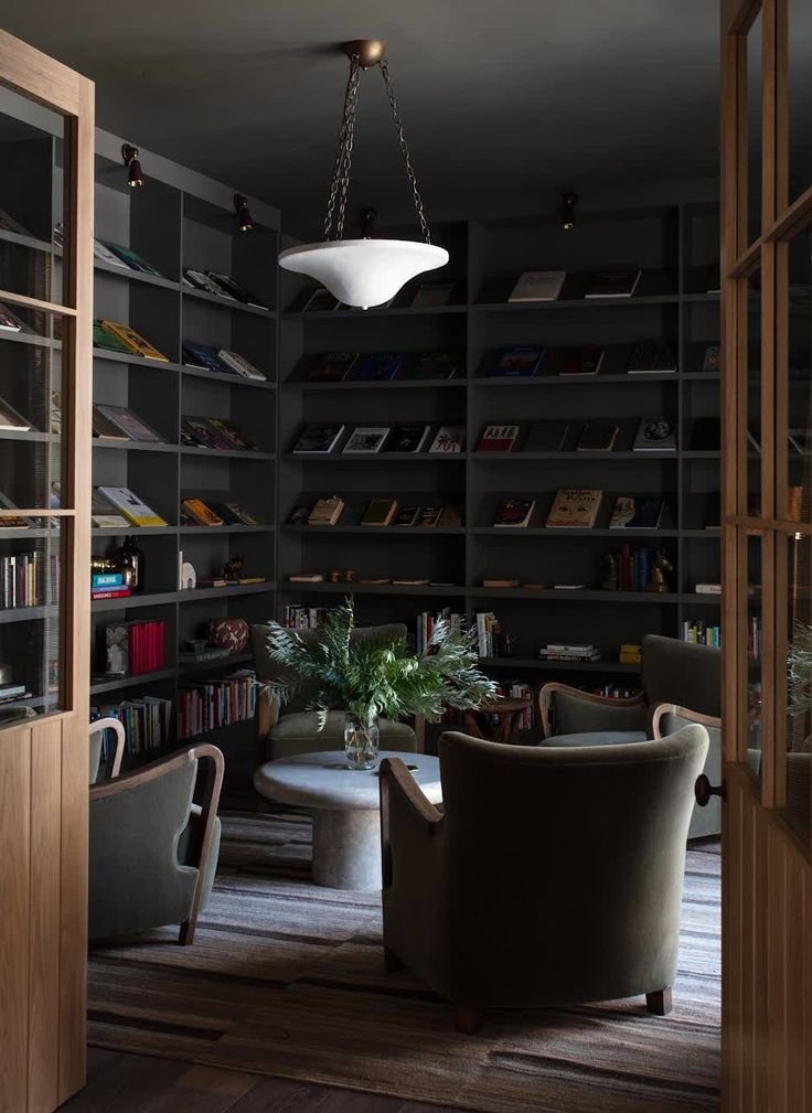
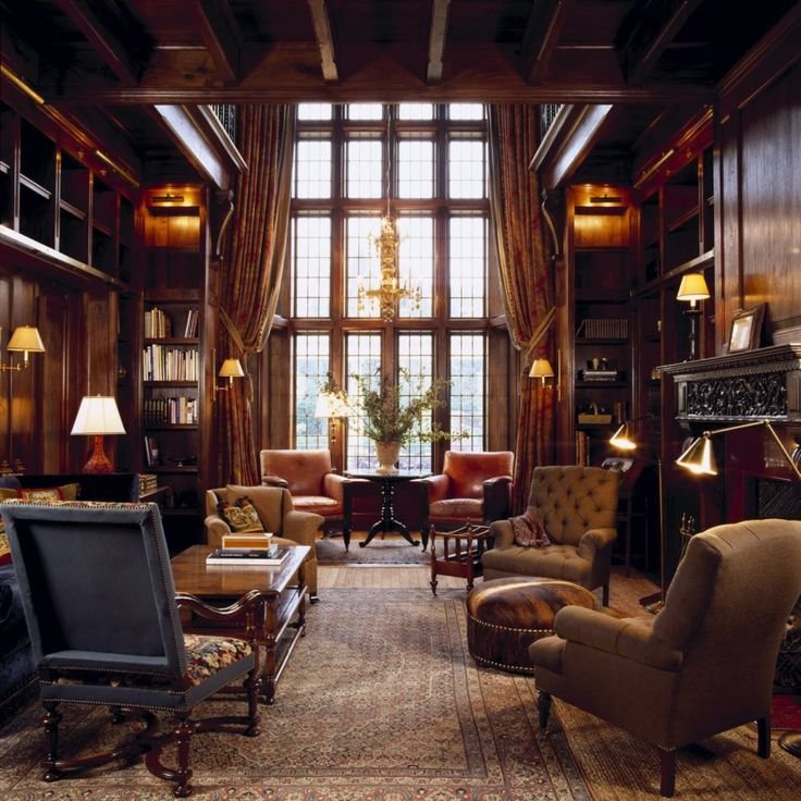
Library Aesthetic…

Creating a home library can be a wonderful addition to any household. Not only does it provide an aesthetic appeal, but it also creates a cozy and intimate atmosphere that is perfect for reading… and other activities. A home library can be designed in various styles, from modern and sleek, to traditional and ornate. A library is a highly personal room because you fill i with your own personal collection of literature.

“The books you have on your shelf say a lot about you. Showing someone your personal library is like showing them a piece of your soul.- Tara Miller

Overall, incorporating these elements into your home can help create a romantic and inviting space that promotes relaxation and intimacy. By adding softness, warmth, and playfulness to your decor, you can create a space that feels like a romantic getaway right in your own home.

The Heartland Interior Design's Holiday Gift Guide 2021

The holiday season is here and we wanted to put together a little curated list of items for you all! ( We felt like Oprah putting together the “Our Favorite Things” collection!) It was so much fun! We selected items all over the board price wise and all over the board when it comes to categories! We found tangible products and service based options as well. Can’t give your mama some slippers this Christmas? Maybe give her a coupon for an uninterrupted nap! I promise you it will be just as good (if not better!) :D This is our first time curating a Holiday Gift Guide so we hope you like it! We centered the aestehtic around warm earthy colors like beige, green and we threw in some black for contrast. Enjoy!!


  1. Sweater. 2. Candle. 3. Book. 4. Blanket. 5. Kettle. 6. Slipper.

Cotton Citizen is a really cool brand that dyes many different cotton apparel pieces in a wide array of colors. This summer I found their “Desert Mirage” colorway and bought a dress in it to wear to Vegas. I love the Desert Mirage colorway because it’s reminiscent of an elevated camouflage. Luckily, they have sweatshirts, tank tops, lounge pants and many more pieces available in this color. The “BAKING DAY” candle is my new favorite candle and THAT is saying something. I bought it at Of the Earth Florals in Lincoln, Nebraska and they created it in collaboration with Wax Buffalo. My old favorite candle was 9 years old and I found the scent in Weston, Missouri. But this candle now holds the #1 spot in my heart. The green coffee table book by DISC INTERIORS is definitely one that you need to add to your collection. It is jam packed full of great interior design inspo! The “WINTERS BLANKET” from Amber Interiors is so soft & cozy. Perfect for cuddling up on a cold winters night. The SMEG tea kettle is also just what you need to quickly make a hot cup of cocoa or tea. This stylish kettle is available in many different colors and would look great on anyone’s countertop. While I showed the champaign finish here, it also is available in a lovely matte white and matte black finish. Lastly, the plush black slippers are sure to make anyone feel luxurious… even if it’s a mom stepping over Legos lol.


  1. Chair. 2. Pillow. 3. Sofa. 4. Book. 5. Rug. 6. Lamp.

I love a good swivel chair because it creates a flexible furniture grouping and gives the person in the chair the option of which way they want to face. Swivel chairs work extraordinarily well in spaces that you want to be for gathering with others, but can also swivel towards a TV. Either or. I love a good moody pillow with some large-scale pattern. This color ties in with the rug as well. I LOVE this sofa because the back literally curves into the arms in one single line. I also love that it is velvet. Don’t wait for your “forever” home to buy a piece you will love forever. If velvet isn’t your thing, this stunning frame is also available in performance linens, cryptons and leather options. Who doesn’t love another good interior design book?! I know I do! Sign me up for aaaaaaaall the interior design books please! :D The area rug. Rule #1- Always always always make sure the rug is big enough for your room and for your furniture grouping. Ideally, the front “legs” of each piece in the room should at least be on the rug. This black rug is also perfect because it adds visual weight to the room and can really anchor your furniture grouping. THE LAMP. This is the lamp of all lamps. It is unique, stunning, gorgeous, all the good words can be used to describe this lamp. It is much more than a lamp. It is also a sculptural art piece for your home.


  1. Jacket. 2. Lamb on pinterest. 3. Boots. 4. Landscape Art. 5. Boot Art. 6. Vintage Bronco.

On the “country” board I have to admit it is my version of a modern edgy country lifestyle ;) as you can see. I absolutely love the “cowboy” jacket but I do wish it said “cowgirl” instead. I’ve been obsessed, literally IN LOVE obsessed with Valais Blacknose Sheep for years. Probably 9+ years. They’re a gorgeous breed of sheep from the Valais region of Switzerland and I love them so much. I dream of having a few of them one day when we have some land. When it comes to cowgirl boots, I actually bought myself my first pair from a real store for my “push” gift before I gave birth to our son. I say that they’re the first pair I really bought because I bought them from a boot dealer and not from a thrift store. Anyway, the point of this story is they are TALL boots and I never knew what I was missing. All my thrift store cowgirl boots are regular height, but the taller shaft cowgirl boots are so much better! Now I’m eyeing these Ariat’s because they’re tall and I love the white stitching contrast on the black leather. Very sleek. If you know me, you know I love supporting local artists. I’v been a big fan of Tori Swanson (@toridenaeart) for a while now. I specifically love her landscape paintings because I feel she captures the true beauty of Nebraska. Next is a highly customizable funky cowgirl image printed on 6 individual pieces of wood from an online company called Society 6. Last but not least is a version of my dream vehicle: a vintage Ford Bronco in the boxwood green color. But completely rebuilt (of course) and with automatic steering because I haven’t mastered a stick shift yet, even though that is on my bucket list!


When I became pregnant with our son, I started reading all the mama books and following all the pregnancy/ motherhood/ postnatal / parenting accounts on Instagram. One account posted an intriguing post around the holidays titled “What New Mom’s Want for Christmas,” and they said, “She wants a 30 minute nap, an uninterrupted shower, and a full meal all in one sitting.” Then in a small text below it said “(You read that right.)” I felt that to my core. I was recently chatting with a cousin of mine about motherhood and we agreed it’s basically a super long fast because you can NOT get any food down while your baby /kids are awake lol. I literally can’t eat until my son goes to sleep because he’s always taking my food or doing something that needs saving haha. Anyways, I decided to make a list of “gifts” for mamas this holiday season and my friend messaged me and said, “I pick the last option because you can get all those gifts in an adults only vacation.” And she’s not wrong! Such a smart woman.

Anyways, I hope you enjoyed this light-hearted holiday gift guide. It’s my first ever “gift guide” so please take it easy on me and enjoy your holiday season with the people who mean the most to you! Focus on only entering into peaceful gatherings this holiday season and avoid the ones with people who mistreat and disrespect you. Inner peace is the greatest gift you can give yourself and your family. Happy Holidays!

Our Nursery Reveal

Wow. Motherhood is an incredible and indescribable journey. It is the wildest ride and the biggest life-changing experience I’ve ever had. I can’t believe our son is now 5 months old. Where did the time go?? As I mentioned in a previous post, I knew that we would not have our son’s nursery ready before he was born and I was totally okay with that. I did not want to stress over getting every last nursery detail squared away before his arrival. I was more focused on trying to set the business up for success in the days prior to our induction, and I was trying to take care of myself too. #2020struggles

All photos by Mandy McGregor Photography.

All photos by Mandy McGregor Photography.

In the months leading up to our delivery day, my husband and I worked hard at transforming our spare bedroom (which was mostly a catch-all storage room at this point) from bland to baby-ready. The walls were neutral, the trim was original and the lighting was horrible. I was set on having a room with dark walls to replicate the dark cozy feeling the baby was used to in the womb. I knew I wanted high contrast furniture and rugs so that the baby’s developing eyes could clearly see things around him. As his eyes continued developed, I wanted interesting and sculptural elements to stimulate creativity and imagination. I’m so happy to say we incorporated all of this into our son’s tiny nursery. I’ll go over these things, and some of the biggest nursery DO’s and DON’Ts.

20201124-Capture0011-1.jpg

I wanted the room to be dark, but also timeless. What is one thing that never goes out of style? Nature. I knew that if I rooted the room’s design in nature, the look would last for many years. At this point, I knew I wanted dark green walls. I rounded up all my paint decks and quickly narrowed the color choices from hundreds down to five, and then three. My husband preferred the slightly lighter green, and I preferred as dark as he’d let me go.

20201124-Capture0029-1.jpg

My husband and I went to Menards and got lots of wood slats that we then primed, painted and installed on the soon-to-be crib wall. My husband painted the remaining walls the same dark green as the vertical slats. I landed on PPG’s Dark Sage (PPG1124-6) for the wall color and I am still in love with it. We left the ceiling white and all the trim remained it’s original warm oak color. Ideally, I’d like to change the trim stain, but it actually isn’t that bad with the green walls.

20201124-Capture0033-1.jpg

I wanted to incorporate both local art and art that was inspired by nature into the room. A few years earlier, I had two very talented friends make an incredible piece. My friend Nicolette Wagner is a trained designer, and spends her days traveling the world, taking incredible photographs and hosting workshops for others to attend. She took a stunning photo of the Nebraska Sandhills and I was so in love with it, that I had my other friend paint it! Rael Belke is a phenomenal painter based in Lincoln, Nebraska and she translated that photo onto canvas with her beautiful brushstrokes. I had this piece in a different room, and I thought it might be too small to hang above the crib, but then I saw Kelly Wearstler hang a tiny piece of art above a fireplace at the Charmaine’s Restaurant, and listened to her talk about scale and proportion in her Masterclass, and I decided my painting would fit just fine. The piece brought in so many lovely colors inspired by nature and it makes me so happy to look at it because it reminds me of how beautiful our state is.

20201124-Capture0008-1.jpg

My husband and I spent a long time looking for a crib that we could agree on. I was looking for a specific wood finish and my husband is always looking for the best deal. We searched through so many crib options and most of them were out of stock. That was a trend we kept noticing: during the early months of COVID everyone must have stocked up on baby room supplies, or the vendors simply weren’t shipping anything. I fell in love with the Harper 3-in1 crib designed by the incredible Novogratz in the walnut finish, but it was out of stock everywhere. I signed up for every e-mail list to be notified when it would be back in stock. The months rolled by, and nothing. Then, one day, my husband saw it in stock one some website. (I honestly don’t remember which one at this point.) We bought it immediately! It was a total miracle.

20201124-Capture0006-1.jpg

I knew I wanted a rug with some subtle pattern, but that also felt neutral and timeless. What pattern is timeless? Stripes! I wanted a low-pile or thin-piled rug so that the door swing of the closet could easily open and close without making the rug curl up. Getting a rug that is too thick is a “Nursery Don’t” for me because it can get in the way of door swings, it could be a tripping hazard, and dimensional rugs tend to be higher-maintenance in the cleaning department. I have a dimensional rug in my fireplace room, but I didn’t want one in our nursery. I found a flat-weave, striped rug with a lovely oatmeal-colored background with slate-blue stripes on it. It was perfect! A big interior design tip is: don’t buy rugs that are too small. You want the rug to take up as much of the room as possible. Ideally, I’d like every piece of furniture to have their front “legs” on the rug. That way the rug feels like it is truly anchoring the room, and not floating in the middle of it.

20201124-Capture0023-1.jpg
20201124-Capture0025-1.jpg

Having a mix of materials was important to me. I didn’t want the room to feel like it was all wood and walls. So I incorporated a brass mobile which brought metal and reflection into the space. I was so excited about this metal mobile since the website showed it above the crib, but when it arrived it had a paper stating that it was not allowed to be hung above the crib. I was sad, but it also made a lot of sense, so we hung it in the corner of the room near the crib, but not above the crib. Our son Wesley loves looking at it! The air from the floor vents make the mobile dance and he just loves watching it.

20201124-Capture0016-1.jpg

The next element I wanted to add in was leather. At first I looked at was this stunning leather rocking chair, but my husband was not a fan of the price. So I kept looking. I reverted back to the fact that I wanted a lot of contrast and the rug alone wasn’t enough. So I began searching for a white rocking chair, but I was also looking for a very particular arm shape. I did not want a scroll arm, a pleated arm, a saddle arm, a key arm or any ruching or nail heads.  I wanted it to be clean-lined, but not as harsh as a track arm. I wanted a slight curve to it too. (Am I picky or what?! Lol.) I also did not want a low-back chair because I wanted to be able to lean my head back and rest on it. Most of the chairs I found had short backs and were WAY TOO LARGE. That is the # 1 “Nursery Don’t” that I see happen is when people buy furniture that is too big for the space. Oversized furniture is for sale everywhere, and can be very affordable. But that doesn’t mean it fits in your space. Finding furniture that fit well into the scale of your room is so important to maintain balance in the room as a whole. When looking at recliners and gliders, you also have to take into account the additional space behind and in front of the chair for when the piece is in motion. I frequently see oversized chairs measuring 36” wide x 36” deep stuck in the corner of a nursery. But they are so big that they basically sit in the middle of the room. I drew the entire floor plan up in AutoCAD and knew what size of chair could fit in our room. I ended up with a cream swivel-glide chair that measures 25” wide x 32” deep by 37.5” high. It fits like a glove! Not too big, and tall enough for me to lean back and rest my head.

20201124-Capture0034-1.jpg

It came with a matching fabric ottoman but I ditched it and kept looking for my leather element. I always wanted one of those leather Moroccan poufs so I thought now was a good time to finally get one. They are sold on almost every website so it was easy to find many different options. I wanted a cognac leather color and I wanted the pouf to be tall enough that I could comfortably use it as an ottoman replacement instead of the matching one that came with my rocking chair. I believe we ended up getting our pouf from Wayfair because it was less expensive by a hundred dollars or so, but I can’t find it anymore. Here is the West Elm pouf but it is considerably more money than what we spent on ours.

20201124-Capture0037-1.jpg

I wanted an itsy bitsy table to put next to the rocking chair. I checked my floor plan dimensions in AutoCAD and knew I could barely afford the room, but I knew something out there would work. I’d seen many drink tables and “martini” tables before so I figured I would find something similar. I ended up going with this super cute little metal table in an antique brass finish. I love having it in the room at night to set the bottle on after a feeding. It’s just the right size. :)

20201124-Capture0052-1-2.jpg

Now it’s time for the dresser/ changing table. I really wanted to pull in a dark navy dresser with brass accents and I completely fell in LOVE with this one from Crate & Barrel but it was way too wide. (54.75”) It would technically fit in the space, but it would have felt crammed in there and would have scrunched into the seating area AND I would not have had room for my Oobi or trash can. I searched high and low and ended up finding this one that is on many different websites, and it was slightly smaller at 45” wide. I noticed that it was not exactly a “navy” color but more of a slatey-blue-grey color. I was hoping it was just a bad photo and I prayed it would come in more navy, but alas, it did not. So it’s not my ideal dresser but I think it still works in the space.

20201124-Capture0057-1.jpg

Since I only had room for a little dresser, this meant I basically only have room on top of the dresser for the changing pad and some wipes. This meant that I could not have a regular sized lamp and I had to go with a floor lamp. I wanted a sculptural floor lamp that wasn’t typical. I wanted it to be sculptural so that when my baby looked at it he would see interesting shapes. I didn’t want it to be just a simple straight line. I LOVED this one but my husband did not like the price tag. Luckily, he came up with a solution. He found this lamp at Target and I really liked it in the Espresso finish. It works great!

20201124-Capture0067-1.jpg

I wanted a sculptural piece of art above the changing pad because I wanted something interesting for our son to look at. I wanted a piece that would spark his imagination and creativity. I searched high and low for that perfect little something that I just couldn’t put my finger on. Then I finally remembered a local Midwestern maker I’d been following on Instagram for a while: Candice Luter. She’s an incredible fiber artist and I had been wanting to use her work in one of my projects. I was happily surprised when my own home was the first project I included her work in. She has so many incredible options. I selected the Ecru color for the fringe and brass slat detail to tie into the other brass elements I had throughout the room. I measured the height from the top of the changing pad to our ceiling to determine which size of art would feel most balanced on that wall. I am extremely happy with the purchase and highly recommend her work! The funny thing is, our son was incredibly shy and almost afraid of mirrors when he was born. (How could I have known that?!) But he LOVED the gallery wall in our living room. After finding that out, I decided to put a mini gallery wall in his nursery right behind the rocking chair so he could look up at it. And he loves it! :D I pulled together a bunch of different frame sizes, colors and textures. I wanted this to be a dynamic little moment. But I still created balance. Then I filled each frame with super cute photos of Wesley. (UPDATE: He also loves mirrors now. He smiles at himself and me all the time. Phew!)

20201124-Capture0066-1.jpg

I was pregnant during COVID and had our baby during COVID. So both of my baby showers were virtual. We were so lucky and received many new fluffy teddy bears and I was excited to incorporate them into his room. I also included vintage bears too! I grew up with my black and brown teddybear named “Teddy” so I put him in Wesley’s room too. My husband’s grandma gave us her vintage orange-ish / tannish bear and I put him on our window ledge too. I love to mix old and new items together. It’s so important to include sentimental and personal items in a nursery. It adds to that extra special feeling.

20201124-Capture0021-1.jpg

Overall, designing my son’s nursery was incredibly fun. But I have to be honest, it is even MORE fun now that he’s alive and IN the space. I love watching him stare at the mobile, reach for Candice’s art (ah! lol.) and explore his surroundings. I feel like he knows that this space is his and I believe he feels most comfortable there. I love him so much and I’m very pleased with how his nursery turned out. Thank you for reading along! I hope you’ve enjoyed this post.

NURSERY DO - Design your room to scale.

NURSERY DON’T- DON’T buy oversized furniture.

NURSERY DON’T - DON’T use under-sized rugs.

NURSERY DO - Have fun! Design a space that is colorful and exciting.

NURSERY DO - Design a room that goes with the rest of your house.

NURSERY DON’T - DON’T design a space that can’t grow with your child.

NURSERY DO - Purposely include CONTRAST to help your baby see the environment.

NURSERY DON’T - DON’T fill the space with tone on tone shades that your baby’s developing eyes can’t differentiate between.

NURSERY DO - Include funky shapes that will stimulate your baby’s creativity! (Think different types and shapes of art! Think funky mobiles! Think sculptural lamps!)

NURSERY DO - Include both new & old items. Vintage and store-bought. Items that have sentimental value, and new items that will be sentimental in a few years.

NURSERY DO- Hire me to help you design your nursery! This was so much fun and I’d love to help you make a special space that is uniquely for your little one.

20201124-Capture0071-1.jpg

Shop the Look: Dollface on HULU

Have you ever daydreamed about what the perfect office would look like? If you’re me, you do all the time. I dream about different styles and layouts of offices based on the user’s needs. But when I dream of a super chic all-female power office, I dream of the Woom on HULU’s original series “Dollface.” I tried doing some research to find out who their set designer is, or where this gem of a spot is, but I came up empty handed. Please let me know if you have any insights into the amazing interior designer behind Woom.

Photo belongs to HULU’s original series Dollface.

Photo belongs to HULU’s original series Dollface.

As HULU slowly takes us through the day-to-day life of Jules, we see her working at Woom in the most incredible office environment. What makes it so awesome you might ask? Intentionality + creativity.

Photo belongs to HULU’s original series Dollface.

Photo belongs to HULU’s original series Dollface.

The conference room has glass (safety glazing) walls and a custom drapery rod around the top so the room can be closed off (via a curtain) for privacy at any time. Safety glazing is required by the IBC (International Building Code Section 2406) in any area that may be subject to human impact. Also- have you ever not been able to fit all the people in a conference room at once? Making the walls out of glass (safety glazing) allows chairs to be pulled up outside of the room as well. SPEAKING OF CHAIRS- who doesn’t love THESE chairs!? The gorgeous Loren Club Chair can be found on Wayfair and AllModern.

Conferene Room Chairs3.jpg
Conferene Room Chairs.jpg
Conferene Room Chairs2.jpg
Photo belongs to HULU’s original series Dollface.

Photo belongs to HULU’s original series Dollface.

This custom built sunken lounge with custom upholstery is an incredible creative breakout area and it doubles as a quiet place to make a phone call. All that cushioning and pillows allows for substantial sound absorption and a little privacy. Imagine you and your team in the sunken lounge brainstorming new ideas. While the sunken lounge is a custom feature, there are millions of places to find pre-made velvet pillows. World Market has the widest range of colors at the most affordable price around. The key to getting the look above is to go with KNIFE EDGE pillows without fringe or welts around the edges. This gives the pillow a crisp & clean look. Very confident and matter-of-fact. (As matter-of-fact as a pillow can look lol.)

velvet pillow1.0.jpg
velvet pillow2.jpg
velvet pillow5.jpg
sunken lighting ELK boudreaux.jpg

If you noticed the cluster of clear-bulb lights hanging above the sunken lounge, you’ll see ELK’s 7 light Boudreaux Chandelier in the Satin Brass finish. It is stunning. It is available in the two different sizes as shown above: the 7 light fixture (as seen in Woom’s office) and the larger 17 light chandelier. Besides purchasing this light from your local lighting company, it can also be purchased online at Shades of Light and Overstock.

Photo bleongs to HULU’s original series Dollface.

Photo bleongs to HULU’s original series Dollface.

Adjacent to the sunken lounge is the break area where a large wall mural says “You Look Like a Snack.” Haha cute! Next to this kitchenette is a large communal dining area where employees eat lunch. The chairs at this table can be found on many websites and are available in multiple colors as well. A few similar styles that I like can be purchased at AllModern, Overstock and Urban Outfitters.

Break Area4 all modern.jpg
Break%2BArea3.jpg
Break Area2.jpg
CB2 Brass plate brass wall sconce.jpg

The sconces on the walls are an old CB2 model that is no longer for sale. It’s actually really difficult to find something similar. If you’ve seen something comparable, please let me know! I’m guessing they either had a bunch of these when they built the set, or they loved the shape (how could they not) and had them custom made.

Wall sconces (and for the most part, pendants and chandeliers) are known as “accent lighting.” This means that they are not the sole reason the room is lit. These kinds of lights are like “jewelry” for the space and are intended to add character, style and impact. General overhead lighting is what actually illuminates the space. These types of lights have totally different lumen output and kelvin temperatures. We can get into the differences between these in another post. For now, back to Woom!

Photo belongs to HULU’s original series Dollface.

Photo belongs to HULU’s original series Dollface.

The basic task chair is a total basic bee of chairs right now. It is on literally every website imaginable- and for a good reason- it’s cute. It’s plush and it’s available in almost every color under the sun. A few similar styles can be found at Wayfair, Joss and Main, and Hayneedle. The desk dividers are most likely plastic, resin or some sort of tempered plexi-glass. They cannot be made out of regular glass for code compliance reasons. As mentioned earlier, it is against the IBC (International Building Code 2406) to have that much glass at those levels because if someone accidentally kicked or bumped into it, it would shatter and harm the person. Therefore, the USA has laws about things like this in order to keep the general public safe. I believe these translucent work-space dividers are a custom order from someone like 3form.

office task chair.jpg
office task.jpg
Photo belongs to HULU’s original series Dollface.

Photo belongs to HULU’s original series Dollface.

One of my favorite chairs OF ALL TIME is in the bossy lady’s office. It is the light pink guest chair with it’s asymmetrical sexiness. While this is not a one-of-a-kind piece, it is also not a cheap piece. This lovely lady starts at $1,095 for one chair. It definitely makes sense that it is in the owner’s office and not strewn about the office like Halloween candy. This is the Elroy Chair and it is available in three different versions: the left arm chair, the chair, and the right arm chair. Pictured above is the left arm chair. It is available for purchase on Mitchell Gold + Bob William’s website.

Boss Lady Guest Chair.jpg
Boss Lady Guest.jpg

While I was not able to find the exact desk and executive desk chair for the boss’s office, I did find some similar styles. The desk is made of two columns of legs that have three brass legs each. The top of the table is made of one simple piece of glass. The chair has an extra-tall back in order to support the neck.

similar lady boss desk.jpg
similar lady boss chair.jpg

You may have also noticed three pendant lights hanging over the desk. These gold/ brass and a frosted glass shade can be found on many websites depending on what size and quality you want. The three lights pictured below are from Build.com, CB2 and Rejuvenation.

Finally, I want to make a confession to you… while this office is wonderful, it might not be perfect for you and your business. Read on to hear me out.

What I’m trying to say is your office could be even COOLER than Woom’s office. You could be in an office that is perfect for your business needs, your client needs and your BRAND needs. While Woom’s is super cool and attractive, I think it serves as a great example to show us that office design can be stunning when it’s focused on your mission, your brand and your clients.

YOU ARE WHAT MAKES YOUR OFFICE UNIQUE.

If you are interested in an office remodel, or building a new office, I would love to hear your vision, learn about your business and your clients. Then we can create the most incredible office you’ve ever seen! It will be WAY better than Woom’s office because it will be curated especially for your business. If you ever get to that point in your life, please reach out to me. I’d love to work with you.

Sincerely, Tara Miller

Heartland Home: Local and Thrifted

Welcome to the vibrant and colorful home of the Bruner family! Our second Heartland Home features an oasis nestled in Lincoln, Nebraska. With all of this winter weather we’re having, you will LOVE to feast your eyes on this fresh and colorful space. Lo Bruner answers the door with a huge smile and welcomes us into her home. Her house immediately smells like heaven because she has lots of local Wax Buffalo candles burning all at once.

All photos taken by Life Unbound Photography

All photos taken by Life Unbound Photography

Nicolette Wagner and I walk into her home and head straight for the kitchen to take photos. I saw this space about a year ago on Instagram and knew that it was a special gem that had to be shared with the world! It’s vibe was so unique and appealing. I couldn’t wait to see it in person! Lo tells me that the natural light immediately drew her to this house. The home is nestled up against a wildlife conservation which makes for an epic backyard. The kitchen originally had blue counter tops, a chicken tile backsplash, and the floor was severely uneven.

With a lot of work, the Bruner family was able to create a space that is uniquely their own. Lo’s husband Aaron is a jack of all trades. He made a concrete mold and made a new countertop for them. It was created in two sections and adds some masculine texture to the space. Lo painted the bottom cabinets pink, but left the upper cabinets the natural stain.

“The main thing I love about my home is that it feels warm.” - Lo Bruner.

_DSC5720.jpg
_DSC5739.jpg

She describes her style as, “Jungalow” and tells me how all the greenery compliments the pink in the room. She said that she really got into plants about three years ago. Lo explains that her daughter is really into plants and frequently gives them as gifts. They are not just for aesthetic purposes though, as her pothos vines produce oxygen which provide clean air for her home. She loves to cook and says that she needs fresh food in the house too. You can see pops of color throughout her home in the form of plants, fruits and fun little accents like her fluffy pink fur throw! This fluffy fur was sourced at Nebraska Furniture Mart along with the mirror-front Credenza that they use as a kitchen island.

_DSC5696.jpg

Lo has collected her decor over the years. She says, “I’ve always had a thing for wicker baskets and my grandma had a wicker peacock chair.” She’s picked up many items at local thrift stores, Home and Closet, and Hutch. She says that the large hide on the floor adds a lot of warmth to the space. She got the large one at Junkstock from Cactus Creek. They’re this AMAZING store in Weston, MO. They have tons of great finds! I’ve been to Weston, MO on girls trips with my aunts and cousins, and it is a fantastic place. Lo got the smaller hide from Stella Collective in Lincoln, NE.

HH2+paper.jpg

Before and After: Roots Collective Hair Salon

It was early April and Addis Browne was taking a leap of faith by opening her own hair salon. She wasn’t just opening a salon in an existing salon building. This wasn’t some change of ownership ordeal. No. She was going to open her hair salon in an empty space on the second story of an old building in downtown Lincoln, Nebraska. I immediately fell in love with that goal.

_DSC3104.jpg
_DSC3108.jpg

This bold pursuit energized me and I reached out to Addis in order to offer her my interior design expertise. I wanted to be a part of this neat salon coming to downtown Lincoln. I worked on many renovation projects in the past where I helped give new life to old spaces so I knew it could be accomplished. I also knew that Addis had a knack for bold and colorful looks, so I wanted to help materialize her style into the interior design of the salon.

All professional photos taken by Nicolette Wagner with Life Unbound Photography.

All professional photos taken by Nicolette Wagner with Life Unbound Photography.

Before. April 2018.

Before. April 2018.

Before. April 2018.

Before. April 2018.

After.

After.

When I first met with Addis, I wanted to know all about her vision for the space. I loved listening to her describe her dream salon. I asked questions about her favorite colors, the clientele, timeline, budget and more. After gathering enough critical information, visiting the site, and gathering all necessary dimensions, I got to work designing a beautiful and functional space for Addis’s hair salon.

_DSC3047.jpg
_DSC3060.jpg

I began my first design approach by giving Addis everything she specifically asked for in a salon. It included the exposed brick, bright white walls, and the typical ‘coffee-shop-style’ interior design that we see so much of. She immediately loved it! I was pleased, but told her I had a couple of tricks up my sleeve. I asked her to bear with me and explore another design option that I created based off of the information I gathered about her personal style and her target clientele.

_DSC3065.jpg
IMG_1843.jpg
IMG_1847.jpg
_DSC3069.jpg

“I asked her to bear with me and explore another design option that I created based off of the information I gathered about her personal style and her target clientele.” - Tara Miller

_DSC3028.jpg
IMG_1850.jpg

This is when I let my talent shine through. This is when I delivered her with an interior design direction that took her wants and needs and elevated them to the next level. That is what an interior designer’s job is. It is my goal take the client’s wants and needs and turn it into an even more fabulous space than the client could have ever imagined on their own. It is my job as an interior designer to do that, and make sure that the space meets building code for life and human safety, fire and egress codes. (Basically- rest assured that your building will be safe.)

_DSC3082.jpg
_DSC3084.jpg

I showed her a design direction I created based on her vision for the salon but I added some specific things to make it stand apart from the rest. I suggested things like bright colored orange chairs, a large-scale bold wallpaper print for a statement wall right off the entry, I switched up her lighting with a knockout chandelier she hadn’t seen before, and I made the suggestion to keep the orange laminated ceiling beams ORANGE instead of cover up their raw beauty with white ceiling paint.

_DSC3033.jpg

When Addis saw the elevated design that I created based on her other likes and interests, she loved it! I was over the moon excited because when my client’s are excited, I know that I have done the first part of my job well. From there we moved on to the second part of my job: Project Management. I helped Addis by providing a detailed list of where different lighting, furniture and accessory pieces could be purchased.

During the construction phase I draw floor plans, reflected ceiling plans, elevations and 3D renderings of the space. These drawings precisely communicate the client’s desires to the contractor and electrician. These detailed drawings leave little room for misinterpretation. I made finish specifications, furniture selections, lighting selections and so much more. We made it our goal to follow her budget and source as many local pieces as possible. Her salon features of mix of items found at Home and Closet Vintage, Craigslist and new products sourced both online and in store.

IMG_1840.jpg

“We made it our goal to follow her budget and source as many local pieces as possible.” - Tara Miller

_DSC3100.jpg
addis final floor plan.jpg

Before and After: Julia Mason Art Studio

When I heard the incredible news that Julia Mason was going to quit her full time job to follow her dreams, I was immediately inspired. When I found out that her new endeavor involved sprucing up a cute little shop to use as her retail storefront, I quickly offered my interior design services. To my amazement, she graciously accepted and we quickly got to work. I began the process with a secret inspiration board on Pinterest that I curated to fit Julia's aesthetic. 

AFTER

AFTER

BEFORE

BEFORE

AFTER

AFTER

BEFORE

BEFORE

At our first site visit, we discussed ways to freshen up the exterior with some simple paint options. I used Photoshop to show Julia different exterior paint colors and signage options. Julia showed me around the charming little studio and explained how she wanted it to function. She told me that she planned to use the space to display her work, sell her art, and work on current projects. She shared her love for natural wood finishes, her need for display, and that she wanted her art to be the focus of the space. She told me that the main design challenge within the space was how to address the two windows and a door that led to a different part of the building that the landlord owned. She mentioned that when people entered the space, their first comment was, "What is behind these windows and that door?" We did not want this to be the focus of the space. I took measurements of the space to draw a floor plan in CAD and quickly got to work.

AFTER

AFTER

AFTER - detail shot -

AFTER - detail shot -

BEORE

BEORE

AFTER

AFTER

I mentioned that we could utilize peg board to fit precisely within the trim of each window and door. Then customers could not see beyond the space, and we could utilize the peg board for product display. I shared my secret Pinterest board with Julia and showed her some bold statement walls that were covered in faux greenery and featured a neon sign hanging the middle of it all. Julia loved this look and utilized it as both a way to cover up the windows, and a way to showcase her work. Brilliant! We also incorporated an encouraging neon sign over the greenery of the second window. It reads, "DO WHAT YOU LOVE." This inspirational quote was spoken by Julia's father and it is a special personal touch within the space.

_DSC9388.jpg
_DSC9289.jpg
_DSC9288.jpg

Julia told me that she wanted a streamlined look. It would be very clean and intentional. I was fully on board! I spoke with Julia about her process and the different types of artwork she produced. It became clear to me that this space would be primarily used in three different ways: to sell "LOCAL" art, to promote her "CUSTOM" capabilities, and to work on projects currently in "PROGRESS."  This simple understanding lent itself nicely to signage throughout the space. We achieved this when Julia hand-painted these three words onto separate pieces of wood, and mounted them in pre-selected areas in the studio. This not thoroughly explains how the space is laid out and what Julia is selling, but it also draws our eyes up towards Julia's high ceilings. 

_DSC9306.jpg
_DSC9301.jpg
BEFORE

BEFORE

AFTER

AFTER

_DSC9329.jpg

It became clear to me that this space would be primarily used in three different ways: to sell LOCAL art, to promote her CUSTOM capabilities, and to work on projects currently in PROGRESS. "

- TARA MILLER

_DSC9330.jpg
BEFORE

BEFORE

AFTER

AFTER

In order to further connect with her customers, I suggested that we create a "sign in" area where people could put their names and e-mail addresses if they wanted to be kept up to date via Julia's e-mail newsletter. I sketched a simple sign in table made of natural plywood that fit into this little spot next to the stairs. This is a great spot to capture e-mails while customers peruse from the "CUSTOM" to the "LOCAL" display section of Julia's studio. (Check out those adorable totes too!)

BEFORE

BEFORE

AFTER

AFTER

The storefront windows flood the space with gorgeous amounts of natural light. I thought this would be the optimal spot for some seating and a little accent table. This snug seating area could be utilized for a one-on-one sit down meeting with a customer to discuss their custom art piece. The seating area lends itself to great conversation while being out of the  main circulation paths throughout the space. 

BEFORE

BEFORE

AFTER

AFTER

Initially, I pulled together a few seating and accent table options for Julia and I to work through. She landed on a stunning duo of pink metal chairs + a ceramic accent table. The accent table came in right away, but the original chairs got delayed for MONTHS. I love perusing through local shops and boutiques and luckily, I had just picked up a gem. This lovely chair was upholstered in a peachy/ pink vinyl and it had intricately carved bamboo wooden legs. It didn't work for the first spot I tried placing it at, but when I brought it to Julia's studio, I knew it was magic. It worked perfectly! HUGE shoutout to the great people at Starts With Vintage for helping me source these amazing pieces. Thank you so much! #supportlocal 

_DSC9349.jpg
BEFORE

BEFORE

AFTER

AFTER

_DSC9376.jpg
Left: Interior Designer Tara Miller with The Heartland. Right: Artist Julia Mason with Julia Mason Art.

Left: Interior Designer Tara Miller with The Heartland. Right: Artist Julia Mason with Julia Mason Art.

Floor plan drawn by Tara Miller at The Heartland Interior Design

Floor plan drawn by Tara Miller at The Heartland Interior Design

All photos by Nicolette Wagner with Life Unbound Photography.


Shop the Look: The Grove Juicery

I love supporting local small businesses. Most of the time, when I’m wanting or needing to purchase something, I ask myself, “can this product be sourced locally?” From there I take a moment to rack my brain or do a quick google search to see if there are any local businesses or makers that I can go to. I would much rather stimulate the local economy an purchase something from a big chain.

From time to time I’m going to share a few local businesses on the blog that I enjoy. The Grove Juicery and Wellness Cafe opened it’s doors to the public on Monday May 28th and it has been quite literally taking over the internet ever since. Instagram feeds are plum full with shots of the trendy interior and their colorful juices. *Swoon* It is dreamy for sure. 

Photos by The Heartland Interior Design
IMG_3297.JPG

It took me about a week to find the time to stop into the cute little spot on 24th and Farnam. I stopped there on my lunch break to see what all the buzz was about and experience not only the beautiful atmosphere, but also to drink some epic juice. Once I looked over the menu (and realized how hungry I actually was) I opted for their Açaí bowl instead of the juice. I had multiple appointments afterwards so I didn’t want to buy a bunch of juices and let them sit in the heat of my car for the remainder of the afternoon.

IMG_3296.JPG

Like a moth to the flame I made a bee-line towards the electric navy sofa after placing my order. Who doesn’t want to sit on lush velvet? There I waited for the barista to take the orders of the numerous people in line behind me. During that time, I was able to really look around and soak in my surroundings. While doing this I realized that I recognized many of the beautiful furniture pieces and light fixtures in the space.

I am an Interior Designer. Therefore, I am constantly shopping for furniture, light fixtures, etc, for my clients. You can say I’m on the internet – a lot – and that is how I can sometimes easily identify products.

In this blog I’m going to share with you how you can “get the look” of The Grove Juicery and buy the pieces for yourself. Most of the products can be easily sourced online and shipped directly to you. I hope you enjoyed reading this and I hope you'll like the quick work I did on identifying the charming elements in The Grove Juicery and Wellness Cafe.

Photo via Anthropologie.com

Photo via Anthropologie.com

The Velvet Lyre Chesterfield Sofa from Anthropologie can be purchased in a variety of ways. You can click here to order it in the "Forest" green colorway with the dark hickory legs on rollers. If you want additional options, you can click here for a full list of all the fabrics and leathers the sofa is available in. See the "Velvet in Navy" color code in the adjacent photo for additional information on the blue sofa.

Photo via Anthropologie.com

Photo via Anthropologie.com

Screen Shot 2018-06-06 at 2.29.33 PM.png
IMG_3303.JPG
Photo from Target.com

Photo from Target.com


The Jewel Round Side Table via Target's Opalhouse collection is made of rattan and adds natural warmth and texture to the space. This piece is available in both the natural and a black finish. It is approximately 19.75" in diameter and 19.75" high. Click here to see additional information on the side table.

IMG_3312.JPG
Photo from Anthropologie.com

Photo from Anthropologie.com

Each table is accented with the Pari Ratan Arm Chair from Anthropoloie. This rattan chair is not only comfortable to sit in, the fact that you can see through the chair makes it visually "light" within the space as well. 

Photo from Houzz.com

Photo from Houzz.com


The Safaveiah Leda Rattan Bar Stools can be purchased through a variety of vendors such as Hayneedle, Houzz, and Overstock.com. Be sure to check the dimensions on each website to see if they are selling the counter height, or the bar height version. This information can typically be found in the 'product info' section or under the 'dimensions' section.

Photo by WorldMarket.com

Photo by WorldMarket.com


(Scroll down to see information on the lighting, tiles and paint in the space.)


The Basketweave Bamboo Pendant Shade can be found at WorldMarket.com and is available in both natural jute and a black finish. This product is hand woven onto a metal frame and is sold separately from the actual lightbulb and chain. You can see WorldMarket's Electrical Cord and Swag Kits here


IMG_3298.JPG


My favorite finish in the space is the original mosaic tile flooring. These intricate pieces compose a striking pattern on the floor and give a freshly acquired look. They tell a story of a time when developers, real estate agents and business owners invested in the hard surfaces of their space. They weren't worried about if the pattern would affect resale value, and they didn't argue over wheather it was "timeless," or not. They knew that mosaic flooring was a great investment and they just did it. It's simple, and it is magnificent. 

While this look may be from another era- there are tile manufacturers today that are creating similar looks at a decent price point. Jeffrey Court came out with a tile line last year called Chapter 18 - Rotunda. This collection features many magnificent tiles, but a few particular styles lend themselves as an exquisite alternative to this historic look.

If you click on the Junaeu Mosaic, the Montpelier Mosaic, or the Augusta Mosaic, you will see dainty compilations of mini-square tiles. These tiny pieces create a large floor pattern similar to the flooring at The Grove. Each of these patterns are available in two colors: Nero Marquina (Black), or Tunisian Grey. 

You could easily put Jeffrey Court's Rotunda mosaics in your home, office or business to create a striking floor pattern, and I guarantee people will love it! (Not everyone of course, but the majority of people will be drawn to it.) Be bold! Be different. Be you! If you like pattern, then I'd like to encourage you not to be afraid of it! :)

Last but not least, let's talk about those WHITE WALLS. We see photos of white interiors everywhere. But have you ever gone to the store to pick out a white paint color? There are literally MILLIONS of white paint options to choose from. So how do you know which white is a good white? The last thing you want is to have all of your walls painted "white" and then end up feeling like they're peachy, or that they have a green undertone.

Some of the brightest stark whites in the business are Sherwin Williams -Pure White (SW7005), Benjamin Moore's -White Heron (OC-57), PPG's -Commercial White (1025-1), and BEHR's Home Decorator's Collection's -Nano White (HDC-MD-06). However, a paint selection depends so much on the flooring, the furniture, the lighting and many other elements in the space. So these whites might not be the perfect fit for your space.

If you ever need help picking a paint color, or anything else that has to do with interior design, feel free to shoot me an e-mail. I am happy to help!

I hope you enjoyed this blog post covering the ultra-trendy interior of The Grove Juicery and Wellness Cafe. Go for the atmosphere - stay for the juice. It's divine. <3 #shoplocal #interiordesigner