Old Nebraska Home... 225 Lakeside Drive. Grand Island, NE.

Hello! Do you fall in love with old homes like I do? Finding super unique old homes on zillow is a guilty pleasure of mine… but it doesn’t stop there! I see the phenomenal bones of the home and I look at the current state. Then I imagine enhancing the uniqueness of the home while also bringing some of the finishes and fixtures into the 21st century. However, more often than not, I see the house for sale on zillow and I dream a thousand dreams for it, then it gets sold. Then it pops back up on the market and someone came in and painted the interior grey & white and try to sell it to make a quick buck. This breaks my heart. Does it break yours too? This is why I’m starting this series on my blog: Old Nebraska Home. I’ll post current listings of older Nebraska homes and I’ll share a few of my dreams to renovate it. If you ever fall in love with one of these homes and want our help at The Heartland Interior Design, we would love to help you renovate it and give it new life.

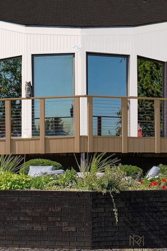
Above is the existing exterior of the home. Photos by Modern Real Estate Nebraska.

Above is the existing exterior of the home. Photos by Modern Real Estate Nebraska.

Above is my vision for the home: white siding, black roof and black brick planter boxes.

Above is my vision for the home: white siding, black roof and black brick planter boxes.

This home is located on a stunning lake just west of Grand Island, Nebraska. The address is 225 Lakeside Drive. Grand Island, NE 68801. I saw the phone on Modern Real Estate Nebraska’s Instagram and I fell in LOVE with the architecture of the home. Look at these incredibly large panoramic windows with spectacular lake views! I am smitten and I know my husband would love this home too because it is literally located on it’s own peninsula on the island. Aka: no direct neighbors. The only slight setback to commanding your own peninsula is the long driveway: think Nebraska winters. You’ll have some serious driveway snow-removal to do…. but that’s besides the point lol.

225 lakeside drive2.jpg
225 lakeside drive2.0.jpg

The home has incredible roof lines and multiple brick planters for tons of fun plants AND it has built in benches. There are so many different indoor & outdoor gathering spots on this property. It has room to accommodate anyone and everyone! If you go to the zillow page, I dare you to count all the exterior furniture groupings. It’s a dream place for anyone with large extended family or a big social circle.

exterior update.jpg

I would say the toughest sell might be the approach to the front door. We can easily fix the landscaping. Add some stair stepped pavers. Remove the concrete blocks. Add some boxwood plants and maybe some white hydrangeas…. but there is the turret to discuss. What is a turret? It’s the part that looks like a castle. I would remove the top of the turret so it would just be a simple cylinder and then I would paint that whole thing white. You may not be able to envision it entirely, but I promise you it will help substantially. I would also restrain all the deck to a more natural wood-tone.

enry update.jpg

The entry is actually very nice. It is spacious and flooded with natural light. There is space to hang a stunning new chandelier and I would have the existing floor tile removed. Then I would replace the floor tile with a natural grey slate tile. It would add texture and warmth to the space while still being durable. I would paint the walls white and replace the windows to have black frames. Then I would also replace the front door with a metal and glass black steel door.

stair update.jpg

As you progress into the home you instantly see the height and scale of the home. The two story entry gets even better when the stairs cut up and down into the adjacent spaces. From the top to the bottom, you can see four different levels from one vantage point. Talk about a WOW factor! I would substantially clean up the stairs. I would start by removing the wooden handrails and replace them with sleek black metal handrails and balusters. Then I would remove the carpeted treads and I would have natural wood treads. Lastly, I would paint the stringers white so they are visually lighter but still keep the structural integrity of the staircase.

fireplace update.jpg

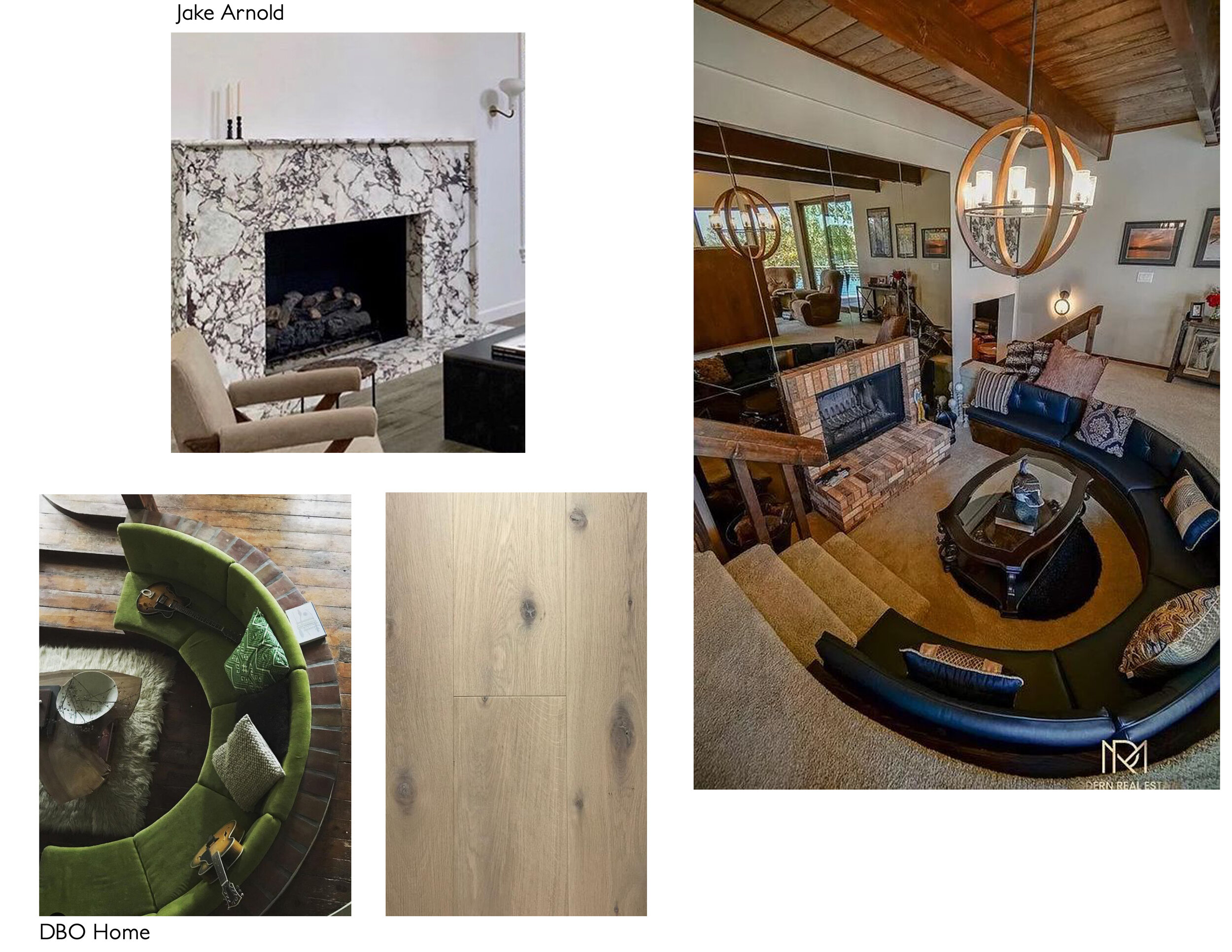
One of my favorite features in old homes is the sunken lounge. I absolutely love this concept because it’s cozy and social in a way that’s not designed around a TV. I think the sunken lounge promotes conversation and taking time out of your day to just be with the people around you. This sunken lounge could definitely use some updating because it looks tired and dated. I would remove all the carpet and install white oak wood flooring. I would paint the walls white. I would update the little stair railings. Then I would replace the brick surround on the fireplace with a marble surround for a more dynamic and contemporary look. Then I would reupholster the lounge cushions in a green fabric to add a pop of color. I would install a new light fixture, add a new table and different throw pillows for a much more unique space.

There are so many simple updates I would do to this incredible home, but I just wanted to give you a little taste of my vision. If you are interested in purchasing this home, I would love to have a conversation with you about how we could renovate it together. I see so much potential here that I even tried to get my husband to move to Grand Island lol! (He works in Omaha and it doesn’t make sense for us to leave his job.) Luckily, I work all over the state (and we even have some potential jobs out of state) so I can really work from anywhere. Anyways, that is not the point. The point is, there are so many incredible homes in Nebraska and sometimes a real gem pops up on the market that catches my attention. If you see an incredible old home, please let me know! I’d love to see it too and maybe even share my two cents about the potential design direction. As always, thank you for reading and I hope you have a wonderful day!

Nursery Sneak Peek

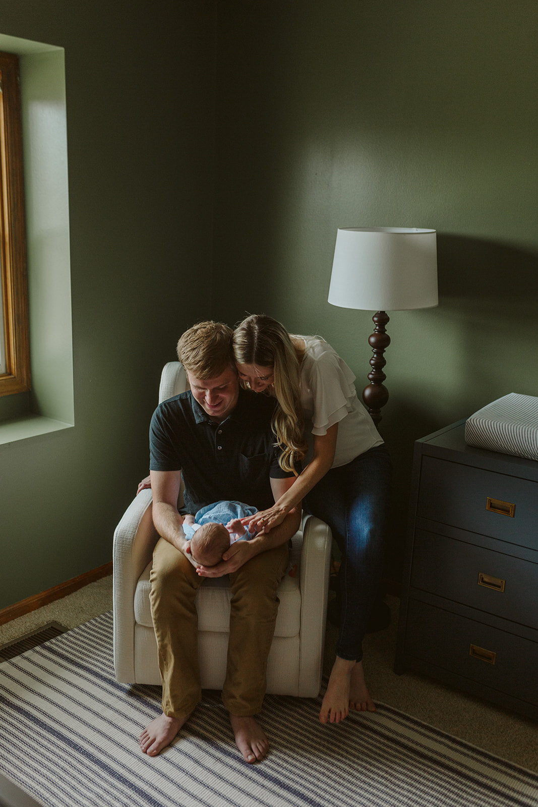
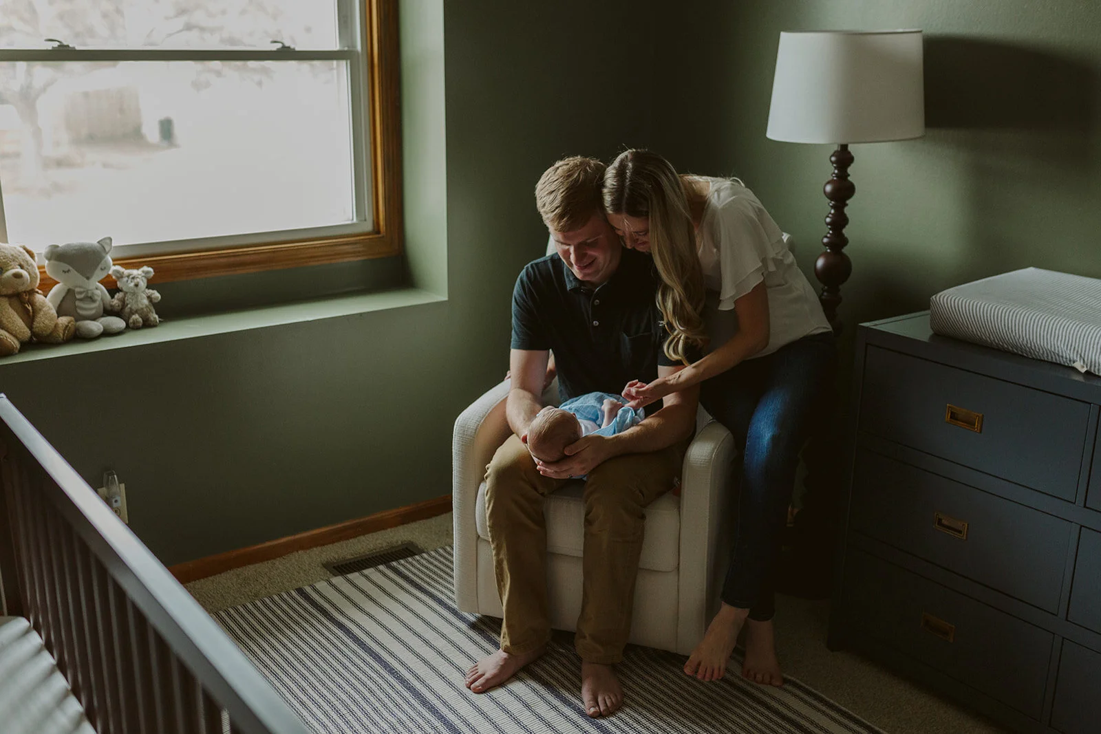
Our little family was lucky enough to have Kimberly Dovi of Kimberly Dovi Photo come to our home and photograph our newborn son weeks after he was born. Our sweet little nursery was not even close to being finished, but we had the basics: a crib, a chair, a rug, a dresser and a mobile. It was not complete, but it was ours and we loved it. We hoped that our sweet little son would love it one day too.

49.jpg
15.jpg

My husband and I had already installed vertical wood slats on the crib wall and painted them a delicious dark green. In my previous blog post, I explained that I wanted to design a dark nursery that would feel cozy and promote sleep. I learned that as baby’s eyes develop, they see contrast the best. I am no child expert, or optometrist, but I read that early baby eyes see dark and light shapes best. If everything is light, or if everything is dark, they can’t see it very well because there is no contrast there. So I took this into consideration moving forward with the design. I chose dark walls (to feel dark and cozy, similar to the womb) and then I chose a bright off-white rocking chair, and a light rug with dark stripes in hopes that he would see these contrasting shapes and be interested.

71.jpg
95.jpg
70.jpg
72.jpg

There is so much more to tell you about our nursery and there is SO much more to show you now that it is officially done, and I promise I will show you those photos soon. In my next blog post, I will explain the depths of the design intent, and I will let you know where you can find all the furniture. :) If you want to read about where I found inspiration for our nursery, this blog post explains it very well. I searched high and low for unique and interesting nurseries that were far from status quo.

81.jpg
96.jpg
27.jpg
31.jpg
33.jpg

Shop the Look: Dollface on HULU

Have you ever daydreamed about what the perfect office would look like? If you’re me, you do all the time. I dream about different styles and layouts of offices based on the user’s needs. But when I dream of a super chic all-female power office, I dream of the Woom on HULU’s original series “Dollface.” I tried doing some research to find out who their set designer is, or where this gem of a spot is, but I came up empty handed. Please let me know if you have any insights into the amazing interior designer behind Woom.

Photo belongs to HULU’s original series Dollface.

Photo belongs to HULU’s original series Dollface.

As HULU slowly takes us through the day-to-day life of Jules, we see her working at Woom in the most incredible office environment. What makes it so awesome you might ask? Intentionality + creativity.

Photo belongs to HULU’s original series Dollface.

Photo belongs to HULU’s original series Dollface.

The conference room has glass (safety glazing) walls and a custom drapery rod around the top so the room can be closed off (via a curtain) for privacy at any time. Safety glazing is required by the IBC (International Building Code Section 2406) in any area that may be subject to human impact. Also- have you ever not been able to fit all the people in a conference room at once? Making the walls out of glass (safety glazing) allows chairs to be pulled up outside of the room as well. SPEAKING OF CHAIRS- who doesn’t love THESE chairs!? The gorgeous Loren Club Chair can be found on Wayfair and AllModern.

Conferene Room Chairs3.jpg
Conferene Room Chairs.jpg
Conferene Room Chairs2.jpg
Photo belongs to HULU’s original series Dollface.

Photo belongs to HULU’s original series Dollface.

This custom built sunken lounge with custom upholstery is an incredible creative breakout area and it doubles as a quiet place to make a phone call. All that cushioning and pillows allows for substantial sound absorption and a little privacy. Imagine you and your team in the sunken lounge brainstorming new ideas. While the sunken lounge is a custom feature, there are millions of places to find pre-made velvet pillows. World Market has the widest range of colors at the most affordable price around. The key to getting the look above is to go with KNIFE EDGE pillows without fringe or welts around the edges. This gives the pillow a crisp & clean look. Very confident and matter-of-fact. (As matter-of-fact as a pillow can look lol.)

velvet pillow1.0.jpg
velvet pillow2.jpg
velvet pillow5.jpg
sunken lighting ELK boudreaux.jpg

If you noticed the cluster of clear-bulb lights hanging above the sunken lounge, you’ll see ELK’s 7 light Boudreaux Chandelier in the Satin Brass finish. It is stunning. It is available in the two different sizes as shown above: the 7 light fixture (as seen in Woom’s office) and the larger 17 light chandelier. Besides purchasing this light from your local lighting company, it can also be purchased online at Shades of Light and Overstock.

Photo bleongs to HULU’s original series Dollface.

Photo bleongs to HULU’s original series Dollface.

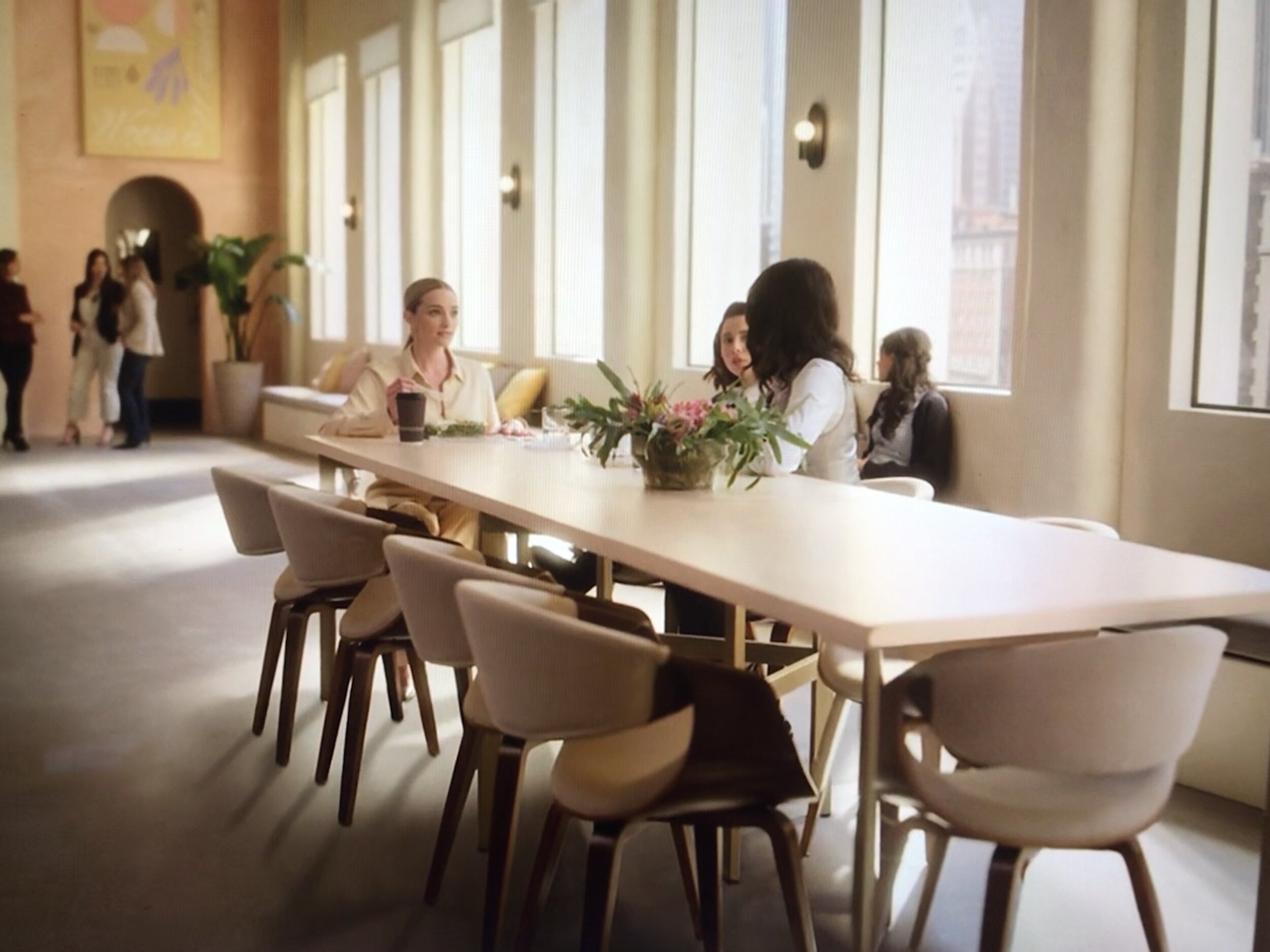
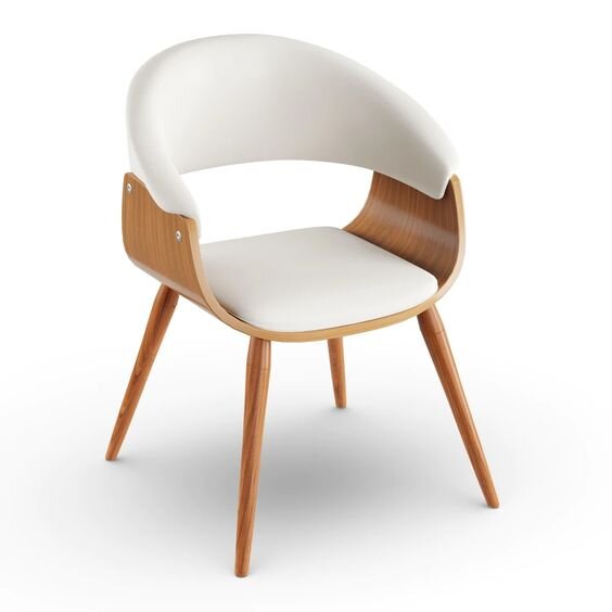
Adjacent to the sunken lounge is the break area where a large wall mural says “You Look Like a Snack.” Haha cute! Next to this kitchenette is a large communal dining area where employees eat lunch. The chairs at this table can be found on many websites and are available in multiple colors as well. A few similar styles that I like can be purchased at AllModern, Overstock and Urban Outfitters.

Break Area4 all modern.jpg
Break%2BArea3.jpg
Break Area2.jpg
CB2 Brass plate brass wall sconce.jpg

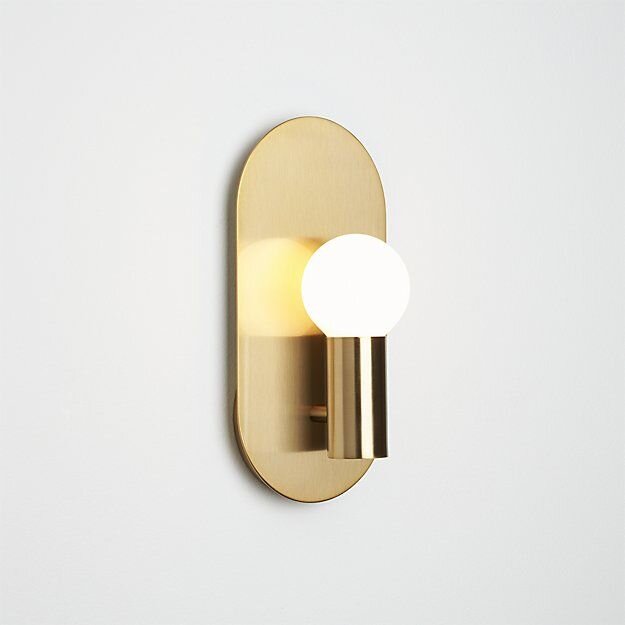
The sconces on the walls are an old CB2 model that is no longer for sale. It’s actually really difficult to find something similar. If you’ve seen something comparable, please let me know! I’m guessing they either had a bunch of these when they built the set, or they loved the shape (how could they not) and had them custom made.

Wall sconces (and for the most part, pendants and chandeliers) are known as “accent lighting.” This means that they are not the sole reason the room is lit. These kinds of lights are like “jewelry” for the space and are intended to add character, style and impact. General overhead lighting is what actually illuminates the space. These types of lights have totally different lumen output and kelvin temperatures. We can get into the differences between these in another post. For now, back to Woom!

Photo belongs to HULU’s original series Dollface.

Photo belongs to HULU’s original series Dollface.

The basic task chair is a total basic bee of chairs right now. It is on literally every website imaginable- and for a good reason- it’s cute. It’s plush and it’s available in almost every color under the sun. A few similar styles can be found at Wayfair, Joss and Main, and Hayneedle. The desk dividers are most likely plastic, resin or some sort of tempered plexi-glass. They cannot be made out of regular glass for code compliance reasons. As mentioned earlier, it is against the IBC (International Building Code 2406) to have that much glass at those levels because if someone accidentally kicked or bumped into it, it would shatter and harm the person. Therefore, the USA has laws about things like this in order to keep the general public safe. I believe these translucent work-space dividers are a custom order from someone like 3form.

office task chair.jpg
office task.jpg
Photo belongs to HULU’s original series Dollface.

Photo belongs to HULU’s original series Dollface.

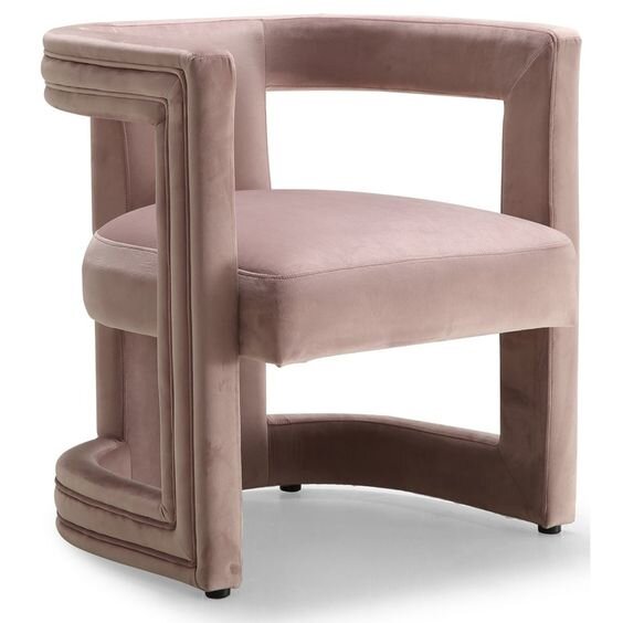
One of my favorite chairs OF ALL TIME is in the bossy lady’s office. It is the light pink guest chair with it’s asymmetrical sexiness. While this is not a one-of-a-kind piece, it is also not a cheap piece. This lovely lady starts at $1,095 for one chair. It definitely makes sense that it is in the owner’s office and not strewn about the office like Halloween candy. This is the Elroy Chair and it is available in three different versions: the left arm chair, the chair, and the right arm chair. Pictured above is the left arm chair. It is available for purchase on Mitchell Gold + Bob William’s website.

Boss Lady Guest Chair.jpg
Boss Lady Guest.jpg

While I was not able to find the exact desk and executive desk chair for the boss’s office, I did find some similar styles. The desk is made of two columns of legs that have three brass legs each. The top of the table is made of one simple piece of glass. The chair has an extra-tall back in order to support the neck.

similar lady boss desk.jpg
similar lady boss chair.jpg

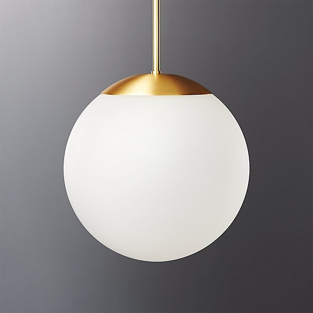
You may have also noticed three pendant lights hanging over the desk. These gold/ brass and a frosted glass shade can be found on many websites depending on what size and quality you want. The three lights pictured below are from Build.com, CB2 and Rejuvenation.

Finally, I want to make a confession to you… while this office is wonderful, it might not be perfect for you and your business. Read on to hear me out.

What I’m trying to say is your office could be even COOLER than Woom’s office. You could be in an office that is perfect for your business needs, your client needs and your BRAND needs. While Woom’s is super cool and attractive, I think it serves as a great example to show us that office design can be stunning when it’s focused on your mission, your brand and your clients.

YOU ARE WHAT MAKES YOUR OFFICE UNIQUE.

If you are interested in an office remodel, or building a new office, I would love to hear your vision, learn about your business and your clients. Then we can create the most incredible office you’ve ever seen! It will be WAY better than Woom’s office because it will be curated especially for your business. If you ever get to that point in your life, please reach out to me. I’d love to work with you.

Sincerely, Tara Miller

Heartland Home: Local and Thrifted

Welcome to the vibrant and colorful home of the Bruner family! Our second Heartland Home features an oasis nestled in Lincoln, Nebraska. With all of this winter weather we’re having, you will LOVE to feast your eyes on this fresh and colorful space. Lo Bruner answers the door with a huge smile and welcomes us into her home. Her house immediately smells like heaven because she has lots of local Wax Buffalo candles burning all at once.

All photos taken by Life Unbound Photography

All photos taken by Life Unbound Photography

Nicolette Wagner and I walk into her home and head straight for the kitchen to take photos. I saw this space about a year ago on Instagram and knew that it was a special gem that had to be shared with the world! It’s vibe was so unique and appealing. I couldn’t wait to see it in person! Lo tells me that the natural light immediately drew her to this house. The home is nestled up against a wildlife conservation which makes for an epic backyard. The kitchen originally had blue counter tops, a chicken tile backsplash, and the floor was severely uneven.

With a lot of work, the Bruner family was able to create a space that is uniquely their own. Lo’s husband Aaron is a jack of all trades. He made a concrete mold and made a new countertop for them. It was created in two sections and adds some masculine texture to the space. Lo painted the bottom cabinets pink, but left the upper cabinets the natural stain.

“The main thing I love about my home is that it feels warm.” - Lo Bruner.

_DSC5720.jpg
_DSC5739.jpg

She describes her style as, “Jungalow” and tells me how all the greenery compliments the pink in the room. She said that she really got into plants about three years ago. Lo explains that her daughter is really into plants and frequently gives them as gifts. They are not just for aesthetic purposes though, as her pothos vines produce oxygen which provide clean air for her home. She loves to cook and says that she needs fresh food in the house too. You can see pops of color throughout her home in the form of plants, fruits and fun little accents like her fluffy pink fur throw! This fluffy fur was sourced at Nebraska Furniture Mart along with the mirror-front Credenza that they use as a kitchen island.

_DSC5696.jpg

Lo has collected her decor over the years. She says, “I’ve always had a thing for wicker baskets and my grandma had a wicker peacock chair.” She’s picked up many items at local thrift stores, Home and Closet, and Hutch. She says that the large hide on the floor adds a lot of warmth to the space. She got the large one at Junkstock from Cactus Creek. They’re this AMAZING store in Weston, MO. They have tons of great finds! I’ve been to Weston, MO on girls trips with my aunts and cousins, and it is a fantastic place. Lo got the smaller hide from Stella Collective in Lincoln, NE.

HH2+paper.jpg

Before and After: Roots Collective Hair Salon

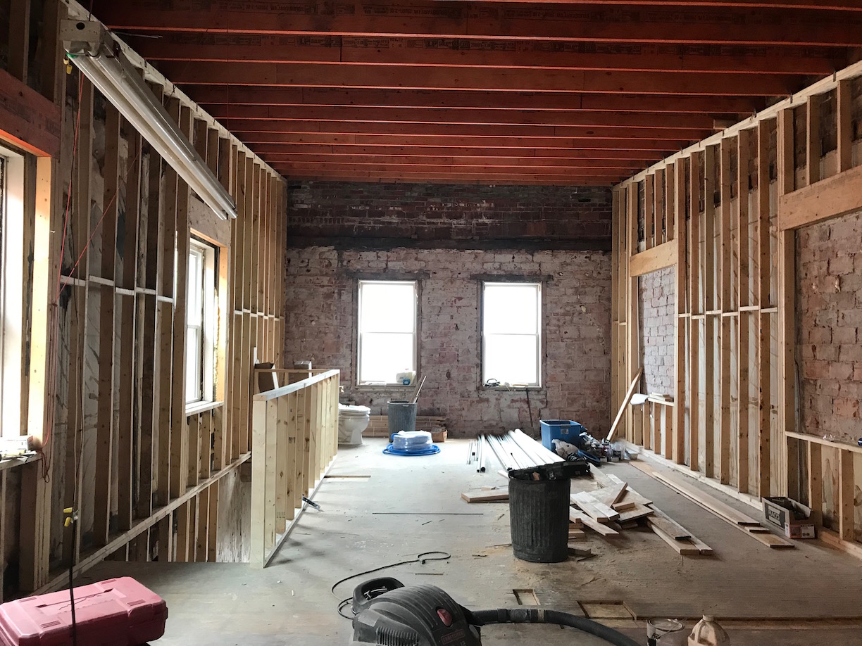
It was early April and Addis Browne was taking a leap of faith by opening her own hair salon. She wasn’t just opening a salon in an existing salon building. This wasn’t some change of ownership ordeal. No. She was going to open her hair salon in an empty space on the second story of an old building in downtown Lincoln, Nebraska. I immediately fell in love with that goal.

_DSC3104.jpg
_DSC3108.jpg

This bold pursuit energized me and I reached out to Addis in order to offer her my interior design expertise. I wanted to be a part of this neat salon coming to downtown Lincoln. I worked on many renovation projects in the past where I helped give new life to old spaces so I knew it could be accomplished. I also knew that Addis had a knack for bold and colorful looks, so I wanted to help materialize her style into the interior design of the salon.

All professional photos taken by Nicolette Wagner with Life Unbound Photography.

All professional photos taken by Nicolette Wagner with Life Unbound Photography.

Before. April 2018.

Before. April 2018.

Before. April 2018.

Before. April 2018.

After.

After.

When I first met with Addis, I wanted to know all about her vision for the space. I loved listening to her describe her dream salon. I asked questions about her favorite colors, the clientele, timeline, budget and more. After gathering enough critical information, visiting the site, and gathering all necessary dimensions, I got to work designing a beautiful and functional space for Addis’s hair salon.

_DSC3047.jpg
_DSC3060.jpg

I began my first design approach by giving Addis everything she specifically asked for in a salon. It included the exposed brick, bright white walls, and the typical ‘coffee-shop-style’ interior design that we see so much of. She immediately loved it! I was pleased, but told her I had a couple of tricks up my sleeve. I asked her to bear with me and explore another design option that I created based off of the information I gathered about her personal style and her target clientele.

_DSC3065.jpg
IMG_1843.jpg
IMG_1847.jpg
_DSC3069.jpg

“I asked her to bear with me and explore another design option that I created based off of the information I gathered about her personal style and her target clientele.” - Tara Miller

_DSC3028.jpg
IMG_1850.jpg

This is when I let my talent shine through. This is when I delivered her with an interior design direction that took her wants and needs and elevated them to the next level. That is what an interior designer’s job is. It is my goal take the client’s wants and needs and turn it into an even more fabulous space than the client could have ever imagined on their own. It is my job as an interior designer to do that, and make sure that the space meets building code for life and human safety, fire and egress codes. (Basically- rest assured that your building will be safe.)

_DSC3082.jpg
_DSC3084.jpg

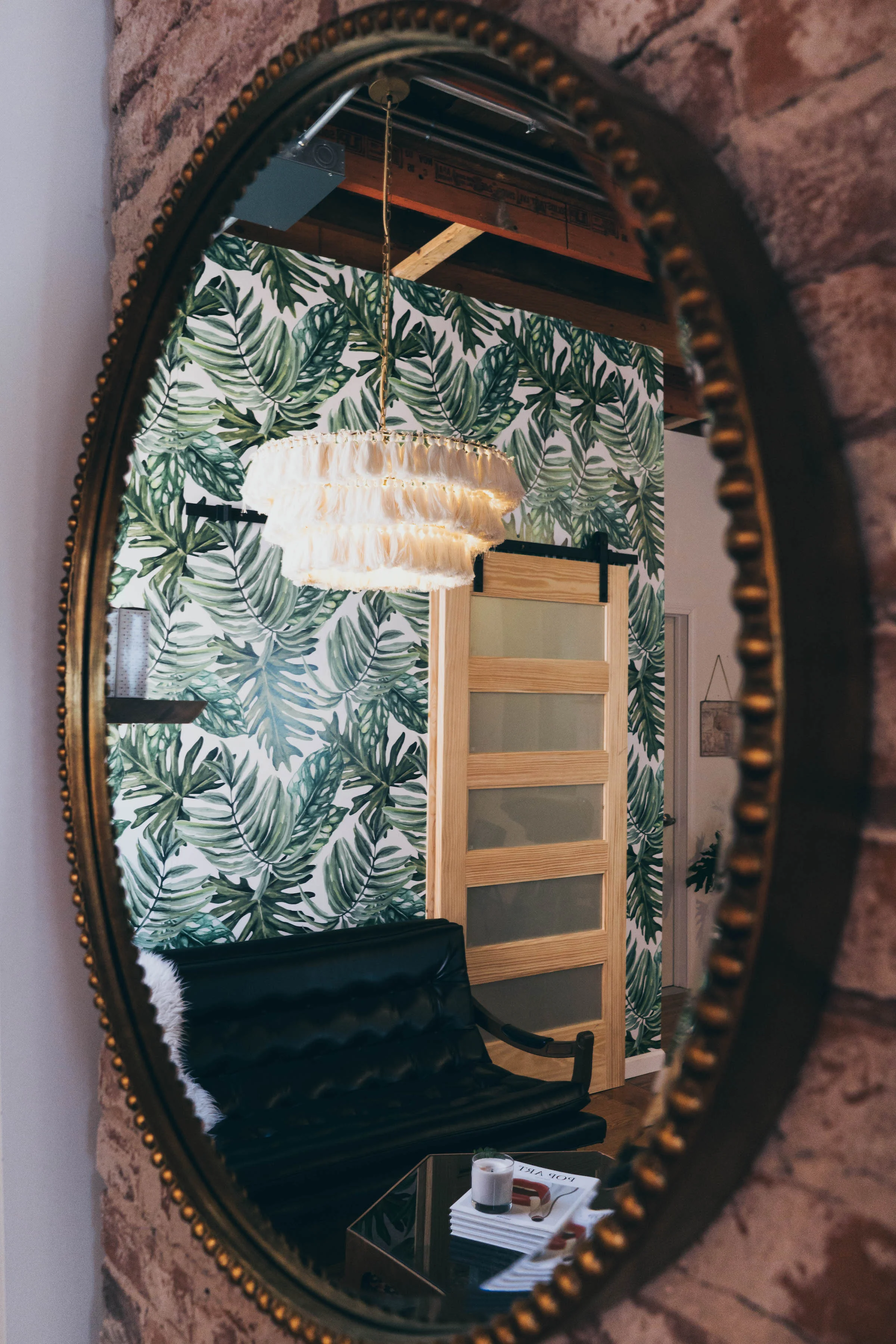
I showed her a design direction I created based on her vision for the salon but I added some specific things to make it stand apart from the rest. I suggested things like bright colored orange chairs, a large-scale bold wallpaper print for a statement wall right off the entry, I switched up her lighting with a knockout chandelier she hadn’t seen before, and I made the suggestion to keep the orange laminated ceiling beams ORANGE instead of cover up their raw beauty with white ceiling paint.

_DSC3033.jpg

When Addis saw the elevated design that I created based on her other likes and interests, she loved it! I was over the moon excited because when my client’s are excited, I know that I have done the first part of my job well. From there we moved on to the second part of my job: Project Management. I helped Addis by providing a detailed list of where different lighting, furniture and accessory pieces could be purchased.

During the construction phase I draw floor plans, reflected ceiling plans, elevations and 3D renderings of the space. These drawings precisely communicate the client’s desires to the contractor and electrician. These detailed drawings leave little room for misinterpretation. I made finish specifications, furniture selections, lighting selections and so much more. We made it our goal to follow her budget and source as many local pieces as possible. Her salon features of mix of items found at Home and Closet Vintage, Craigslist and new products sourced both online and in store.

IMG_1840.jpg

“We made it our goal to follow her budget and source as many local pieces as possible.” - Tara Miller

_DSC3100.jpg
addis final floor plan.jpg

Before and After: Julia Mason Art Studio

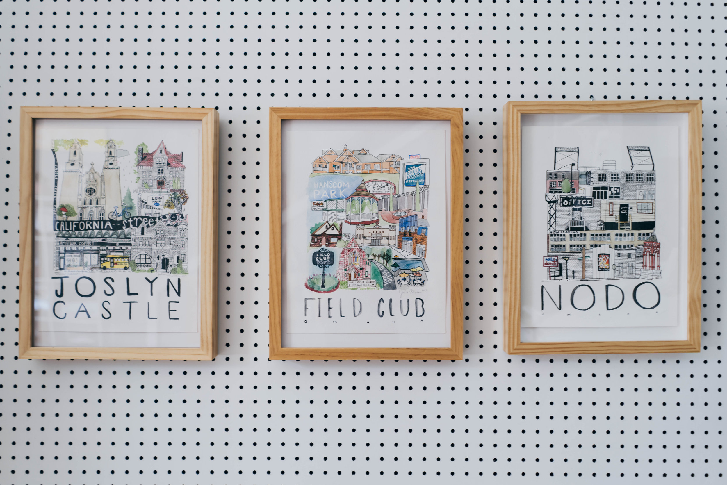
When I heard the incredible news that Julia Mason was going to quit her full time job to follow her dreams, I was immediately inspired. When I found out that her new endeavor involved sprucing up a cute little shop to use as her retail storefront, I quickly offered my interior design services. To my amazement, she graciously accepted and we quickly got to work. I began the process with a secret inspiration board on Pinterest that I curated to fit Julia's aesthetic. 

AFTER

AFTER

BEFORE

BEFORE

AFTER

AFTER

BEFORE

BEFORE

At our first site visit, we discussed ways to freshen up the exterior with some simple paint options. I used Photoshop to show Julia different exterior paint colors and signage options. Julia showed me around the charming little studio and explained how she wanted it to function. She told me that she planned to use the space to display her work, sell her art, and work on current projects. She shared her love for natural wood finishes, her need for display, and that she wanted her art to be the focus of the space. She told me that the main design challenge within the space was how to address the two windows and a door that led to a different part of the building that the landlord owned. She mentioned that when people entered the space, their first comment was, "What is behind these windows and that door?" We did not want this to be the focus of the space. I took measurements of the space to draw a floor plan in CAD and quickly got to work.

AFTER

AFTER

AFTER - detail shot -

AFTER - detail shot -

BEORE

BEORE

AFTER

AFTER

I mentioned that we could utilize peg board to fit precisely within the trim of each window and door. Then customers could not see beyond the space, and we could utilize the peg board for product display. I shared my secret Pinterest board with Julia and showed her some bold statement walls that were covered in faux greenery and featured a neon sign hanging the middle of it all. Julia loved this look and utilized it as both a way to cover up the windows, and a way to showcase her work. Brilliant! We also incorporated an encouraging neon sign over the greenery of the second window. It reads, "DO WHAT YOU LOVE." This inspirational quote was spoken by Julia's father and it is a special personal touch within the space.

_DSC9388.jpg
_DSC9289.jpg
_DSC9288.jpg

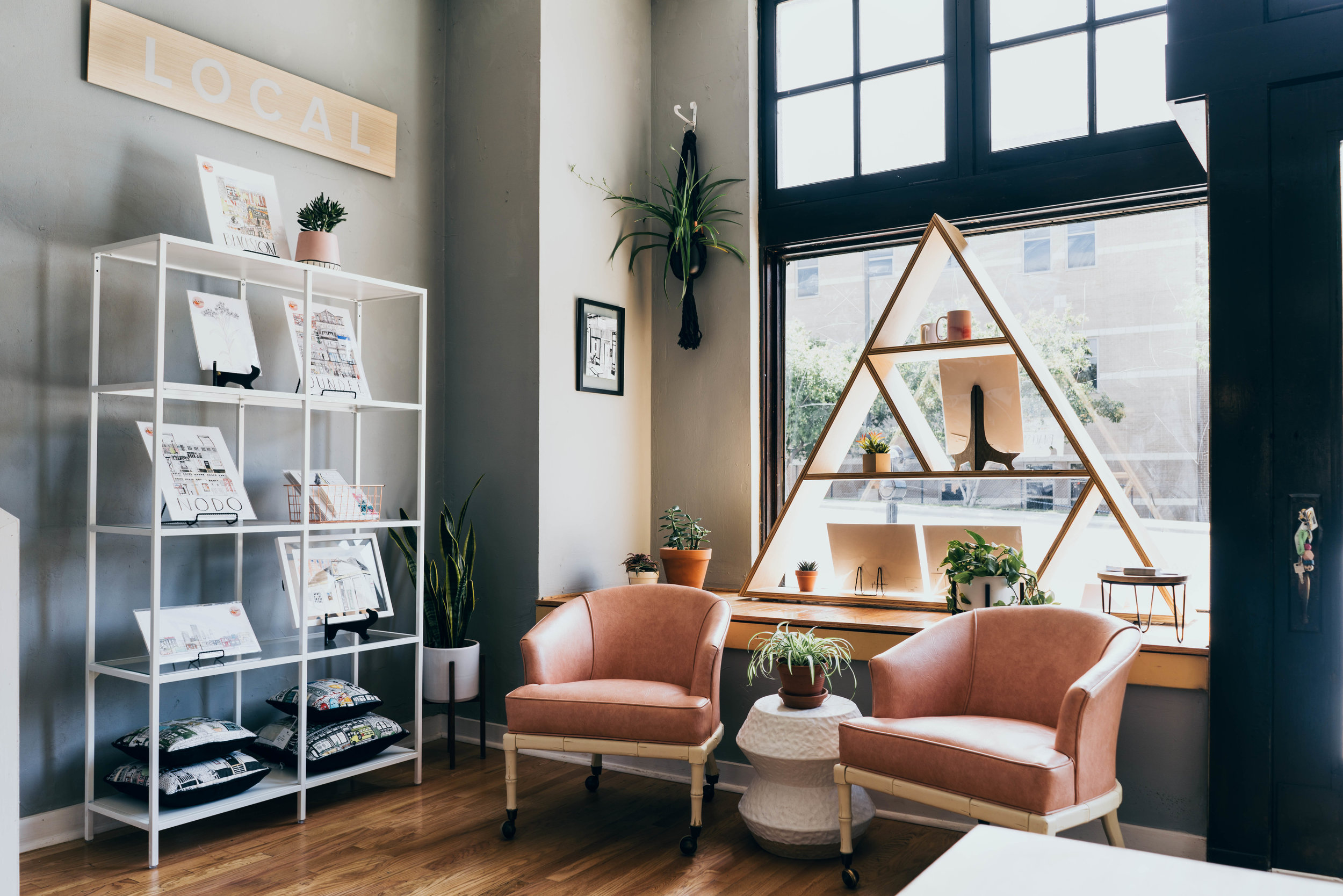
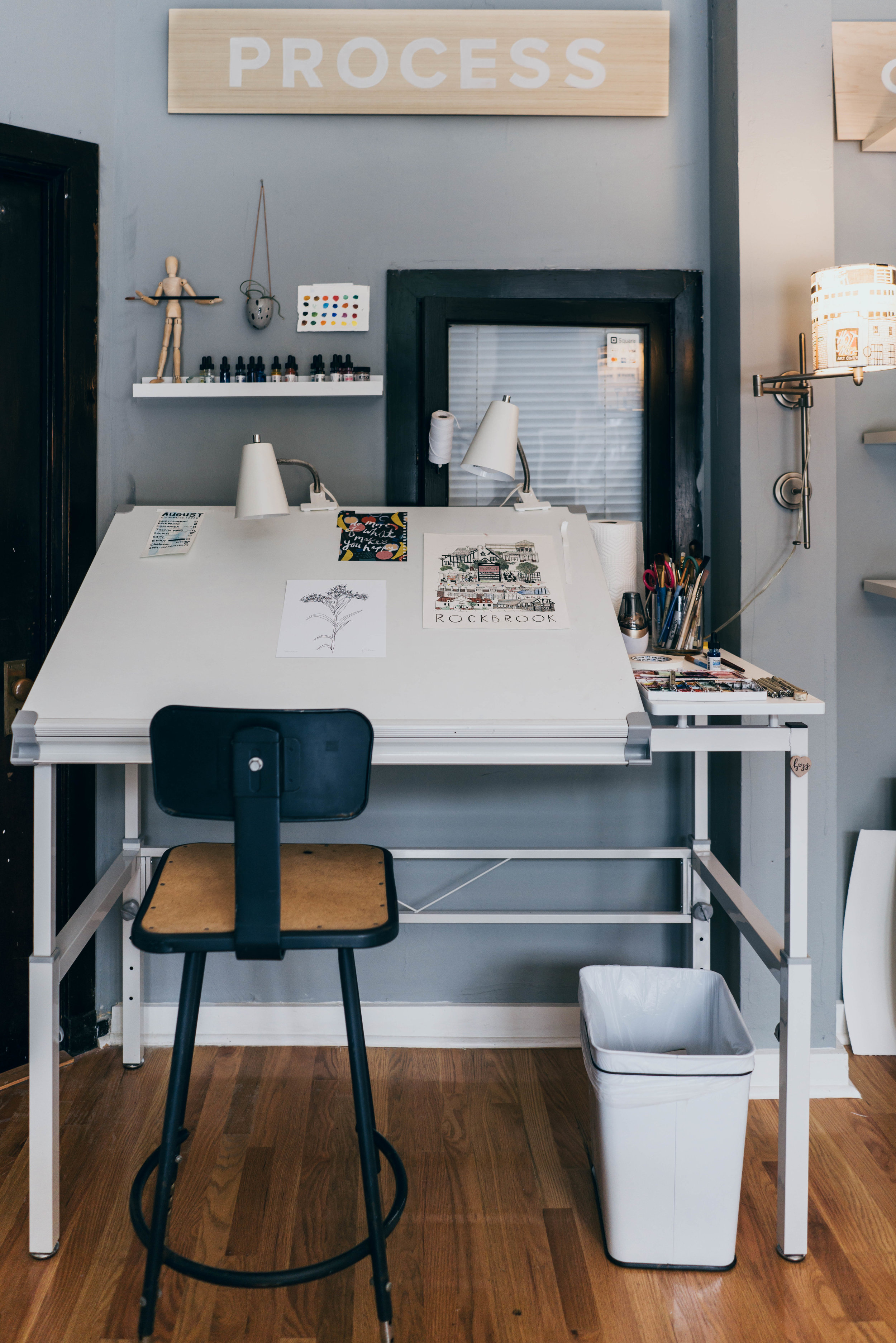
Julia told me that she wanted a streamlined look. It would be very clean and intentional. I was fully on board! I spoke with Julia about her process and the different types of artwork she produced. It became clear to me that this space would be primarily used in three different ways: to sell "LOCAL" art, to promote her "CUSTOM" capabilities, and to work on projects currently in "PROGRESS."  This simple understanding lent itself nicely to signage throughout the space. We achieved this when Julia hand-painted these three words onto separate pieces of wood, and mounted them in pre-selected areas in the studio. This not thoroughly explains how the space is laid out and what Julia is selling, but it also draws our eyes up towards Julia's high ceilings. 

_DSC9306.jpg
_DSC9301.jpg
BEFORE

BEFORE

AFTER

AFTER

_DSC9329.jpg

It became clear to me that this space would be primarily used in three different ways: to sell LOCAL art, to promote her CUSTOM capabilities, and to work on projects currently in PROGRESS. "

- TARA MILLER

_DSC9330.jpg
BEFORE

BEFORE

AFTER

AFTER

In order to further connect with her customers, I suggested that we create a "sign in" area where people could put their names and e-mail addresses if they wanted to be kept up to date via Julia's e-mail newsletter. I sketched a simple sign in table made of natural plywood that fit into this little spot next to the stairs. This is a great spot to capture e-mails while customers peruse from the "CUSTOM" to the "LOCAL" display section of Julia's studio. (Check out those adorable totes too!)

BEFORE

BEFORE

AFTER

AFTER

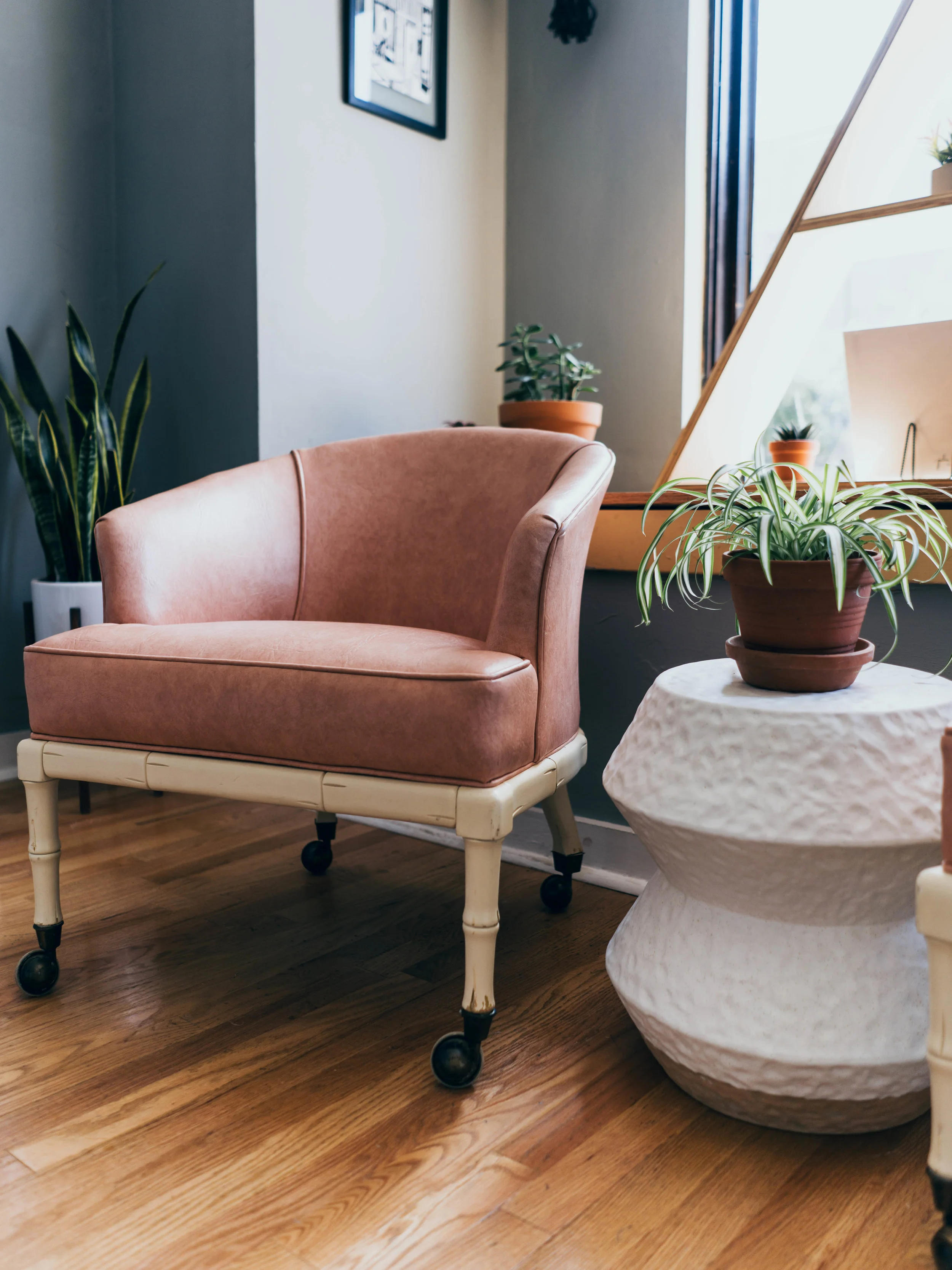
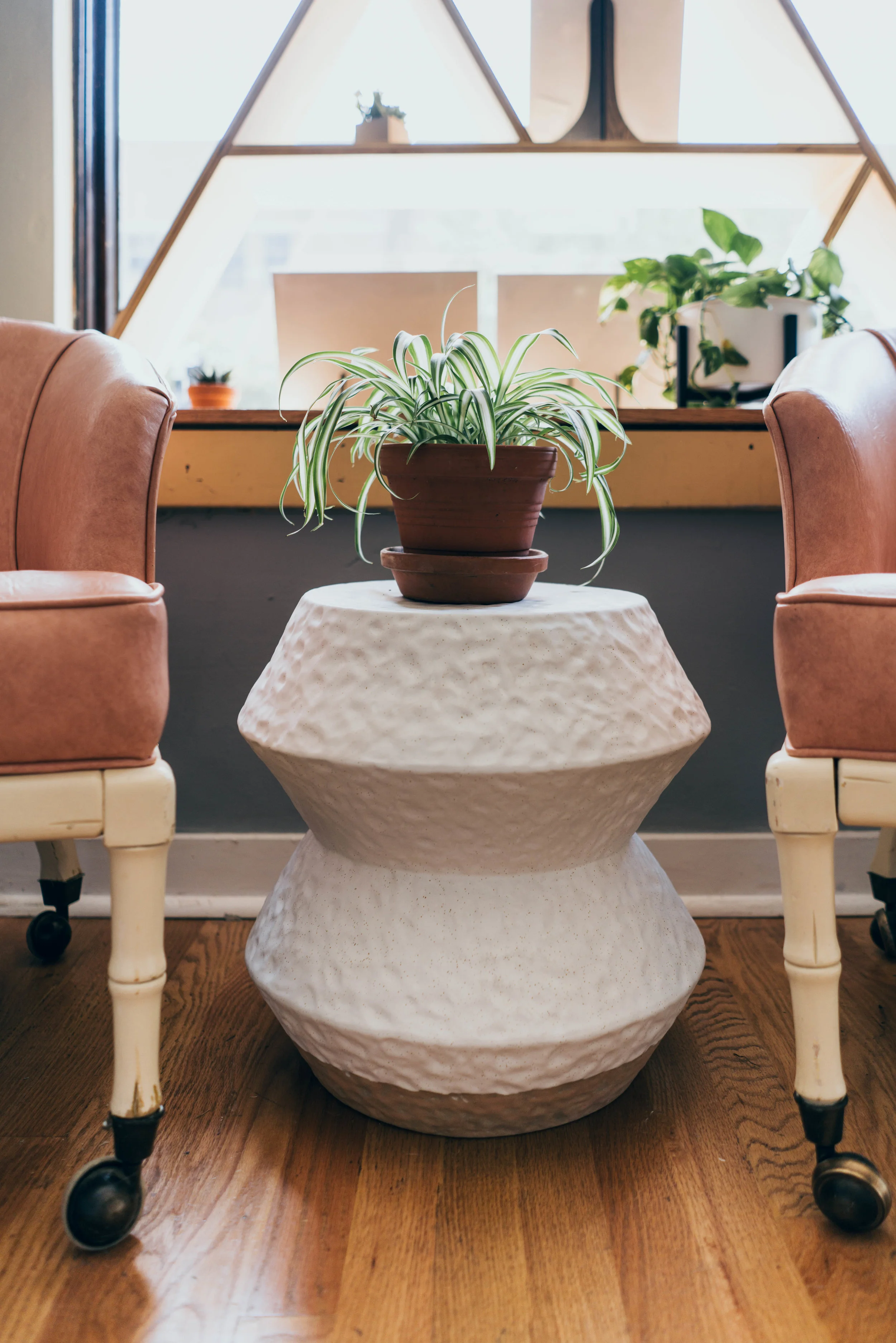
The storefront windows flood the space with gorgeous amounts of natural light. I thought this would be the optimal spot for some seating and a little accent table. This snug seating area could be utilized for a one-on-one sit down meeting with a customer to discuss their custom art piece. The seating area lends itself to great conversation while being out of the  main circulation paths throughout the space. 

BEFORE

BEFORE

AFTER

AFTER

Initially, I pulled together a few seating and accent table options for Julia and I to work through. She landed on a stunning duo of pink metal chairs + a ceramic accent table. The accent table came in right away, but the original chairs got delayed for MONTHS. I love perusing through local shops and boutiques and luckily, I had just picked up a gem. This lovely chair was upholstered in a peachy/ pink vinyl and it had intricately carved bamboo wooden legs. It didn't work for the first spot I tried placing it at, but when I brought it to Julia's studio, I knew it was magic. It worked perfectly! HUGE shoutout to the great people at Starts With Vintage for helping me source these amazing pieces. Thank you so much! #supportlocal 
_DSC9349.jpg
BEFORE

BEFORE

AFTER

AFTER

_DSC9376.jpg
Left: Interior Designer Tara Miller with The Heartland. Right: Artist Julia Mason with Julia Mason Art.

Left: Interior Designer Tara Miller with The Heartland. Right: Artist Julia Mason with Julia Mason Art.

Floor plan drawn by Tara Miller at The Heartland Interior Design

Floor plan drawn by Tara Miller at The Heartland Interior Design

All photos by Nicolette Wagner with Life Unbound Photography.


Shop the Look: The Grove Juicery

I love supporting local small businesses. Most of the time, when I’m wanting or needing to purchase something, I ask myself, “can this product be sourced locally?” From there I take a moment to rack my brain or do a quick google search to see if there are any local businesses or makers that I can go to. I would much rather stimulate the local economy an purchase something from a big chain.

From time to time I’m going to share a few local businesses on the blog that I enjoy. The Grove Juicery and Wellness Cafe opened it’s doors to the public on Monday May 28th and it has been quite literally taking over the internet ever since. Instagram feeds are plum full with shots of the trendy interior and their colorful juices. *Swoon* It is dreamy for sure. 

Photos by The Heartland Interior Design
IMG_3297.JPG

It took me about a week to find the time to stop into the cute little spot on 24th and Farnam. I stopped there on my lunch break to see what all the buzz was about and experience not only the beautiful atmosphere, but also to drink some epic juice. Once I looked over the menu (and realized how hungry I actually was) I opted for their Açaí bowl instead of the juice. I had multiple appointments afterwards so I didn’t want to buy a bunch of juices and let them sit in the heat of my car for the remainder of the afternoon.

IMG_3296.JPG

Like a moth to the flame I made a bee-line towards the electric navy sofa after placing my order. Who doesn’t want to sit on lush velvet? There I waited for the barista to take the orders of the numerous people in line behind me. During that time, I was able to really look around and soak in my surroundings. While doing this I realized that I recognized many of the beautiful furniture pieces and light fixtures in the space.

I am an Interior Designer. Therefore, I am constantly shopping for furniture, light fixtures, etc, for my clients. You can say I’m on the internet – a lot – and that is how I can sometimes easily identify products.

In this blog I’m going to share with you how you can “get the look” of The Grove Juicery and buy the pieces for yourself. Most of the products can be easily sourced online and shipped directly to you. I hope you enjoyed reading this and I hope you'll like the quick work I did on identifying the charming elements in The Grove Juicery and Wellness Cafe.

Photo via Anthropologie.com

Photo via Anthropologie.com

The Velvet Lyre Chesterfield Sofa from Anthropologie can be purchased in a variety of ways. You can click here to order it in the "Forest" green colorway with the dark hickory legs on rollers. If you want additional options, you can click here for a full list of all the fabrics and leathers the sofa is available in. See the "Velvet in Navy" color code in the adjacent photo for additional information on the blue sofa.

Photo via Anthropologie.com

Photo via Anthropologie.com

Screen Shot 2018-06-06 at 2.29.33 PM.png
IMG_3303.JPG
Photo from Target.com

Photo from Target.com


The Jewel Round Side Table via Target's Opalhouse collection is made of rattan and adds natural warmth and texture to the space. This piece is available in both the natural and a black finish. It is approximately 19.75" in diameter and 19.75" high. Click here to see additional information on the side table.

IMG_3312.JPG
Photo from Anthropologie.com

Photo from Anthropologie.com

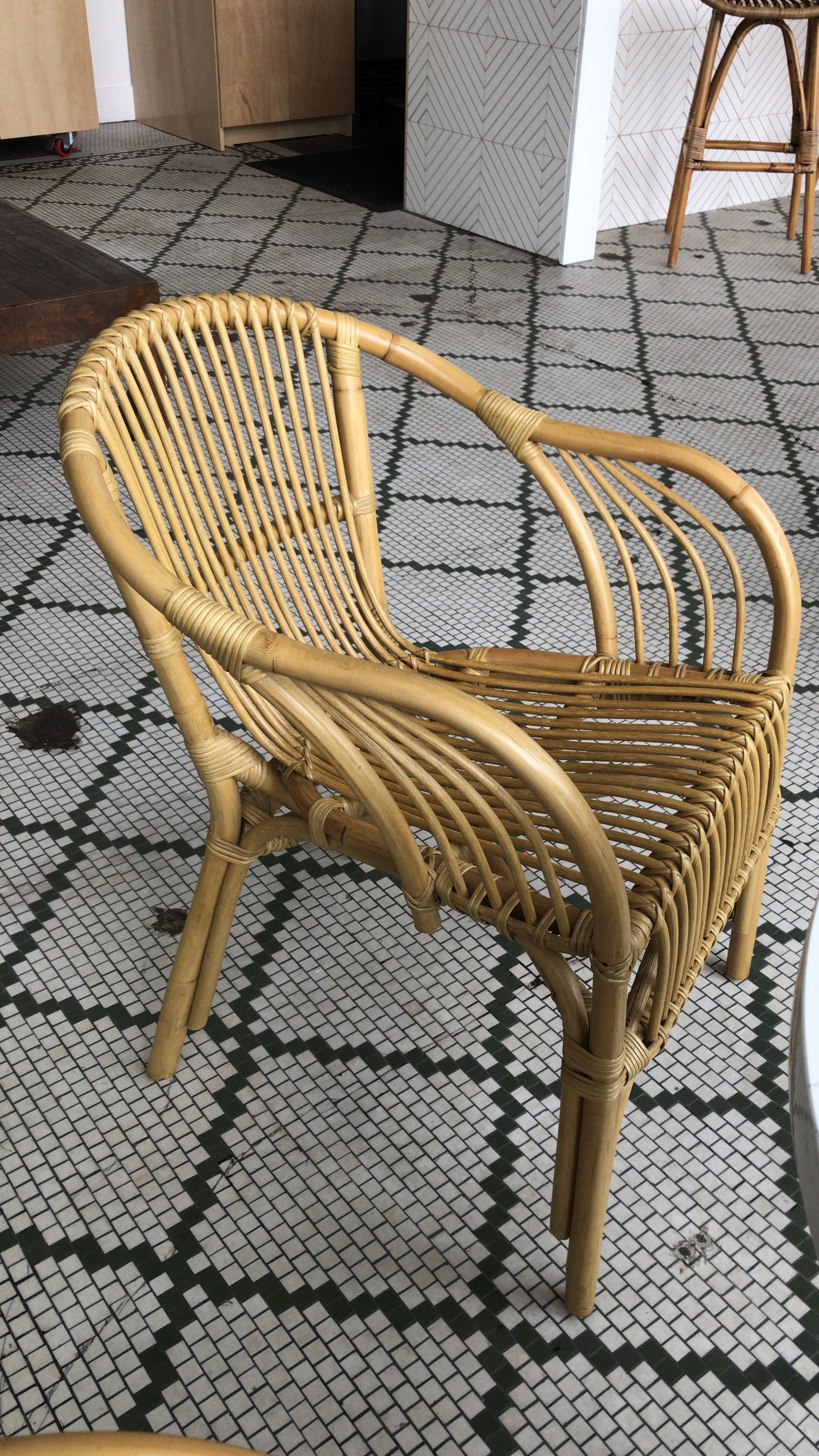
Each table is accented with the Pari Ratan Arm Chair from Anthropoloie. This rattan chair is not only comfortable to sit in, the fact that you can see through the chair makes it visually "light" within the space as well. 

Photo from Houzz.com

Photo from Houzz.com


The Safaveiah Leda Rattan Bar Stools can be purchased through a variety of vendors such as Hayneedle, Houzz, and Overstock.com. Be sure to check the dimensions on each website to see if they are selling the counter height, or the bar height version. This information can typically be found in the 'product info' section or under the 'dimensions' section.

Photo by WorldMarket.com

Photo by WorldMarket.com


(Scroll down to see information on the lighting, tiles and paint in the space.)


The Basketweave Bamboo Pendant Shade can be found at WorldMarket.com and is available in both natural jute and a black finish. This product is hand woven onto a metal frame and is sold separately from the actual lightbulb and chain. You can see WorldMarket's Electrical Cord and Swag Kits here


IMG_3298.JPG


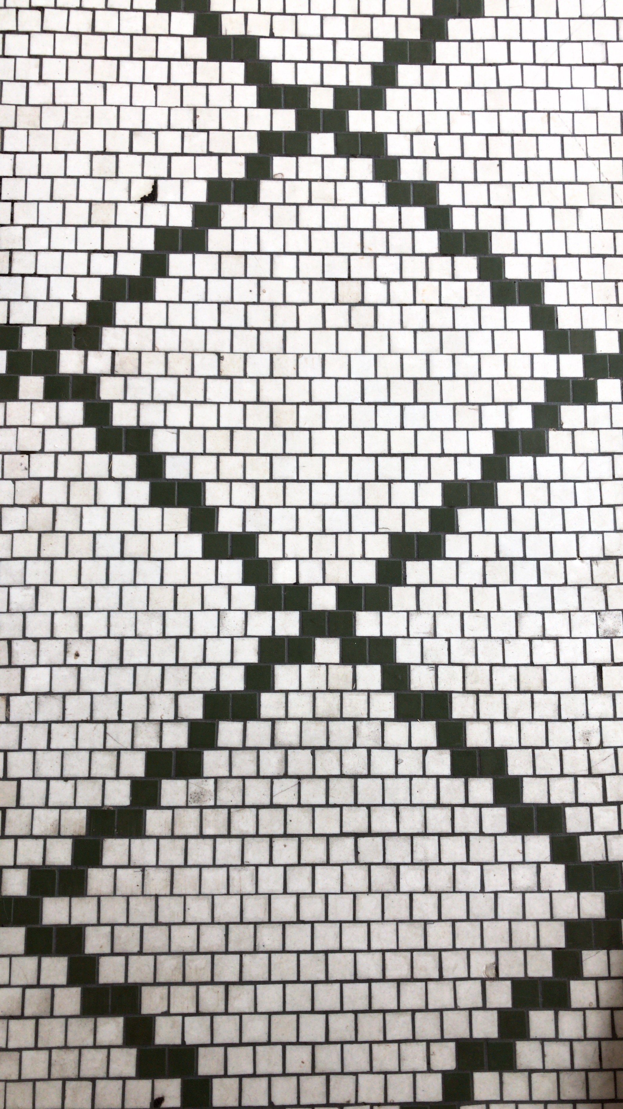
My favorite finish in the space is the original mosaic tile flooring. These intricate pieces compose a striking pattern on the floor and give a freshly acquired look. They tell a story of a time when developers, real estate agents and business owners invested in the hard surfaces of their space. They weren't worried about if the pattern would affect resale value, and they didn't argue over wheather it was "timeless," or not. They knew that mosaic flooring was a great investment and they just did it. It's simple, and it is magnificent. 

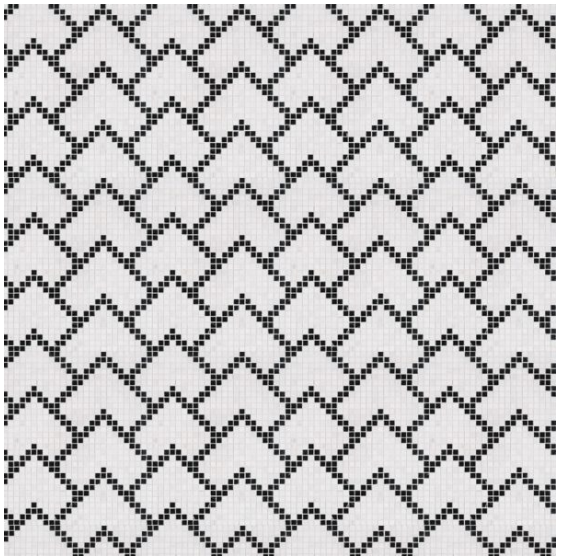
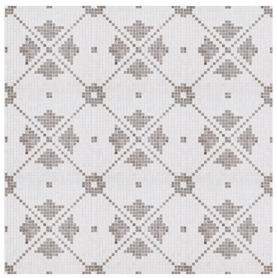
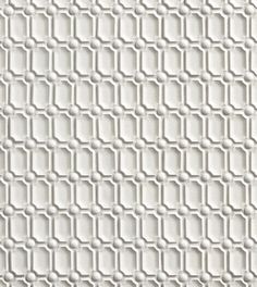
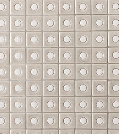
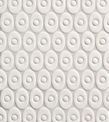
While this look may be from another era- there are tile manufacturers today that are creating similar looks at a decent price point. Jeffrey Court came out with a tile line last year called Chapter 18 - Rotunda. This collection features many magnificent tiles, but a few particular styles lend themselves as an exquisite alternative to this historic look.

If you click on the Junaeu Mosaic, the Montpelier Mosaic, or the Augusta Mosaic, you will see dainty compilations of mini-square tiles. These tiny pieces create a large floor pattern similar to the flooring at The Grove. Each of these patterns are available in two colors: Nero Marquina (Black), or Tunisian Grey. 

You could easily put Jeffrey Court's Rotunda mosaics in your home, office or business to create a striking floor pattern, and I guarantee people will love it! (Not everyone of course, but the majority of people will be drawn to it.) Be bold! Be different. Be you! If you like pattern, then I'd like to encourage you not to be afraid of it! :)

Last but not least, let's talk about those WHITE WALLS. We see photos of white interiors everywhere. But have you ever gone to the store to pick out a white paint color? There are literally MILLIONS of white paint options to choose from. So how do you know which white is a good white? The last thing you want is to have all of your walls painted "white" and then end up feeling like they're peachy, or that they have a green undertone.

Some of the brightest stark whites in the business are Sherwin Williams -Pure White (SW7005), Benjamin Moore's -White Heron (OC-57), PPG's -Commercial White (1025-1), and BEHR's Home Decorator's Collection's -Nano White (HDC-MD-06). However, a paint selection depends so much on the flooring, the furniture, the lighting and many other elements in the space. So these whites might not be the perfect fit for your space.

If you ever need help picking a paint color, or anything else that has to do with interior design, feel free to shoot me an e-mail. I am happy to help!

I hope you enjoyed this blog post covering the ultra-trendy interior of The Grove Juicery and Wellness Cafe. Go for the atmosphere - stay for the juice. It's divine. <3 #shoplocal #interiordesigner