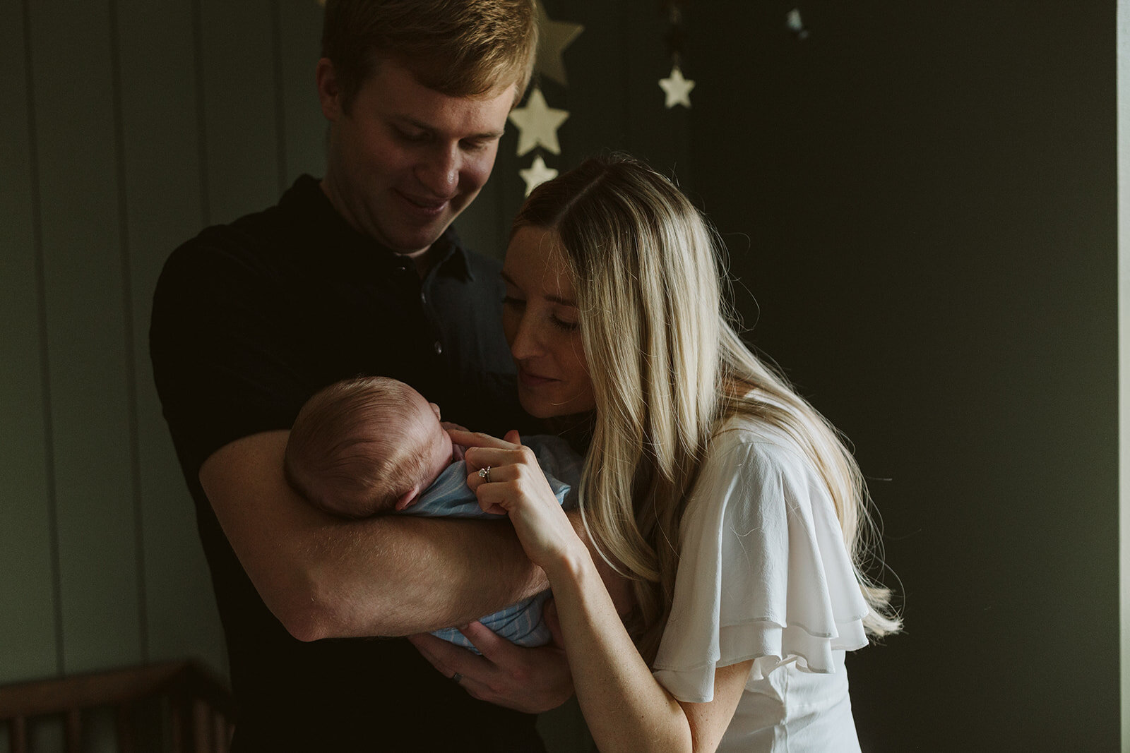
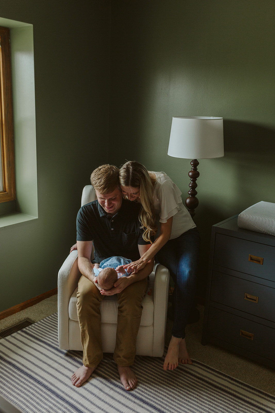
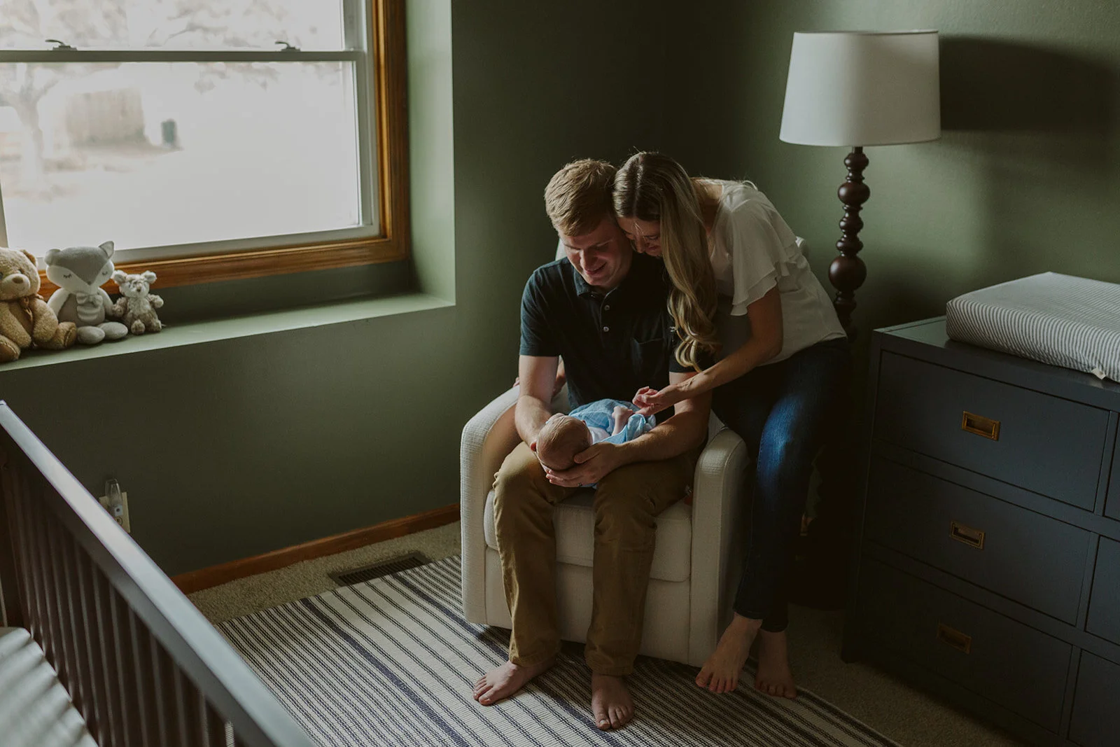
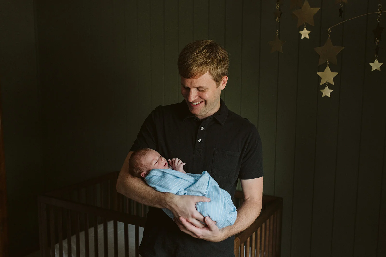
Our little family was lucky enough to have Kimberly Dovi of Kimberly Dovi Photo come to our home and photograph our newborn son weeks after he was born. Our sweet little nursery was not even close to being finished, but we had the basics: a crib, a chair, a rug, a dresser and a mobile. It was not complete, but it was ours and we loved it. We hoped that our sweet little son would love it one day too.
My husband and I had already installed vertical wood slats on the crib wall and painted them a delicious dark green. In my previous blog post, I explained that I wanted to design a dark nursery that would feel cozy and promote sleep. I learned that as baby’s eyes develop, they see contrast the best. I am no child expert, or optometrist, but I read that early baby eyes see dark and light shapes best. If everything is light, or if everything is dark, they can’t see it very well because there is no contrast there. So I took this into consideration moving forward with the design. I chose dark walls (to feel dark and cozy, similar to the womb) and then I chose a bright off-white rocking chair, and a light rug with dark stripes in hopes that he would see these contrasting shapes and be interested.
There is so much more to tell you about our nursery and there is SO much more to show you now that it is officially done, and I promise I will show you those photos soon. In my next blog post, I will explain the depths of the design intent, and I will let you know where you can find all the furniture. :) If you want to read about where I found inspiration for our nursery, this blog post explains it very well. I searched high and low for unique and interesting nurseries that were far from status quo.


