Wow. Motherhood is an incredible and indescribable journey. It is the wildest ride and the biggest life-changing experience I’ve ever had. I can’t believe our son is now 5 months old. Where did the time go?? As I mentioned in a previous post, I knew that we would not have our son’s nursery ready before he was born and I was totally okay with that. I did not want to stress over getting every last nursery detail squared away before his arrival. I was more focused on trying to set the business up for success in the days prior to our induction, and I was trying to take care of myself too. #2020struggles
All photos by Mandy McGregor Photography.
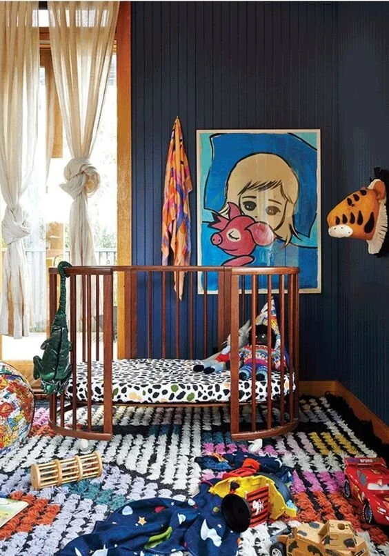
In the months leading up to our delivery day, my husband and I worked hard at transforming our spare bedroom (which was mostly a catch-all storage room at this point) from bland to baby-ready. The walls were neutral, the trim was original and the lighting was horrible. I was set on having a room with dark walls to replicate the dark cozy feeling the baby was used to in the womb. I knew I wanted high contrast furniture and rugs so that the baby’s developing eyes could clearly see things around him. As his eyes continued developed, I wanted interesting and sculptural elements to stimulate creativity and imagination. I’m so happy to say we incorporated all of this into our son’s tiny nursery. I’ll go over these things, and some of the biggest nursery DO’s and DON’Ts.
I wanted the room to be dark, but also timeless. What is one thing that never goes out of style? Nature. I knew that if I rooted the room’s design in nature, the look would last for many years. At this point, I knew I wanted dark green walls. I rounded up all my paint decks and quickly narrowed the color choices from hundreds down to five, and then three. My husband preferred the slightly lighter green, and I preferred as dark as he’d let me go.
My husband and I went to Menards and got lots of wood slats that we then primed, painted and installed on the soon-to-be crib wall. My husband painted the remaining walls the same dark green as the vertical slats. I landed on PPG’s Dark Sage (PPG1124-6) for the wall color and I am still in love with it. We left the ceiling white and all the trim remained it’s original warm oak color. Ideally, I’d like to change the trim stain, but it actually isn’t that bad with the green walls.
I wanted to incorporate both local art and art that was inspired by nature into the room. A few years earlier, I had two very talented friends make an incredible piece. My friend Nicolette Wagner is a trained designer, and spends her days traveling the world, taking incredible photographs and hosting workshops for others to attend. She took a stunning photo of the Nebraska Sandhills and I was so in love with it, that I had my other friend paint it! Rael Belke is a phenomenal painter based in Lincoln, Nebraska and she translated that photo onto canvas with her beautiful brushstrokes. I had this piece in a different room, and I thought it might be too small to hang above the crib, but then I saw Kelly Wearstler hang a tiny piece of art above a fireplace at the Charmaine’s Restaurant, and listened to her talk about scale and proportion in her Masterclass, and I decided my painting would fit just fine. The piece brought in so many lovely colors inspired by nature and it makes me so happy to look at it because it reminds me of how beautiful our state is.
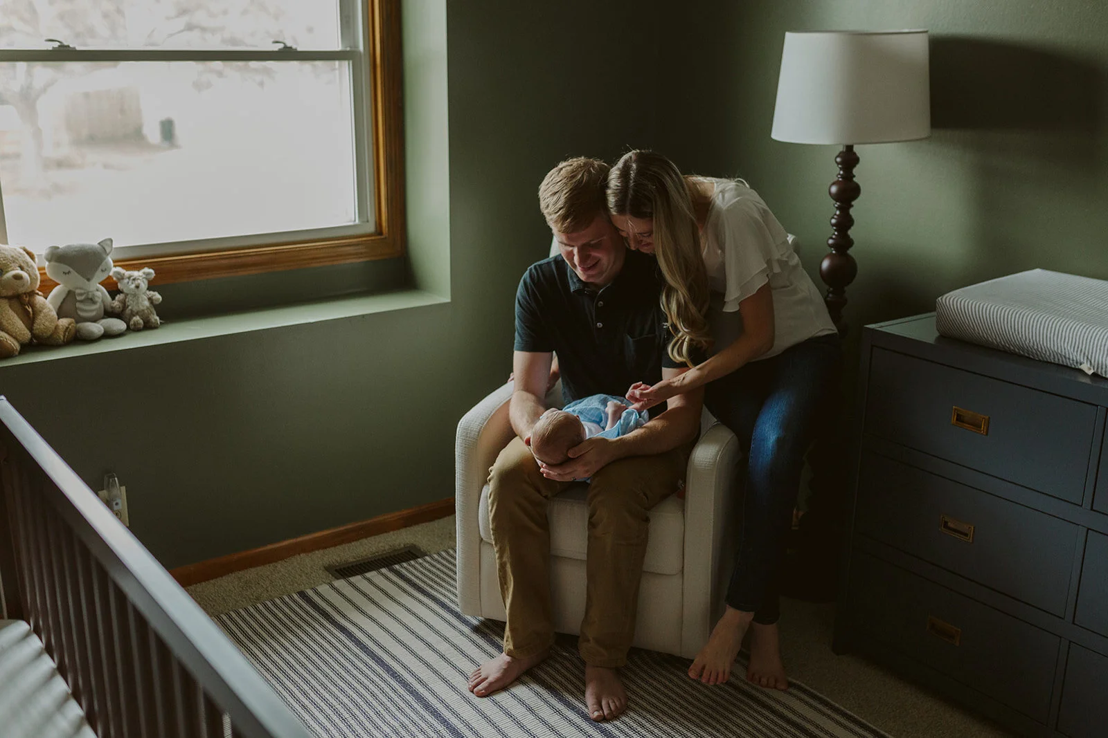
My husband and I spent a long time looking for a crib that we could agree on. I was looking for a specific wood finish and my husband is always looking for the best deal. We searched through so many crib options and most of them were out of stock. That was a trend we kept noticing: during the early months of COVID everyone must have stocked up on baby room supplies, or the vendors simply weren’t shipping anything. I fell in love with the Harper 3-in1 crib designed by the incredible Novogratz in the walnut finish, but it was out of stock everywhere. I signed up for every e-mail list to be notified when it would be back in stock. The months rolled by, and nothing. Then, one day, my husband saw it in stock one some website. (I honestly don’t remember which one at this point.) We bought it immediately! It was a total miracle.
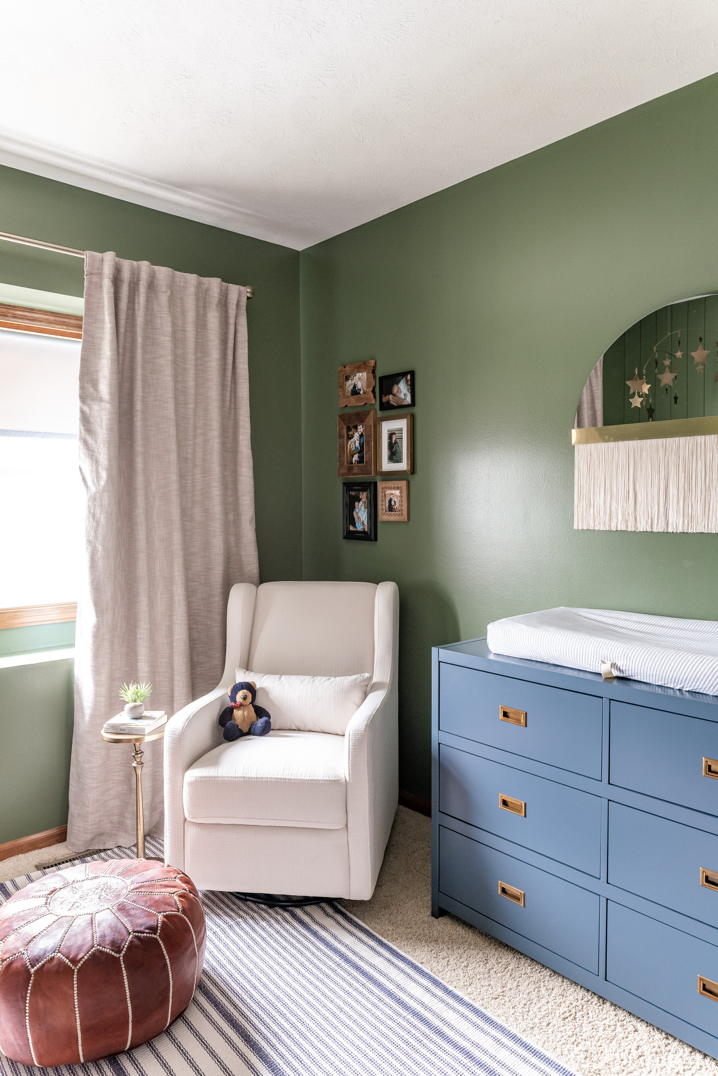
I knew I wanted a rug with some subtle pattern, but that also felt neutral and timeless. What pattern is timeless? Stripes! I wanted a low-pile or thin-piled rug so that the door swing of the closet could easily open and close without making the rug curl up. Getting a rug that is too thick is a “Nursery Don’t” for me because it can get in the way of door swings, it could be a tripping hazard, and dimensional rugs tend to be higher-maintenance in the cleaning department. I have a dimensional rug in my fireplace room, but I didn’t want one in our nursery. I found a flat-weave, striped rug with a lovely oatmeal-colored background with slate-blue stripes on it. It was perfect! A big interior design tip is: don’t buy rugs that are too small. You want the rug to take up as much of the room as possible. Ideally, I’d like every piece of furniture to have their front “legs” on the rug. That way the rug feels like it is truly anchoring the room, and not floating in the middle of it.
Having a mix of materials was important to me. I didn’t want the room to feel like it was all wood and walls. So I incorporated a brass mobile which brought metal and reflection into the space. I was so excited about this metal mobile since the website showed it above the crib, but when it arrived it had a paper stating that it was not allowed to be hung above the crib. I was sad, but it also made a lot of sense, so we hung it in the corner of the room near the crib, but not above the crib. Our son Wesley loves looking at it! The air from the floor vents make the mobile dance and he just loves watching it.
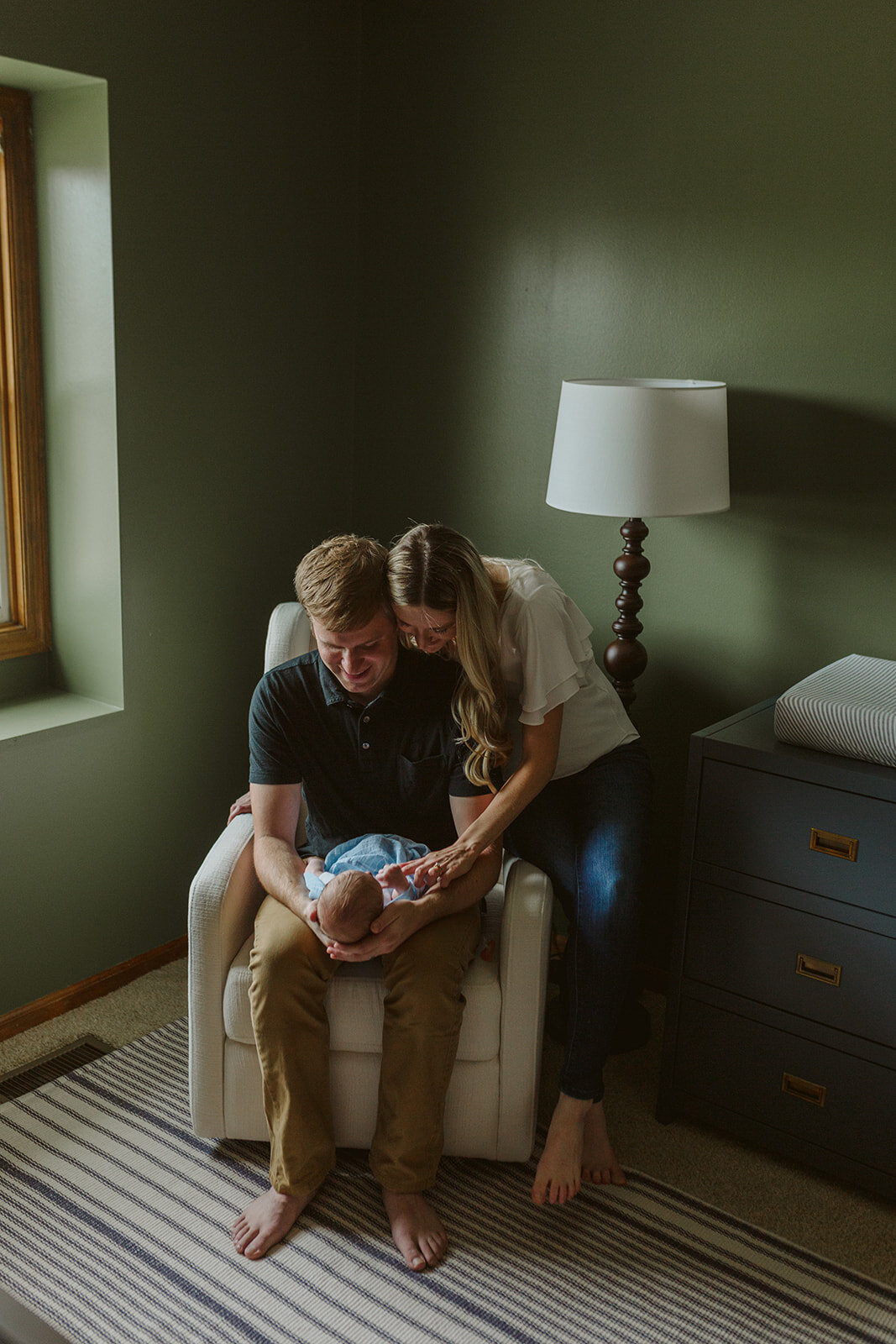
The next element I wanted to add in was leather. At first I looked at was this stunning leather rocking chair, but my husband was not a fan of the price. So I kept looking. I reverted back to the fact that I wanted a lot of contrast and the rug alone wasn’t enough. So I began searching for a white rocking chair, but I was also looking for a very particular arm shape. I did not want a scroll arm, a pleated arm, a saddle arm, a key arm or any ruching or nail heads. I wanted it to be clean-lined, but not as harsh as a track arm. I wanted a slight curve to it too. (Am I picky or what?! Lol.) I also did not want a low-back chair because I wanted to be able to lean my head back and rest on it. Most of the chairs I found had short backs and were WAY TOO LARGE. That is the # 1 “Nursery Don’t” that I see happen is when people buy furniture that is too big for the space. Oversized furniture is for sale everywhere, and can be very affordable. But that doesn’t mean it fits in your space. Finding furniture that fit well into the scale of your room is so important to maintain balance in the room as a whole. When looking at recliners and gliders, you also have to take into account the additional space behind and in front of the chair for when the piece is in motion. I frequently see oversized chairs measuring 36” wide x 36” deep stuck in the corner of a nursery. But they are so big that they basically sit in the middle of the room. I drew the entire floor plan up in AutoCAD and knew what size of chair could fit in our room. I ended up with a cream swivel-glide chair that measures 25” wide x 32” deep by 37.5” high. It fits like a glove! Not too big, and tall enough for me to lean back and rest my head.
It came with a matching fabric ottoman but I ditched it and kept looking for my leather element. I always wanted one of those leather Moroccan poufs so I thought now was a good time to finally get one. They are sold on almost every website so it was easy to find many different options. I wanted a cognac leather color and I wanted the pouf to be tall enough that I could comfortably use it as an ottoman replacement instead of the matching one that came with my rocking chair. I believe we ended up getting our pouf from Wayfair because it was less expensive by a hundred dollars or so, but I can’t find it anymore. Here is the West Elm pouf but it is considerably more money than what we spent on ours.
I wanted an itsy bitsy table to put next to the rocking chair. I checked my floor plan dimensions in AutoCAD and knew I could barely afford the room, but I knew something out there would work. I’d seen many drink tables and “martini” tables before so I figured I would find something similar. I ended up going with this super cute little metal table in an antique brass finish. I love having it in the room at night to set the bottle on after a feeding. It’s just the right size. :)
Now it’s time for the dresser/ changing table. I really wanted to pull in a dark navy dresser with brass accents and I completely fell in LOVE with this one from Crate & Barrel but it was way too wide. (54.75”) It would technically fit in the space, but it would have felt crammed in there and would have scrunched into the seating area AND I would not have had room for my Oobi or trash can. I searched high and low and ended up finding this one that is on many different websites, and it was slightly smaller at 45” wide. I noticed that it was not exactly a “navy” color but more of a slatey-blue-grey color. I was hoping it was just a bad photo and I prayed it would come in more navy, but alas, it did not. So it’s not my ideal dresser but I think it still works in the space.
Since I only had room for a little dresser, this meant I basically only have room on top of the dresser for the changing pad and some wipes. This meant that I could not have a regular sized lamp and I had to go with a floor lamp. I wanted a sculptural floor lamp that wasn’t typical. I wanted it to be sculptural so that when my baby looked at it he would see interesting shapes. I didn’t want it to be just a simple straight line. I LOVED this one but my husband did not like the price tag. Luckily, he came up with a solution. He found this lamp at Target and I really liked it in the Espresso finish. It works great!
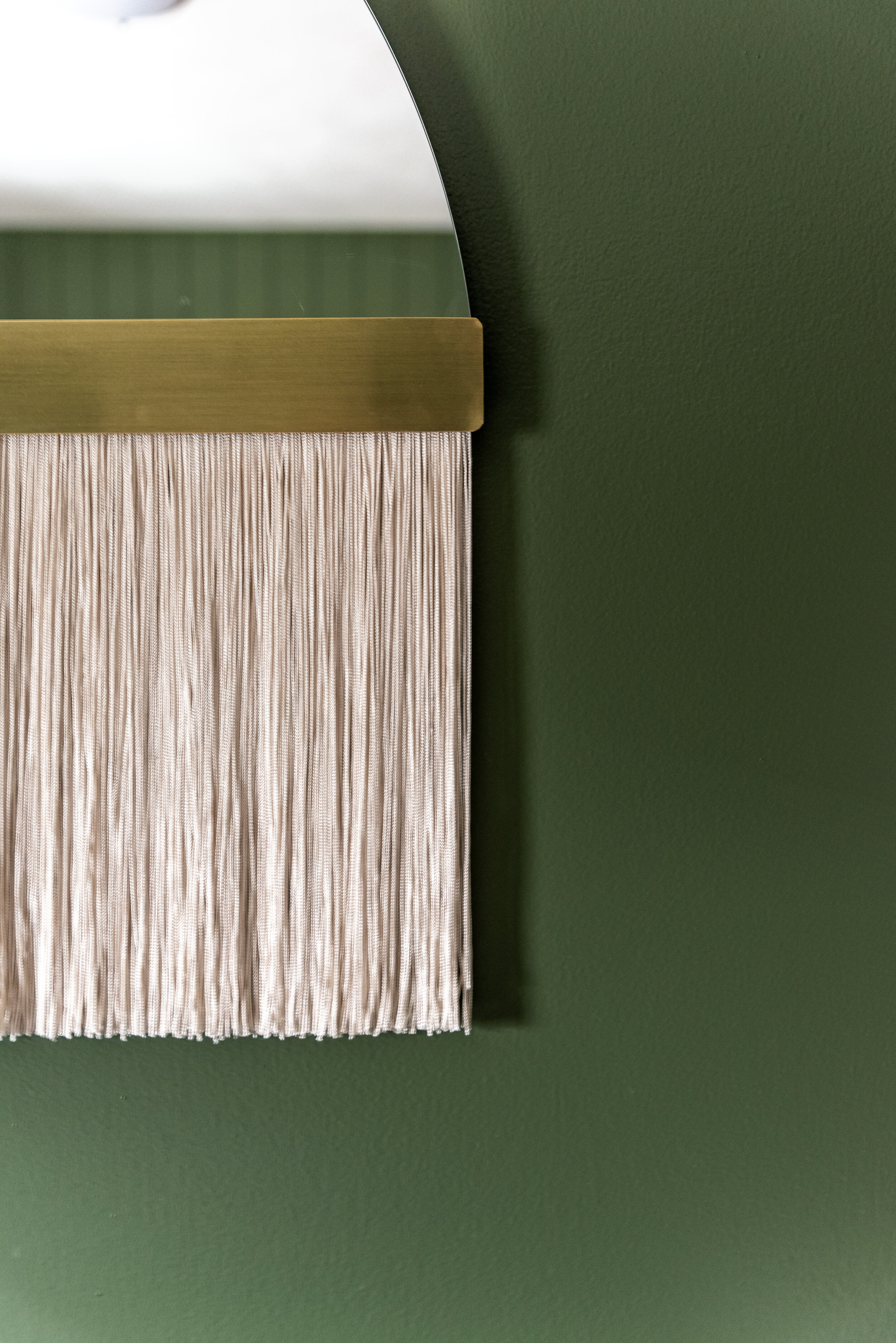
I wanted a sculptural piece of art above the changing pad because I wanted something interesting for our son to look at. I wanted a piece that would spark his imagination and creativity. I searched high and low for that perfect little something that I just couldn’t put my finger on. Then I finally remembered a local Midwestern maker I’d been following on Instagram for a while: Candice Luter. She’s an incredible fiber artist and I had been wanting to use her work in one of my projects. I was happily surprised when my own home was the first project I included her work in. She has so many incredible options. I selected the Ecru color for the fringe and brass slat detail to tie into the other brass elements I had throughout the room. I measured the height from the top of the changing pad to our ceiling to determine which size of art would feel most balanced on that wall. I am extremely happy with the purchase and highly recommend her work! The funny thing is, our son was incredibly shy and almost afraid of mirrors when he was born. (How could I have known that?!) But he LOVED the gallery wall in our living room. After finding that out, I decided to put a mini gallery wall in his nursery right behind the rocking chair so he could look up at it. And he loves it! :D I pulled together a bunch of different frame sizes, colors and textures. I wanted this to be a dynamic little moment. But I still created balance. Then I filled each frame with super cute photos of Wesley. (UPDATE: He also loves mirrors now. He smiles at himself and me all the time. Phew!)
I was pregnant during COVID and had our baby during COVID. So both of my baby showers were virtual. We were so lucky and received many new fluffy teddy bears and I was excited to incorporate them into his room. I also included vintage bears too! I grew up with my black and brown teddybear named “Teddy” so I put him in Wesley’s room too. My husband’s grandma gave us her vintage orange-ish / tannish bear and I put him on our window ledge too. I love to mix old and new items together. It’s so important to include sentimental and personal items in a nursery. It adds to that extra special feeling.
Overall, designing my son’s nursery was incredibly fun. But I have to be honest, it is even MORE fun now that he’s alive and IN the space. I love watching him stare at the mobile, reach for Candice’s art (ah! lol.) and explore his surroundings. I feel like he knows that this space is his and I believe he feels most comfortable there. I love him so much and I’m very pleased with how his nursery turned out. Thank you for reading along! I hope you’ve enjoyed this post.


