When I heard the incredible news that Julia Mason was going to quit her full time job to follow her dreams, I was immediately inspired. When I found out that her new endeavor involved sprucing up a cute little shop to use as her retail storefront, I quickly offered my interior design services. To my amazement, she graciously accepted and we quickly got to work. I began the process with a secret inspiration board on Pinterest that I curated to fit Julia's aesthetic.
AFTER
BEFORE
AFTER
BEFORE
At our first site visit, we discussed ways to freshen up the exterior with some simple paint options. I used Photoshop to show Julia different exterior paint colors and signage options. Julia showed me around the charming little studio and explained how she wanted it to function. She told me that she planned to use the space to display her work, sell her art, and work on current projects. She shared her love for natural wood finishes, her need for display, and that she wanted her art to be the focus of the space. She told me that the main design challenge within the space was how to address the two windows and a door that led to a different part of the building that the landlord owned. She mentioned that when people entered the space, their first comment was, "What is behind these windows and that door?" We did not want this to be the focus of the space. I took measurements of the space to draw a floor plan in CAD and quickly got to work.
AFTER
AFTER - detail shot -
BEORE
AFTER
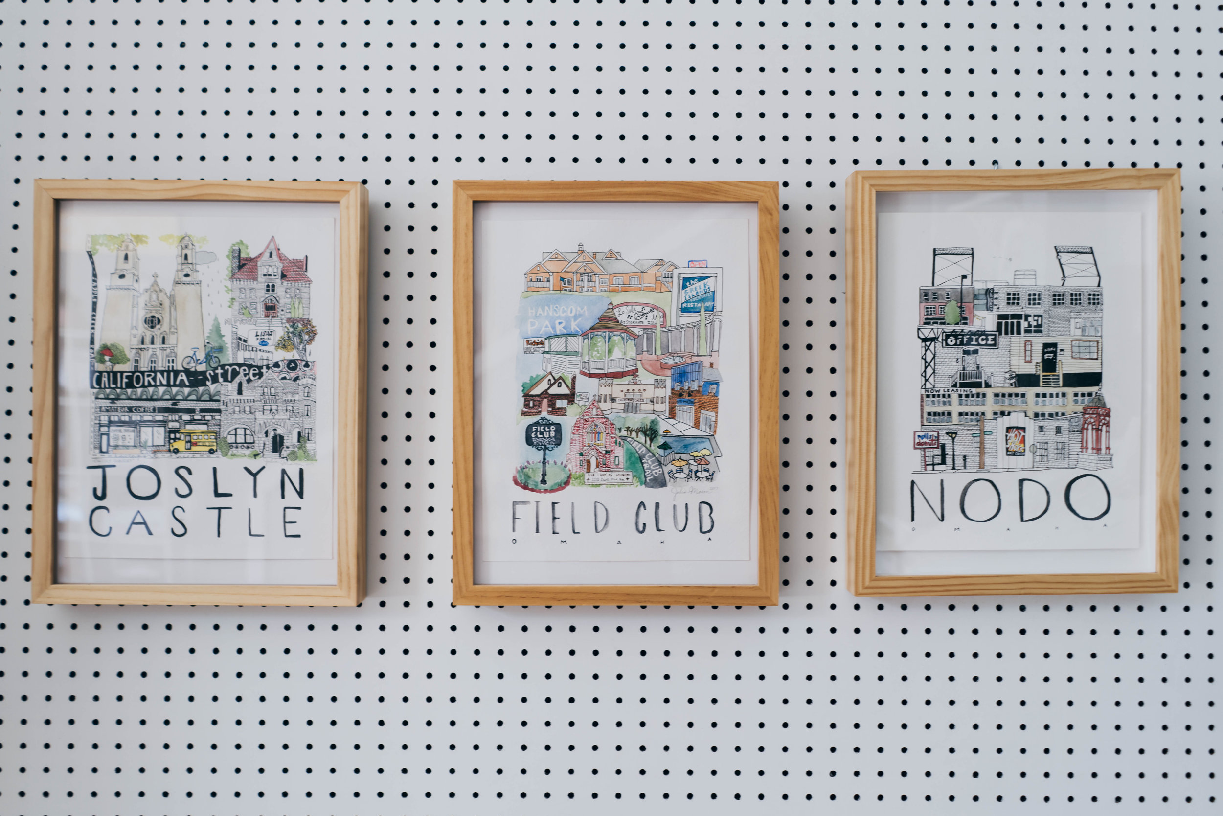
I mentioned that we could utilize peg board to fit precisely within the trim of each window and door. Then customers could not see beyond the space, and we could utilize the peg board for product display. I shared my secret Pinterest board with Julia and showed her some bold statement walls that were covered in faux greenery and featured a neon sign hanging the middle of it all. Julia loved this look and utilized it as both a way to cover up the windows, and a way to showcase her work. Brilliant! We also incorporated an encouraging neon sign over the greenery of the second window. It reads, "DO WHAT YOU LOVE." This inspirational quote was spoken by Julia's father and it is a special personal touch within the space.
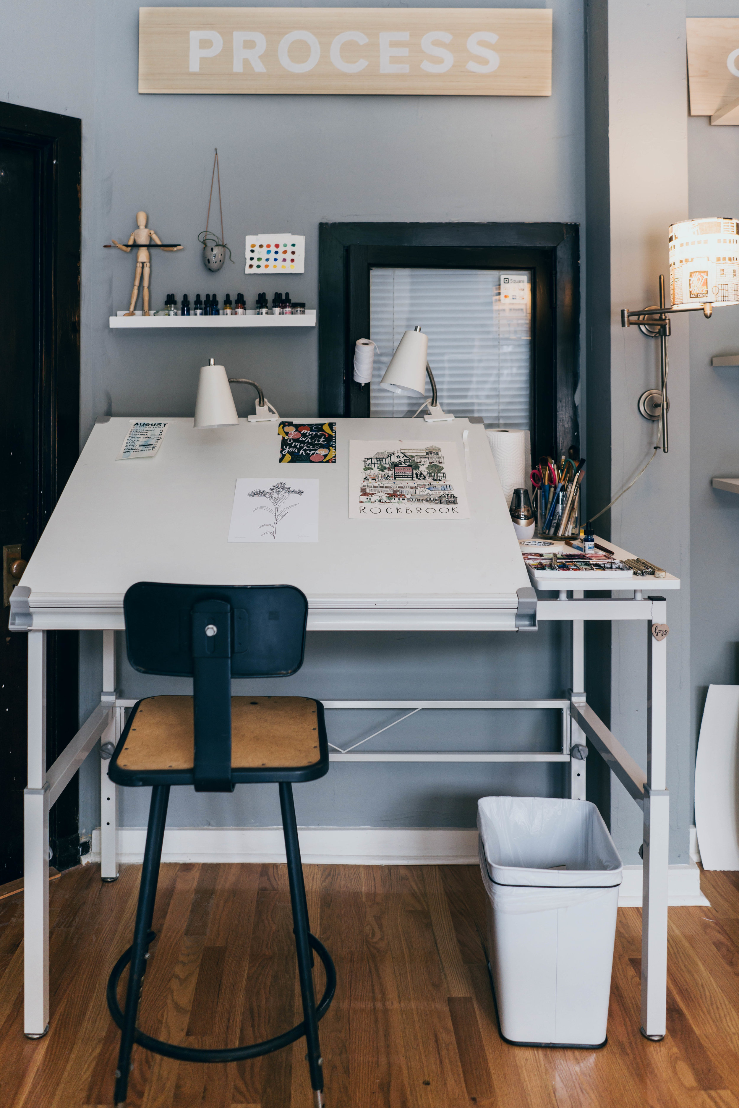
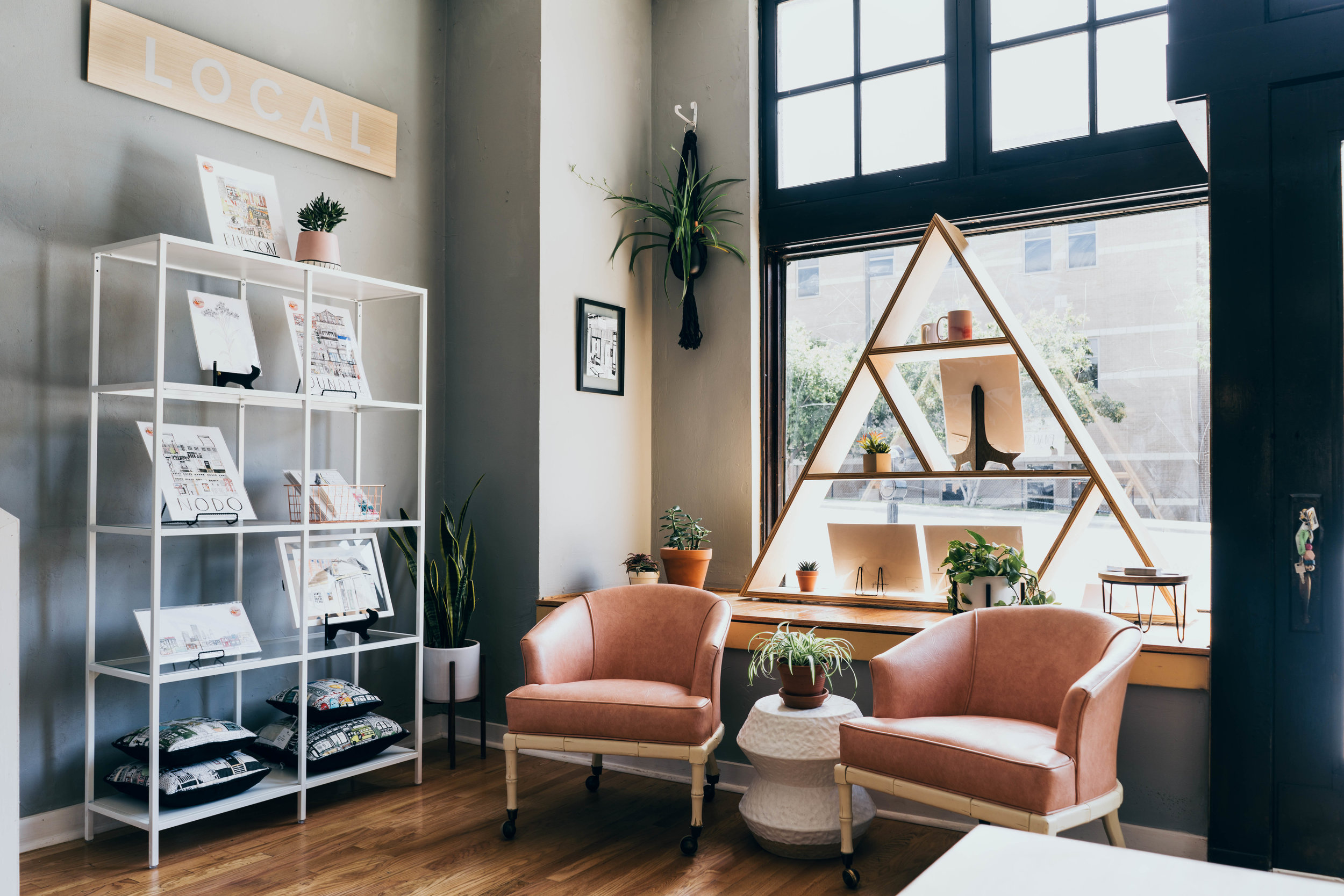
Julia told me that she wanted a streamlined look. It would be very clean and intentional. I was fully on board! I spoke with Julia about her process and the different types of artwork she produced. It became clear to me that this space would be primarily used in three different ways: to sell "LOCAL" art, to promote her "CUSTOM" capabilities, and to work on projects currently in "PROGRESS." This simple understanding lent itself nicely to signage throughout the space. We achieved this when Julia hand-painted these three words onto separate pieces of wood, and mounted them in pre-selected areas in the studio. This not thoroughly explains how the space is laid out and what Julia is selling, but it also draws our eyes up towards Julia's high ceilings.
BEFORE
AFTER
" It became clear to me that this space would be primarily used in three different ways: to sell LOCAL art, to promote her CUSTOM capabilities, and to work on projects currently in PROGRESS. "
- TARA MILLER
BEFORE
AFTER
In order to further connect with her customers, I suggested that we create a "sign in" area where people could put their names and e-mail addresses if they wanted to be kept up to date via Julia's e-mail newsletter. I sketched a simple sign in table made of natural plywood that fit into this little spot next to the stairs. This is a great spot to capture e-mails while customers peruse from the "CUSTOM" to the "LOCAL" display section of Julia's studio. (Check out those adorable totes too!)
BEFORE
AFTER
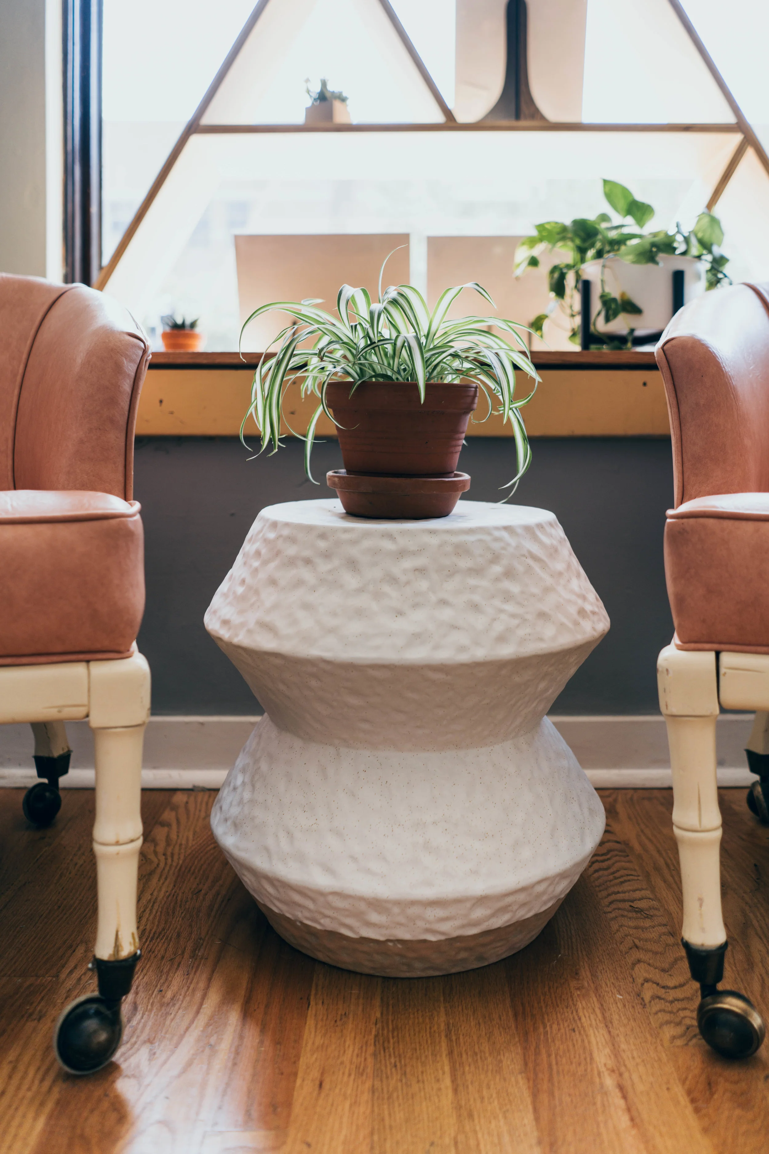
The storefront windows flood the space with gorgeous amounts of natural light. I thought this would be the optimal spot for some seating and a little accent table. This snug seating area could be utilized for a one-on-one sit down meeting with a customer to discuss their custom art piece. The seating area lends itself to great conversation while being out of the main circulation paths throughout the space.
BEFORE
AFTER
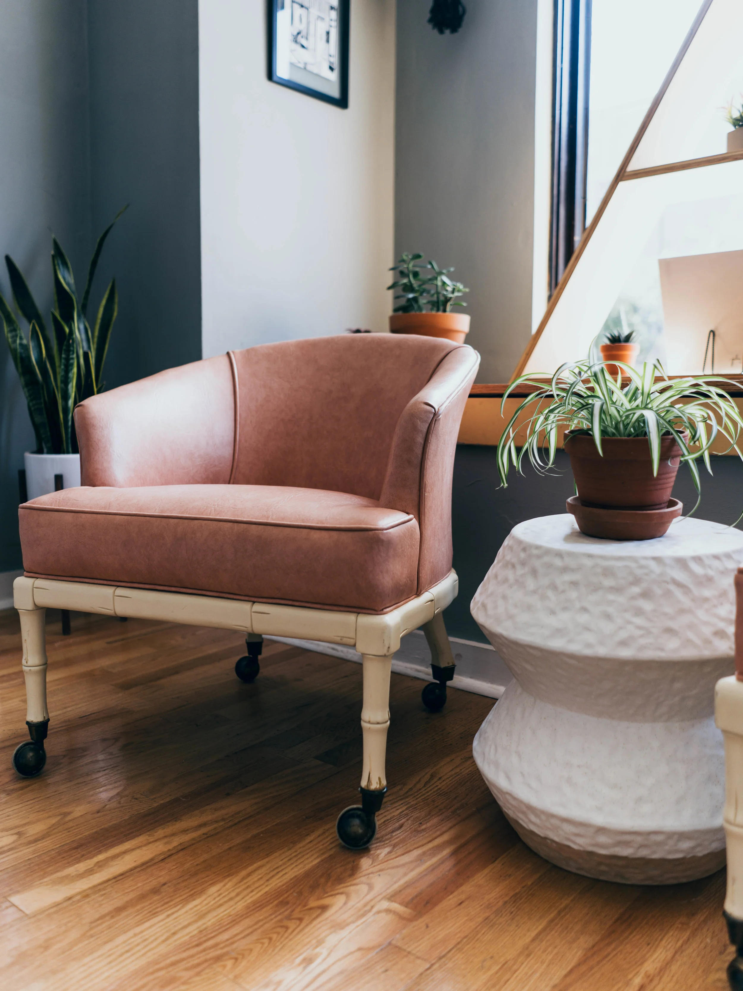
Initially, I pulled together a few seating and accent table options for Julia and I to work through. She landed on a stunning duo of pink metal chairs + a ceramic accent table. The accent table came in right away, but the original chairs got delayed for MONTHS. I love perusing through local shops and boutiques and luckily, I had just picked up a gem. This lovely chair was upholstered in a peachy/ pink vinyl and it had intricately carved bamboo wooden legs. It didn't work for the first spot I tried placing it at, but when I brought it to Julia's studio, I knew it was magic. It worked perfectly! HUGE shoutout to the great people at Starts With Vintage for helping me source these amazing pieces. Thank you so much! #supportlocal
BEFORE
AFTER
Left: Interior Designer Tara Miller with The Heartland. Right: Artist Julia Mason with Julia Mason Art.
Floor plan drawn by Tara Miller at The Heartland Interior Design


