Retail Interior Design is so near and dear to my heart because it involves working with the business owner in order to translate their brand into a built 3D space that their customers enjoy and make purchases in. I get to know people, their brand, and their work so well which enables me to authentically communicate their brand through interior design.
“As an interior designer, I help clients transform their retail environment in a way that evokes emotion, influences mood and engages the customer more fully in the retail experience as a whole. Retail design is about more than just making one sale. It’s about curating a space where customers return again and again.”
-Tara Miller, owner of The Heartland Interior Design
The space planning (and ultimately the floor plan) is a crucial design element that I love working on because it sets the tone of the retail environment. How the space is laid out invites people into and through the space. Interior design can reinforce a brand identity and greatly impact the customer’s experience with the brand.
Strong relationships equals a strong client base. Brands are already crushing it with a great logo, website and social media presence. Once they make the leap to opening a storefront, my goal is to make sure there’s no disconnect between that brand and their retail environment. Therefore, it’s important to me to engage in meaningful conversation with the business owners about their business and their customers so that we can exceed expectations by delivering a one-of-a-kind space.
One-of-a-kind doesn’t mean top dollar. One-of-a-kind simply means that you aren’t like everyone else and your space shouldn’t be either. It is easy to fall into the latest design trend seen on TV and social media, but we intentionally explore other options that are more in line with your brand and the message you want to convey to your customers. With all of my construction experience and design exposure, I can reveal creative solutions and alternate designs that will last the test of time.
“What sets The Heartland Interior Design apart is our focus on the final cohesive composition and not only the material finishes. My goal is to understand what the client wants to do with their space and not just select some surface-level finishes, but deliver interior design solutions that inspire.”
-Tara Miller, owner of The Heartland Interior Design
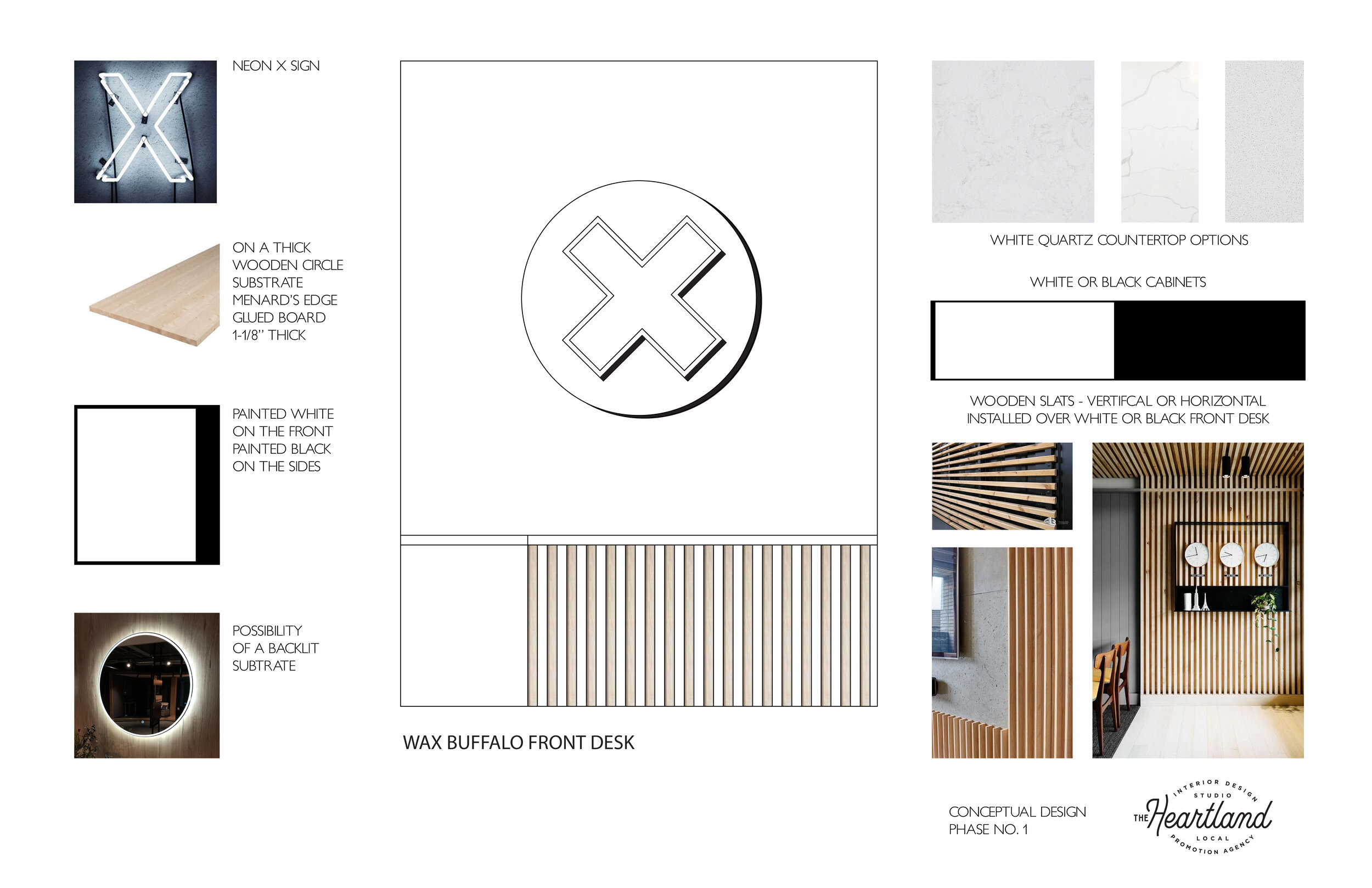
This was all kept in the forefront of my mind when I worked with Wax Buffalo on their first brick and mortar space. I started by asking my list of intentional questions to learn what their hopes, dreams, budget and timeline are for the project. Then I dove deep into researching their brand identity and what how customers identify with that brand. I created a conceptual level presentation board to indicate the design direction moving forward.
Conceptual Mood Board created by The Heartland Interior Design using photos from Wax Buffalo’s website, social media and other sources.
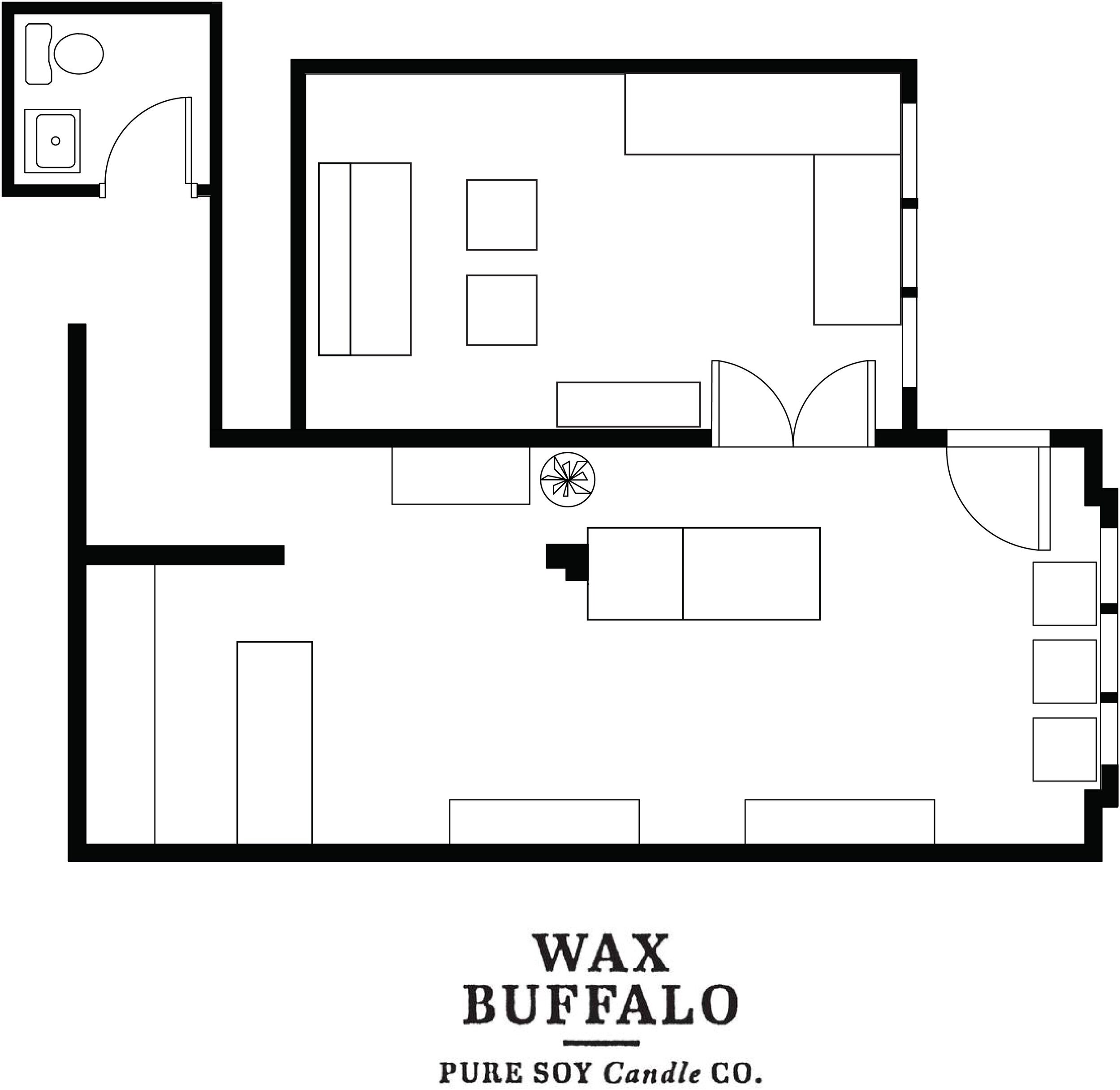
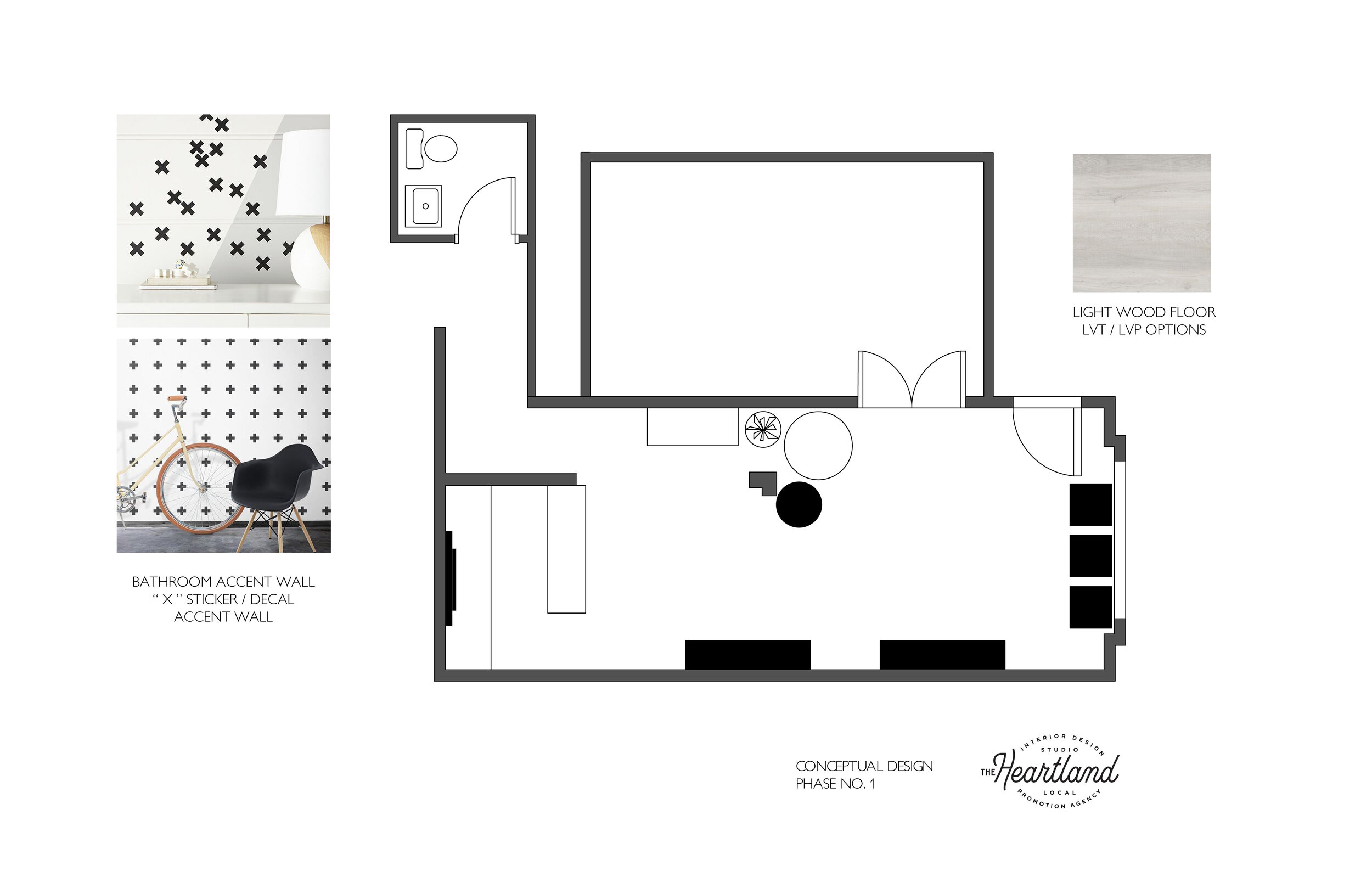
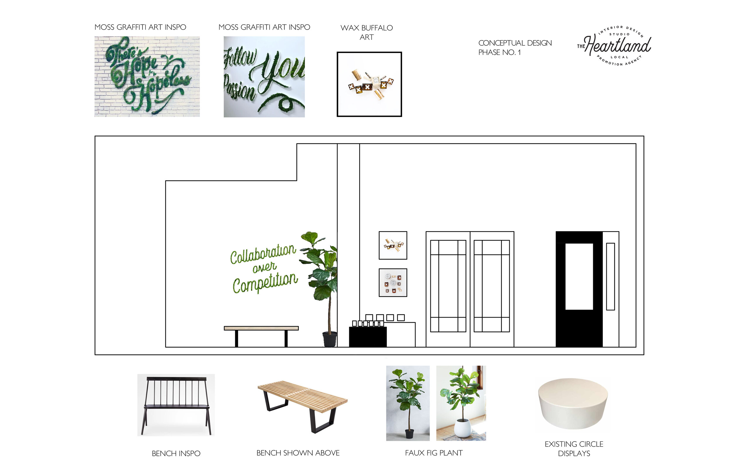
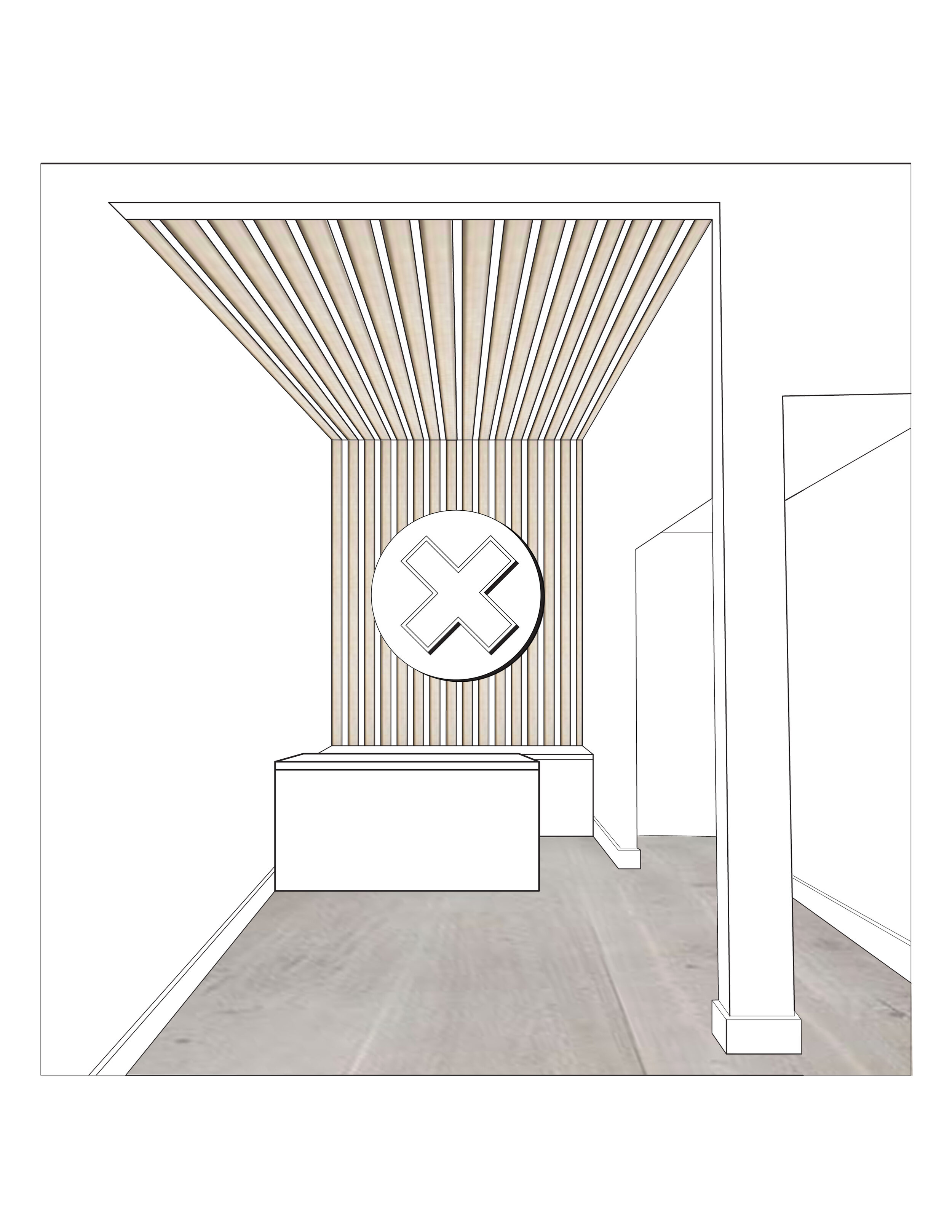
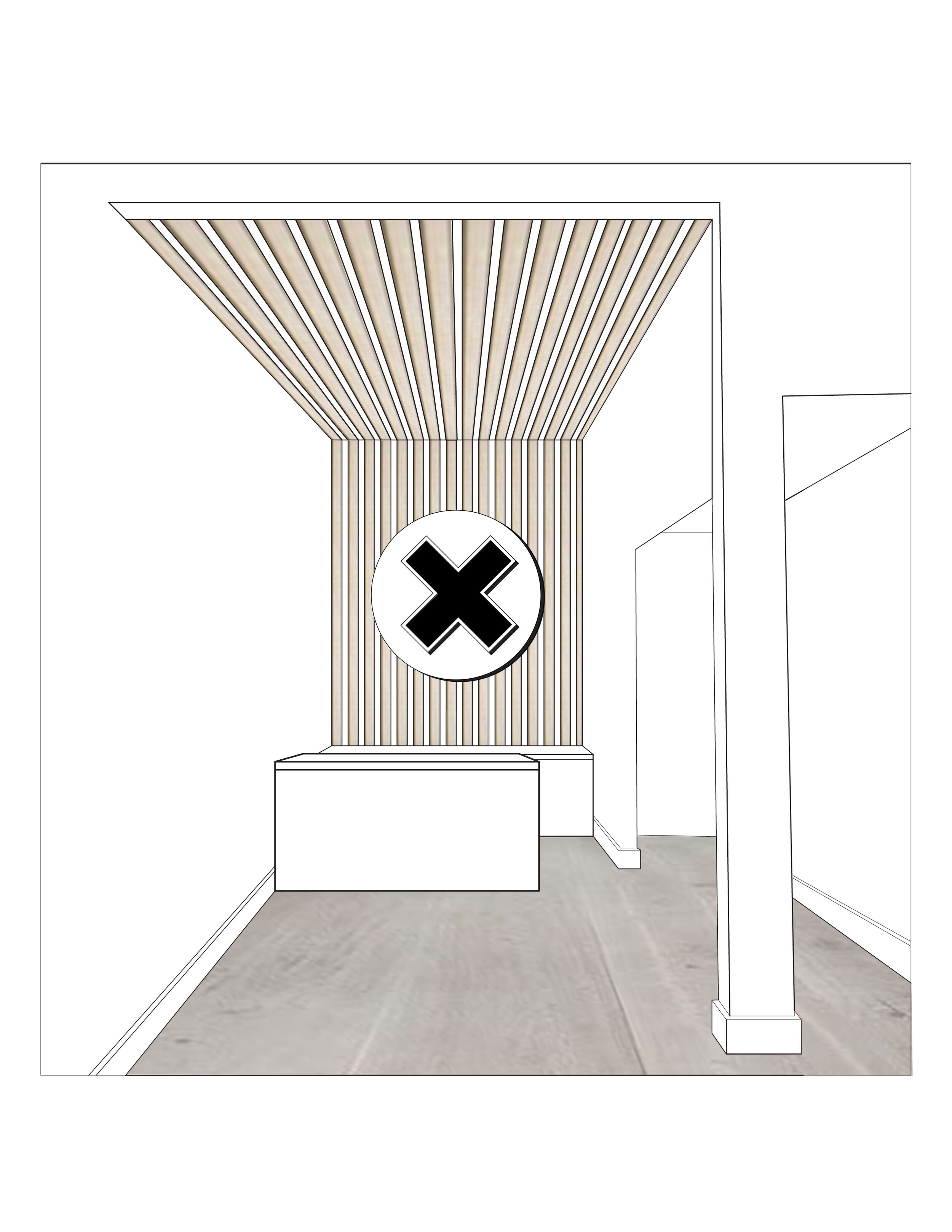
Next, I got to work measuring the existing site to create a working floor plan in AutoCAD. This enabled me to explore multiple different ways to lay out the space which influences customer interaction. Once I landed on an optimal floor plan, I focused on the elevation of each wall and what customers would be see. After the basic black and white elevation drawings were approved by Wax Buffalo, I went into Photoshop and added a little bit of color and materiality to breathe life into the drawings. This helps you visualize the space a little better, and think through your options.
STEP 1- Draw the Elevation of the EAST wall using the dimensions from the floor plan made earlier.
STEP 2- Use Photoshop to add materials and finishes to the elevation.
Once the floor plan and elevation drawings were finalized and approved, I moved onto solidifying the FF&E items. What is FF&E you might ask? In the commercial interior design world it means: Furniture Fixtures and Equipment which is a short way to summarize anything that isn’t physically attached to the building. So this is stuff you can take with you like furnishings, rugs, art, plants, décor, removable signage, TVS, computers, window shades, curtains, curtain rods, vending machine, etc…. You get the idea :) Every one of those items is not used in every project, but that list just gives you a general idea. There are TONS more FF&E items that aren’t in that list too.
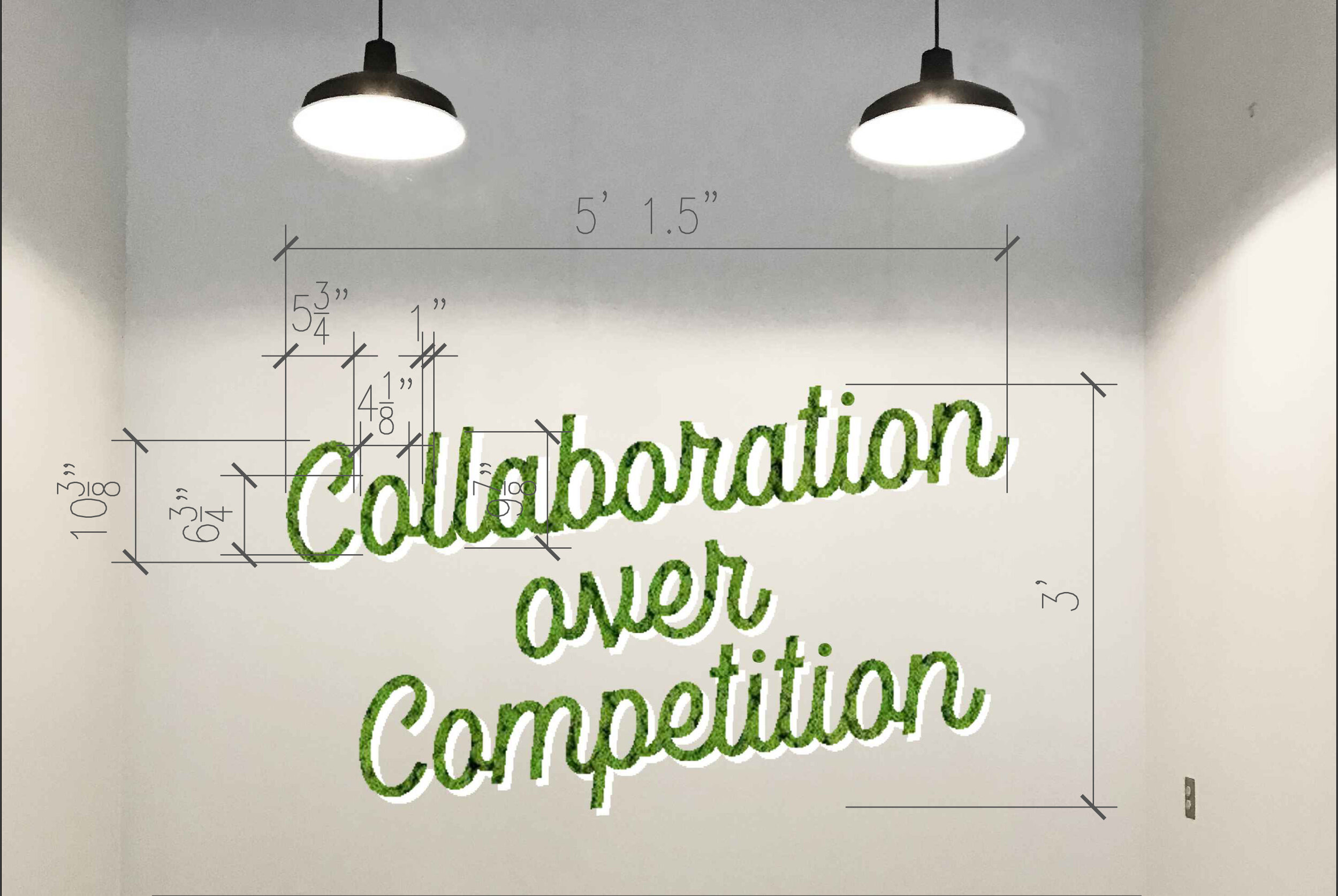
We found sofas, art and tables that were the correct size and style to fit both the floor plan and the brand aesthetic. Then I worked diligently on designing, dimensioning and fabricating a large custom art piece that is quite a focal point within the space. It highlights an important quote to the Wax Buffalo brand which is “Collaboration over Competition.” Rather than put this up like any old sign, I wanted to bring in some interest by making it three-dimensional and I wanted to make it approachable and inviting by creating it out of fluffy green moss. I used a font developed by the local lettersmith Nic Fred and went to work in AutoCAD making sure the sign would fit just right on the size of wall we were working with. The green of the moss has great contrast against the white wall and I wanted to warm it up by introducing another natural material- leather. I chose the cognac leather because the space needed some natural warmth to anchor the room.
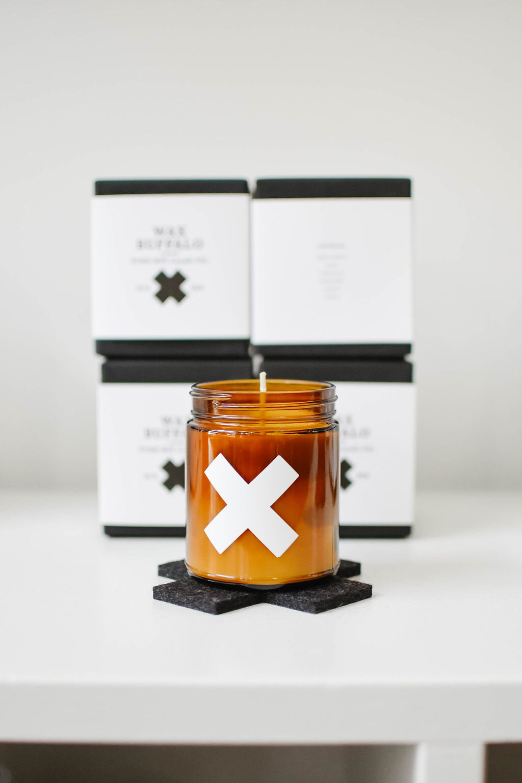
There are multiple important design impact moments throughout the space that reinforce the brand identity. One is the “Collaboration over Competition” moss quote, but another is the “BEAUTIFULLY IMPERFECT” verbiage over a bench near the point of sale counter. I personally love making a bold statement in bathrooms, so instead of investing in fancy custom wallpaper, I suggested they take their readily available black “X” stickers and post them all over one bathroom wall to make a stunning visual impact that is – of course – on brand.
Speaking of simple and affordable solutions: the existing light fixtures were dark purple which is not on brand at all, but lights are expensive to replace. So I suggested using a matte black Rust-Oleum spray paint to freshen up the existing light fixtures rather than replacing them. After ripping up the old carpet, the floor was covered in old carpet glue. I suggested using the extremely affordable (and durable) LVP (laminate vinyl wood plank) for the flooring to bring in another material.
The team at Wax Buffalo is crazy talented and they care so deeply for their customers. I believe that the design of their lovely store reflects that on so many levels. I am thankful that they welcomed me into the design and construction process, and I am so pleased with how their space turned out.
“If you are opening a retail store, I would love to learn more about your brand, your vision and your customers so I can help make your space the space of your dreams.”
-Tara Miller, owner of The Heartland Interior Design


