Heartland Home: Local and Thrifted

Welcome to the vibrant and colorful home of the Bruner family! Our second Heartland Home features an oasis nestled in Lincoln, Nebraska. With all of this winter weather we’re having, you will LOVE to feast your eyes on this fresh and colorful space. Lo Bruner answers the door with a huge smile and welcomes us into her home. Her house immediately smells like heaven because she has lots of local Wax Buffalo candles burning all at once.

All photos taken by Life Unbound Photography

All photos taken by Life Unbound Photography

Nicolette Wagner and I walk into her home and head straight for the kitchen to take photos. I saw this space about a year ago on Instagram and knew that it was a special gem that had to be shared with the world! It’s vibe was so unique and appealing. I couldn’t wait to see it in person! Lo tells me that the natural light immediately drew her to this house. The home is nestled up against a wildlife conservation which makes for an epic backyard. The kitchen originally had blue counter tops, a chicken tile backsplash, and the floor was severely uneven.

With a lot of work, the Bruner family was able to create a space that is uniquely their own. Lo’s husband Aaron is a jack of all trades. He made a concrete mold and made a new countertop for them. It was created in two sections and adds some masculine texture to the space. Lo painted the bottom cabinets pink, but left the upper cabinets the natural stain.

“The main thing I love about my home is that it feels warm.” - Lo Bruner.

_DSC5720.jpg
_DSC5739.jpg

She describes her style as, “Jungalow” and tells me how all the greenery compliments the pink in the room. She said that she really got into plants about three years ago. Lo explains that her daughter is really into plants and frequently gives them as gifts. They are not just for aesthetic purposes though, as her pothos vines produce oxygen which provide clean air for her home. She loves to cook and says that she needs fresh food in the house too. You can see pops of color throughout her home in the form of plants, fruits and fun little accents like her fluffy pink fur throw! This fluffy fur was sourced at Nebraska Furniture Mart along with the mirror-front Credenza that they use as a kitchen island.

_DSC5696.jpg

Lo has collected her decor over the years. She says, “I’ve always had a thing for wicker baskets and my grandma had a wicker peacock chair.” She’s picked up many items at local thrift stores, Home and Closet, and Hutch. She says that the large hide on the floor adds a lot of warmth to the space. She got the large one at Junkstock from Cactus Creek. They’re this AMAZING store in Weston, MO. They have tons of great finds! I’ve been to Weston, MO on girls trips with my aunts and cousins, and it is a fantastic place. Lo got the smaller hide from Stella Collective in Lincoln, NE.

HH2+paper.jpg

Before and After: Roots Collective Hair Salon

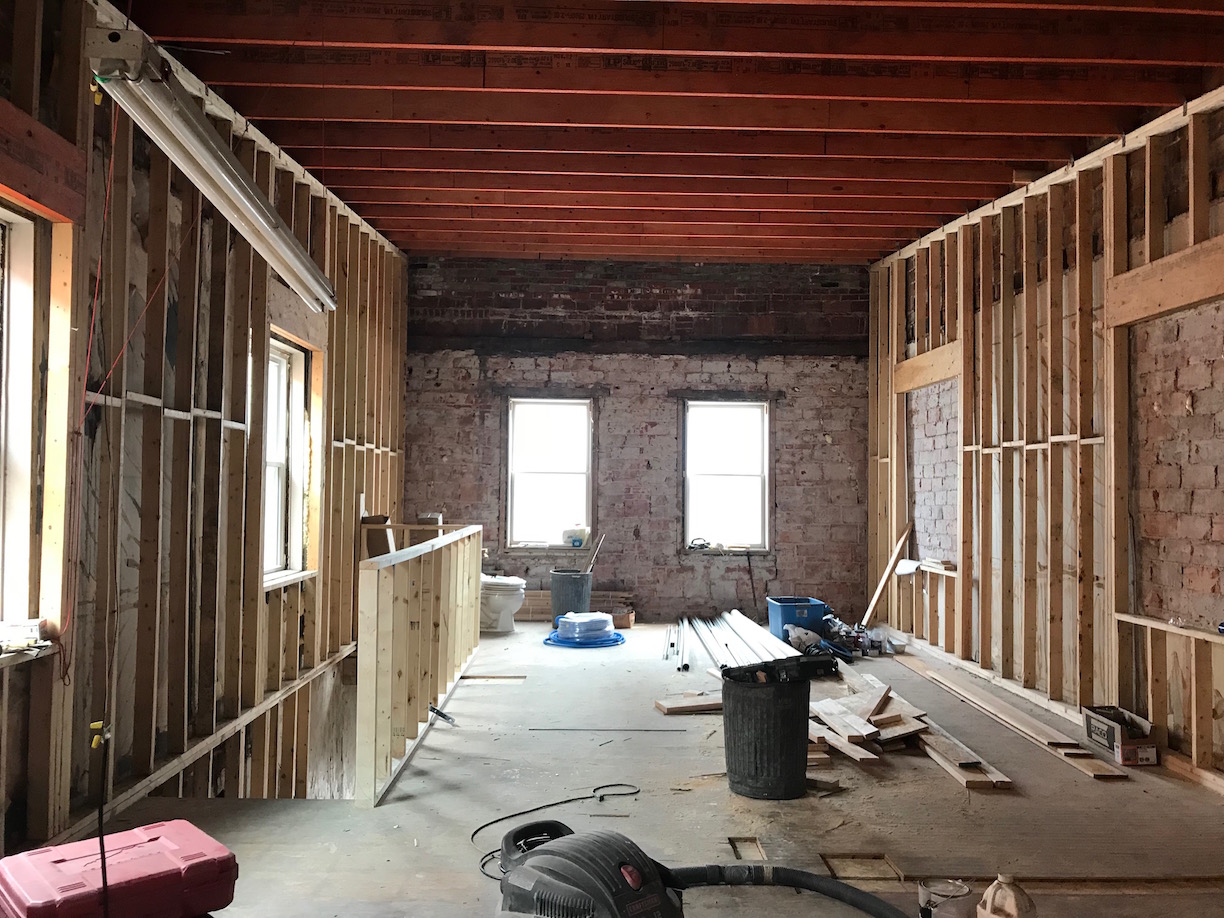
It was early April and Addis Browne was taking a leap of faith by opening her own hair salon. She wasn’t just opening a salon in an existing salon building. This wasn’t some change of ownership ordeal. No. She was going to open her hair salon in an empty space on the second story of an old building in downtown Lincoln, Nebraska. I immediately fell in love with that goal.
_DSC3104.jpg
_DSC3108.jpg

This bold pursuit energized me and I reached out to Addis in order to offer her my interior design expertise. I wanted to be a part of this neat salon coming to downtown Lincoln. I worked on many renovation projects in the past where I helped give new life to old spaces so I knew it could be accomplished. I also knew that Addis had a knack for bold and colorful looks, so I wanted to help materialize her style into the interior design of the salon.

All professional photos taken by Nicolette Wagner with Life Unbound Photography.

All professional photos taken by Nicolette Wagner with Life Unbound Photography.

Before. April 2018.

Before. April 2018.

Before. April 2018.

Before. April 2018.

After.

After.

When I first met with Addis, I wanted to know all about her vision for the space. I loved listening to her describe her dream salon. I asked questions about her favorite colors, the clientele, timeline, budget and more. After gathering enough critical information, visiting the site, and gathering all necessary dimensions, I got to work designing a beautiful and functional space for Addis’s hair salon.

_DSC3047.jpg
_DSC3060.jpg

I began my first design approach by giving Addis everything she specifically asked for in a salon. It included the exposed brick, bright white walls, and the typical ‘coffee-shop-style’ interior design that we see so much of. She immediately loved it! I was pleased, but told her I had a couple of tricks up my sleeve. I asked her to bear with me and explore another design option that I created based off of the information I gathered about her personal style and her target clientele.

_DSC3065.jpg
IMG_1843.jpg
IMG_1847.jpg
_DSC3069.jpg

“I asked her to bear with me and explore another design option that I created based off of the information I gathered about her personal style and her target clientele.” - Tara Miller

_DSC3028.jpg
IMG_1850.jpg

This is when I let my talent shine through. This is when I delivered her with an interior design direction that took her wants and needs and elevated them to the next level. That is what an interior designer’s job is. It is my goal take the client’s wants and needs and turn it into an even more fabulous space than the client could have ever imagined on their own. It is my job as an interior designer to do that, and make sure that the space meets building code for life and human safety, fire and egress codes. (Basically- rest assured that your building will be safe.)

_DSC3082.jpg
_DSC3084.jpg

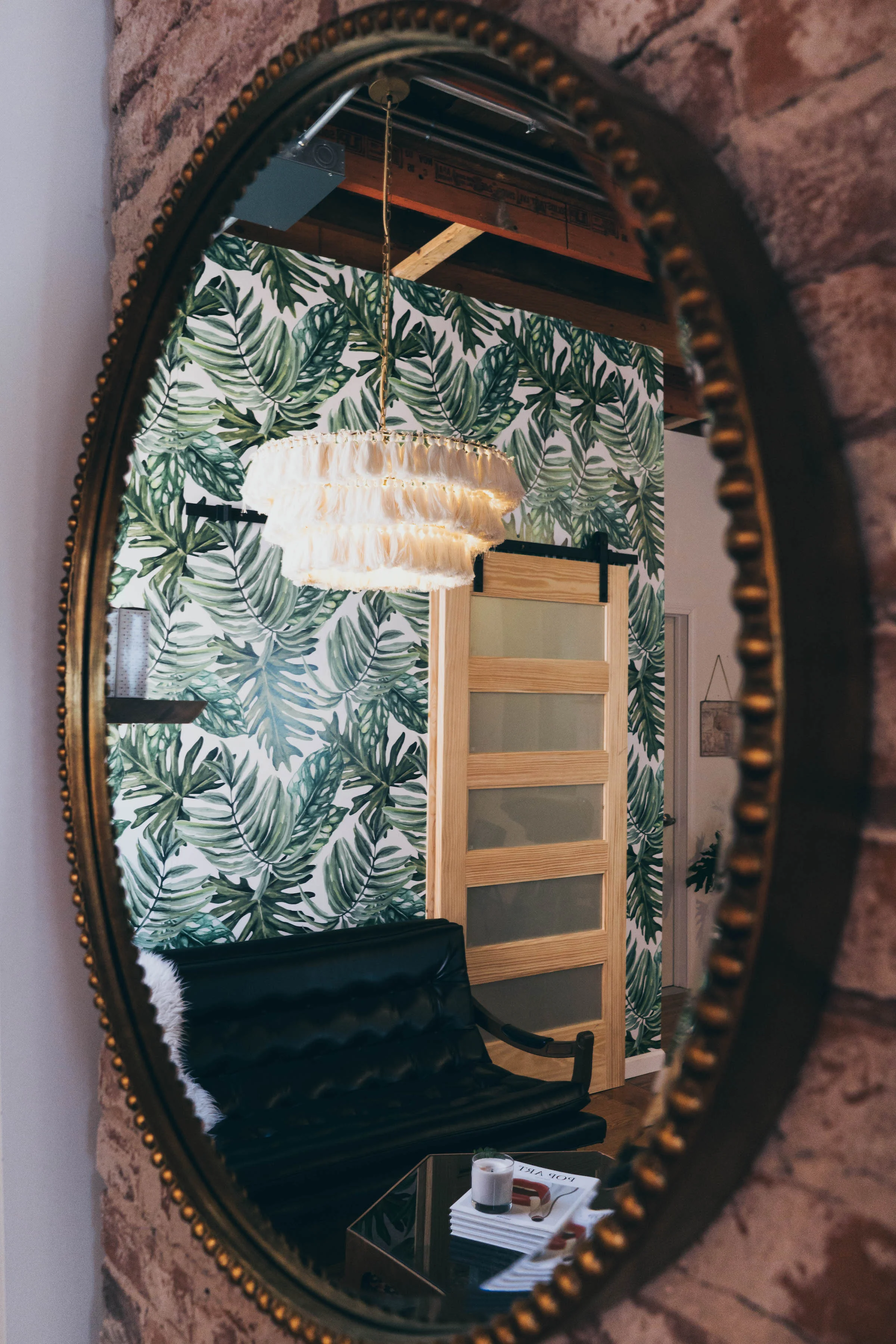
I showed her a design direction I created based on her vision for the salon but I added some specific things to make it stand apart from the rest. I suggested things like bright colored orange chairs, a large-scale bold wallpaper print for a statement wall right off the entry, I switched up her lighting with a knockout chandelier she hadn’t seen before, and I made the suggestion to keep the orange laminated ceiling beams ORANGE instead of cover up their raw beauty with white ceiling paint.

_DSC3033.jpg

When Addis saw the elevated design that I created based on her other likes and interests, she loved it! I was over the moon excited because when my client’s are excited, I know that I have done the first part of my job well. From there we moved on to the second part of my job: Project Management. I helped Addis by providing a detailed list of where different lighting, furniture and accessory pieces could be purchased.

During the construction phase I draw floor plans, reflected ceiling plans, elevations and 3D renderings of the space. These drawings precisely communicate the client’s desires to the contractor and electrician. These detailed drawings leave little room for misinterpretation. I made finish specifications, furniture selections, lighting selections and so much more. We made it our goal to follow her budget and source as many local pieces as possible. Her salon features of mix of items found at Home and Closet Vintage, Craigslist and new products sourced both online and in store.

IMG_1840.jpg

“We made it our goal to follow her budget and source as many local pieces as possible.” - Tara Miller

_DSC3100.jpg
addis final floor plan.jpg

Heartland Home: Bright and White

The midwest is full of inspiring people and places. "Heartland Home" is one of the topics I'll be exploring in order to highlight some of the amazing homes throughout our central region. The homes in this area are just as inspiring and beautiful as the people who call the heartland home. 

All photos by Nicolette Wagner with Life Unbound Photography

All photos by Nicolette Wagner with Life Unbound Photography

Our very first home of the series is nestled in the capitol city of Lincoln, Nebraska. I'd like to thank Erin and Dusty Stanczyk for opening up their house and being featured as our very first "Heartland Home." You may recognize Erin and Dusty from their awesome social media presence titled "EAT MOVE REST." But did you also know that they have a knockout home?! YES! It's true! They put their very heart and soul into their house and have created a wonderful space. I couldn't think of a better way to start off this series than to show you this amazing home.

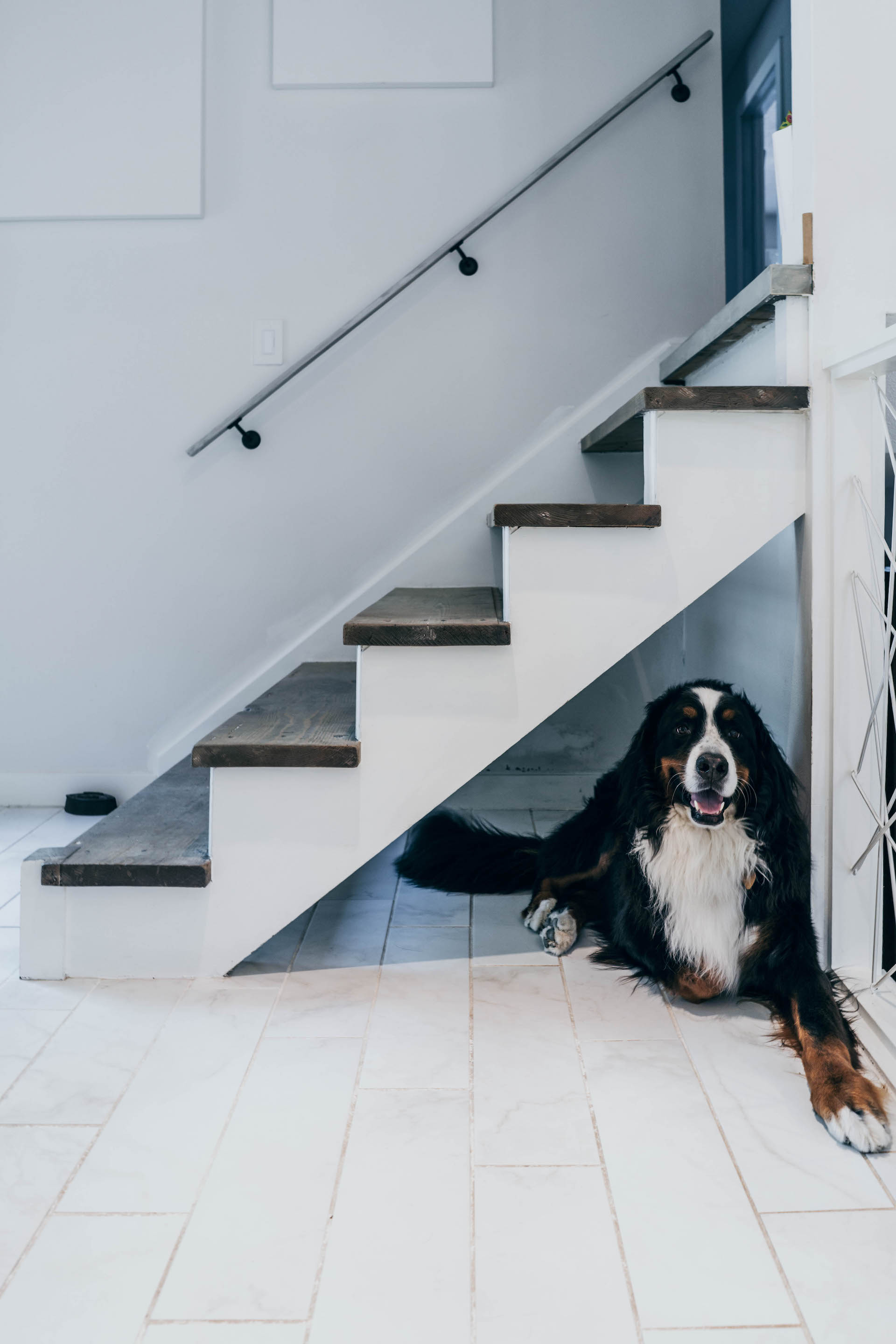
Their handsome dog Beau rests in his favorite spot in the house.

Their handsome dog Beau rests in his favorite spot in the house.

Loving this stylish drop zone right off the entry.

Loving this stylish drop zone right off the entry.

While their Instagram is plum full of vibrant colors, their home sets the stage as the perfect neutral space to eat, move and rest in. Dusty and Erin moved into their home during Thanksgiving weekend in 2015. They fell in love with the white kitchen cabinets right off the bat. The windows had beautiful white wood shutters that filtered the natural light perfectly. However, the kitchen was walled off from the rest of the space. 

_DSC9564.jpg

Before long, Dusty kept asking Erin if he could start demoing the house already.  Erin said "yes" and came home after work to a pile of rubble. Their goal was to open up the space and let as much natural light in as possible. They achieved this by installing French doors and tearing out the walls that separated the kitchen from the rest of the space. Now, they are able to open up the French doors and enjoy the fresh air on a nice night.

_DSC9502.jpg

The current sitting room used to be the dining room, and their current dining room used to be a carpeted living room. The first thing they did when they moved in was paint all of the walls white. They used Home Depot's Behr paint in the color Painter's White. This brightened up the space immediately. 

_DSC9504.jpg

They wanted white marble countertops, but were advised not to invest in them since the natural stone stains easily and can absorb red wine, beet juice and more. They replaced their original blue countertops with a white quartz and couldn't be happier. They purchased their dining room furniture and the kitchen island as a set, but they added a slab of white quartz on top of the island to give it a more permanent feel. 

They removed the walls surrounding the kitchen to open it up to the other spaces.

They removed the walls surrounding the kitchen to open it up to the other spaces.

They spend most of their time in the kitchen because they love to cook and entertain guests. The open floor plan makes their space the perfect location for a get-together. They can have a dinner party with some people in the formal dining room, some people in the sitting room with coffee, and more people standing with drinks at the kitchen island. There are multiple gathering areas within the one large space. This layout enables a group to be in close proximity without being separated by walls.  

This lovely sitting area used to be the dining room. The space is now flooded with natural light from the gorgeous French doors they installed.

This lovely sitting area used to be the dining room. The space is now flooded with natural light from the gorgeous French doors they installed.

_DSC9466.jpg
_DSC9458.jpg

"Everything we have is a mix of old and new." -Erin Stanczyk

_DSC9552.jpg

Not only can the Stanczyks tear out walls and install new doors, they are also talented artists! The cocktail table in the sitting room was found on Craigslist. They proceeded to sand and white wash the table until it turned out perfectly. The painting in their dining room was originally pink and blue, but Erin painted over it with neutral tones. The finished product adds texture and contrast to the large white wall.

_DSC9477.jpg
_DSC9488.jpg

As you can tell from the photos, they have some seriously amazing plants- and they are ALL REAL! The Fiddle leaf fig was an anniversary gift that Dusty gave Erin years ago. All of their plants started off tiny and have grown extremely tall over the years. They thrive on the natural light from the large windows. 

_DSC9561.jpg

The credenza in the dining room was originally dark brown, but they painted it a nice neutral grey color and swapped out the old knobs for some fun ones from Anthropologie. The dining room is filled with great plant variation. When they started renovating their space, their goal was to have a bright white space with lots of plants. They definitely accomplished that goal! 

_DSC9478.jpg

Erin explained that part of her wants to be super minimal, but her and Dusty both like interesting decor items. A perfect example of this is the head sculpture from Restoration Hardware in their entry. "It makes it interesting," Erin says. "Not everything has a story." They have the perfect balance of repurposed and new pieces to give their home that "homey" vibe. 

_DSC9562.jpg

They also painted all of the doors and trim in the space white because they used to be dark brown. This brightens the entire space and adds to their light and airy aesthetic. Speaking of "light"- they searched high and low to find the perfect light fixtures for their home. They typically start by finding a fixture they like on Pinterest and continue the search from there. Erin said, "Dusty goes to Home Depot almost every other day and they have really good priced fixtures as well." The light fixtures in their space draw the eyes up towards their lovely high ceilings. 

Read the note above to find out what the Stanczyk's love most about the home they've created.

Read the note above to find out what the Stanczyk's love most about the home they've created.

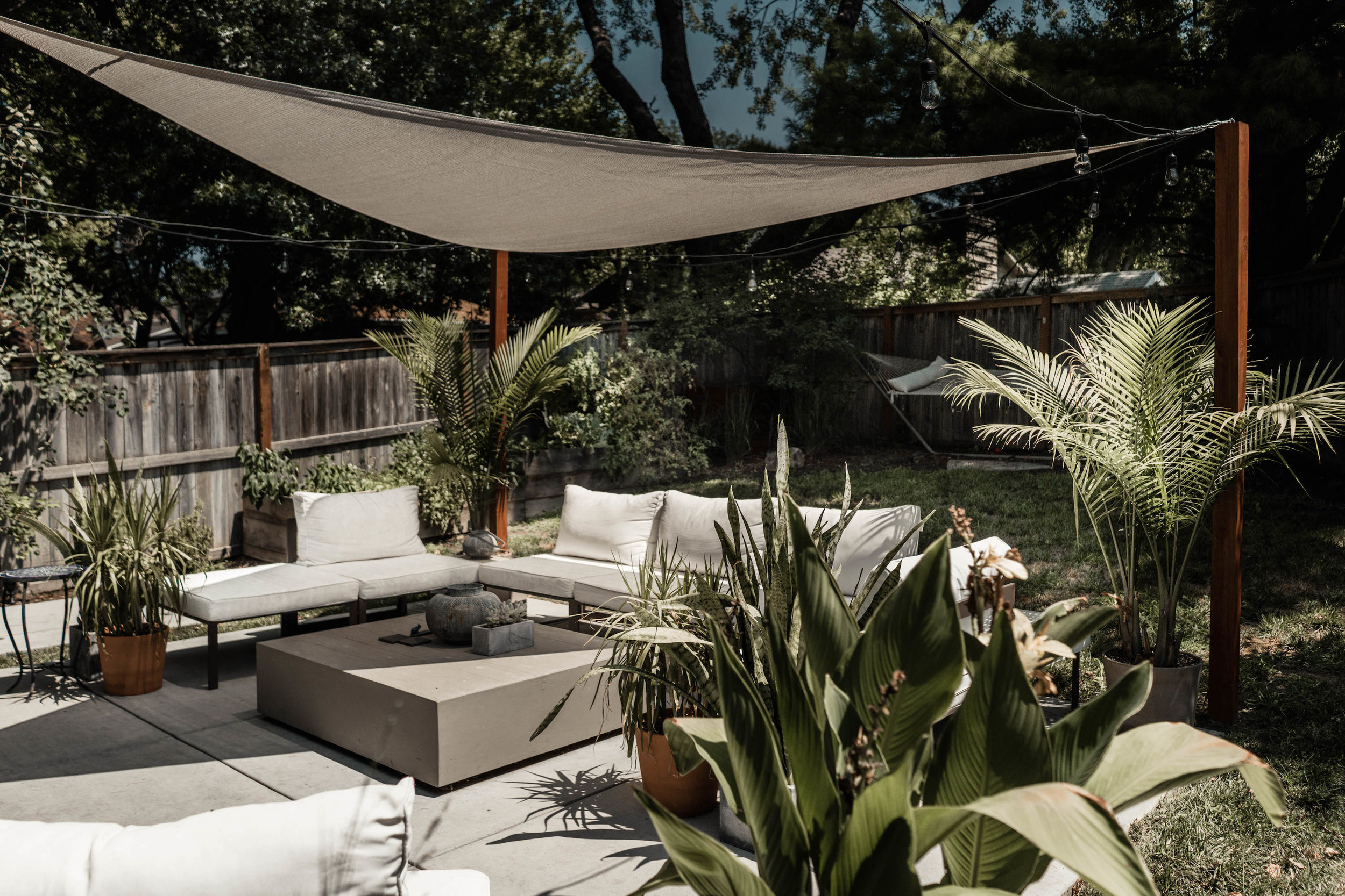
Their back patio is just as lovely and inviting as the interior of their home.

Their back patio is just as lovely and inviting as the interior of their home.

Don't forget their back porch! The "bright and white + plants" aesthetic continues into their backyard as well. The Stancyk's could not have created a more perfect spot for relaxing outside. Their home is absolutely gorgeous and is in the heart of Nebraska.

If you live in the Midwest and have a home that is uniquely "you" and beautiful because of it's own special qualities, please reach out to me via our "contact" page. I would love to feature your home in the Heartland Home series.

If you have a friend or family member that has a wonderfully special space that people find themselves drawn to, please reach out to me about them. Erin and Dusty were happy to have their home shared as the first Heartland Home and I look forward to sharing many more. It is up to each homeowner to choose if they would like their identity to be revealed in the post or not. The goal of this series is to celebrate the uniquely beautiful homes of throughout the heartland. 

[ All photos in this blog post were taken by Nicolette Wagner with Life Unbound Photography ]