Spring 2023 Mood Board

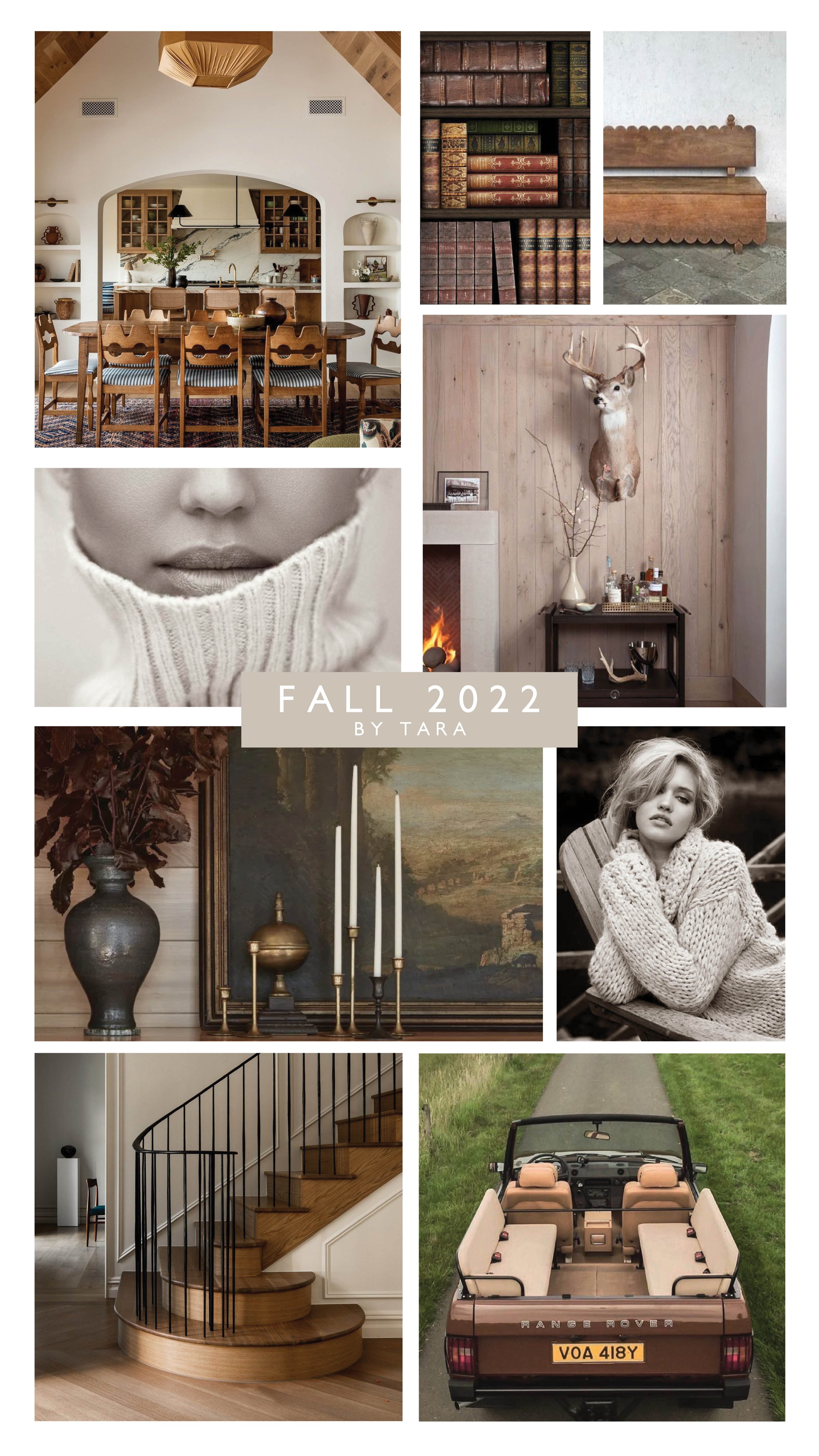
Yay!! Spring is here and it feels so good! The sun is shining a little brighter, the air is warming up, the trees are green and flowers are blooming. What’s not to love about spring time? It’s a seasonal delight to see life finding it’s way back into our lives. We’re leaving the cold dullness of winter behind and straining onwards toward brighter days with this fun & colorful edition of our Spring Mood Boards! 2023 Let’s do this! :)


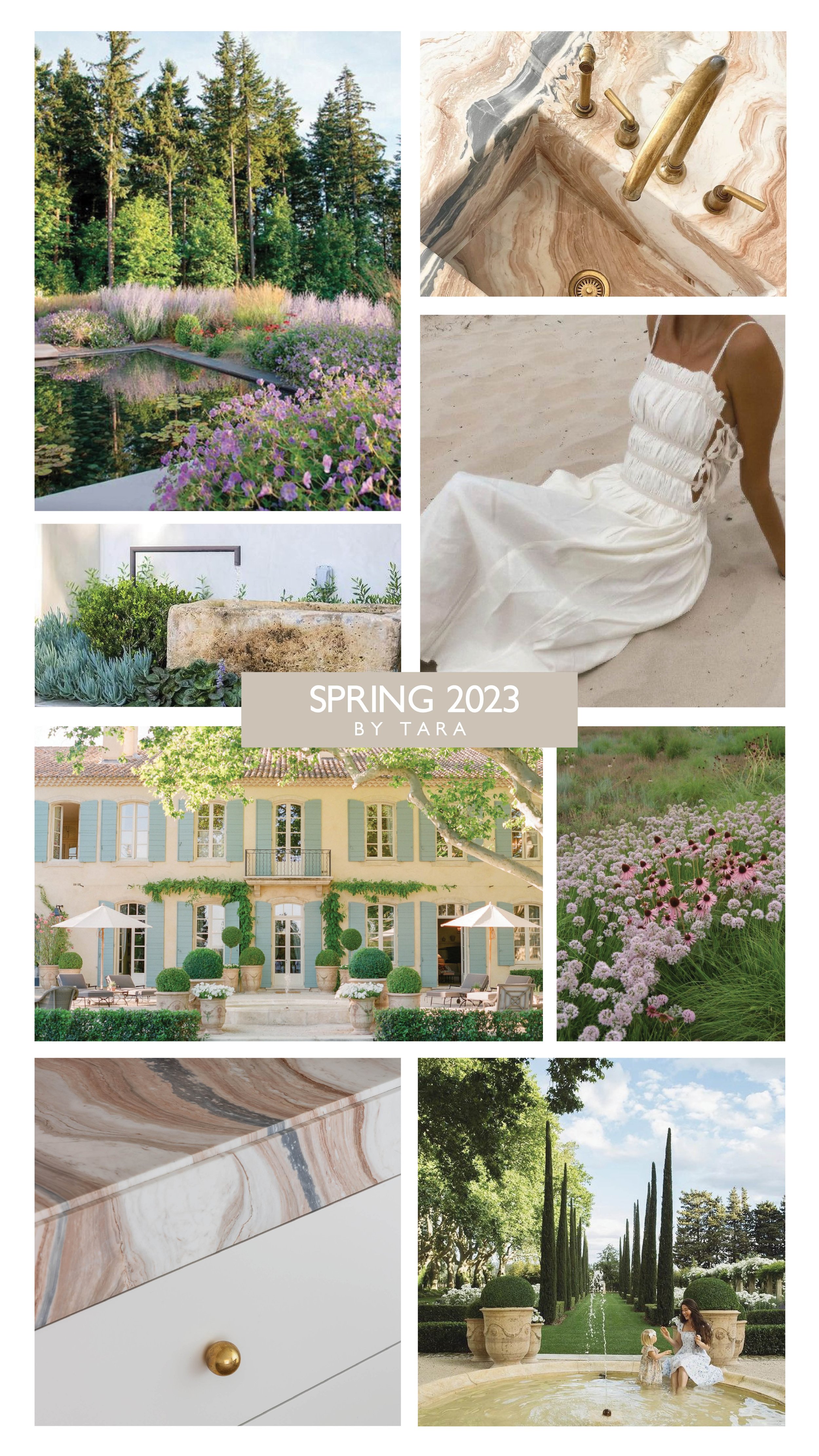
Sources: Humphrey Residence by Olson Kundig & Daniel Hinkley found via Pinterest, Sink via @edeneats Instagram page designed by Montana Burnett Designs and built by Chait Homes, Pinterest, the building at Provence Le Mas Des Poiriers, Threads and Blooms Blog, the grounds of Provence Le Mas Des Poiriers.


“I absolutely love the color spring palette associated with springtime. Of course there’s soft pastels and lush greenery, but I also enjoy adding in brass because it’s warmth is reminiscent of the sun. The warm golden undertones of brass make any room feel warmer and I love that! Spring is a time when we can finally escape our winter hibernation and spend longer amounts of time outside. My son and I are particularly enjoying spending time swinging in the hammock and feeding baby carrots to bunnies in our backyard. I created the mood board above to highlight French architecture, colorful stone countertops, gardens in bloom and time spent outdoors with our little ones. All these images feel rejuvenating and life-giving to me. I love the personality of natural stone- especially when it has a playful color in it. I also love natural, unstructured gardens that seem to dance along the ground in a playful way. I love spring time and I’m so happy it’s here!” - Tara Miller.


Sources: Cotswolds, England by We Dream of Travel, Bike riding photographed by Elizabeth Chlouber found via Pinterest, “Bridge over a Pond of Water Lilies” painting by Claude Monet, Macarons by Laduree, Daughter’s bedroom designed by Sophie Paterson, Palace of Versailles, Sundress from Lait Collection, Mayfair project bedroom designed by Sophie Paterson, House in Basel, Switzerland photographed by Sarah Tucker.


“When painting a picture of Spring, the first image that comes to mind is frolicking in a field of flowers and living in a little cottage surrounded by the beauty of nature. I was inspired by the traditional little villages in Cotswolds, England. It makes me want to bake macarons and take a bike ride though Claude Monet’s luscious garden. Florals are a big aspect of Spring, so I love the idea of bringing nature inside one’s space. My favorite interior designer is Sophie Paterson, and she does an exquisite job of incorporating elegant nature wallpapers in her spaces. Overall, I enjoy the earthy tones and materials with pops of color to make the space come to life and Spring really encapsulates that idea.” - Lara Parker.

Fall 2022

Fall is officially in the air. You can smell the crispness and hear the crunching of leaves. What makes you think of fall? Finally getting out your cable-knit sweaters? Savoring a hot cup of cider? We pulled together two mood boards that give us aaaaaaall the fall vibes. Check them out below!


“Fall is my favorite season. I love the cozy feeling of fall apparel & I love bringing that essence into home design as well. “ - Tara Miller

I’ve loved fall my entire life. I enjoy the simple things like saying “it’s boots & sweatshirt weather!” I like hearing the muffled sounds of a marching band on a Friday night. I feel like you can always smell fall coming in the air before it arrives. It’s beautiful to see the leaves turning and the deer in rut. The whole world seems to soften and quiet down a little bit. Except for the crackling of a candle wick and the crunching of leaves underfoot. Warm tones keep my soul cozy as the temperature starts to drop outside. I think of pulling a loved one in close & curling up under a blanket by a bonfire…… or snuggling up in a corner and reading a good book. Fall can be a very romantic season for people who capitalize on it. Think: apple picking, hay-rack rides, drive in movie theaters. Swoon-worthy. I love fall so much that I ignore the fact that winter is coming.


“Just give me a quiet cozy spot with a nice window view, a good book, and a warm cozy drink and I will be content for life!” - Chelsey

I wanted my Fall mood board to feel super warm and textural, and I wanted to evoke that through the images to give viewers that same homey feeling. During Fall, I love the coolness in the air and the warm coloring in the trees and grass. I also love staying in more and enjoying more cozy time with family. So many yummy textures to enjoy this time of year!


SOURCES for Tara’s Fall Mood Board

1 Home designed by Meghan Eisenberg and Jeff Troyer. 2. Books via Pinterest. 3. Bench. 4. Jessica Alba photographed by Adam Franzino 2017. 5. Living space design by Emily Seiders. 6. Accessories via Pinterest. 7. Terese Pagh Appears in the 'Bucolica' Editorial by Eric Guillemain 2011. 8. Staircase. 9. Range Rover via Pinterest.

SOURCES for Chelsey’s Fall Mood Board

1 Richard Gaston Photography. 2. Boots. 3. Roasted Pears by Brie Willy. 4. Car: Moskvich 408. 5. Chairs via Menu Design Shop. 6. Bone Jenga. 7. Amber Interiors. 8. Wood Bowls. 9. Sherling fabric via Pinterest. 10. Oak leaves via Pinterest.

Summer 2022

Here at The Heartland Interior Design, we are excited about summer! We like the vibrant colors and all of the seasonal outdoor activities. We also noticed how much we love summer foods! :) We put together two mood boards that give us ALL the summer feels. The funny thing is, we did NOT tell each other WHAT we were putting on our mood boards, however they both came up with a YELLOW + PINK theme. How cool is that!? Enjoy!


“Summertime vibes make me think of vibrant colors, fruit and time spent outdoors.” - Tara Miller

The above mood board was created by Tara Miller, the owner of The Heartland Interior Design. “The first thing I think of when I hear the word ‘summer’ is the HEAT,” said Tara. “Then I think about ways I cool down from the heat. Pools and lakes come to mind, followed by cold drinks and sweet treats. Then of course spending some time in air conditioning haha. I love bright and saturated colors for summertime. Warm tones like yellows, oranges and pinks remind me of summertime Barbie editions and for some reason I still vibe with it today.”

“I picked the shower image specifically because of the feeling of showering off chlorine or lake water after a long day in the sun. The yellow mosaic tiles made me think of the yellow sunshine and I LOVE how the tile visually connects the wall with the floor. I chose the ombre staircase shot because it is INCREDIBLE. But also because it progresses from warm tones at the top of the staircase to cooler town down at the bottom and that makes me think of how heat rises. Lemonade is my go-to summertime drink, but when I saw that lemon/ lime frozen drink I thought ‘I have to try that!’ so I included it in the board along with watermelon, and ice cream. Why? Because watermelon and ice cream are summertime staples for me!” :)


“Summer makes me think about going to ice cream shops, since that’s what I did a lot with my family during this time of year.” - Chelsey Segura

The above mood board was made by Chelsey Segura. When talking about her summer mood board, she said, “I created this mood board around ice cream since that is what reminds me most of summer. I was inspired by the many ice cream shops I would visit with my family where I grew up in Upstate New York. The experience of going out for ice cream bring back a lot of happy memories for me. Isn’t making happy memories what summer is all about anyways?

I’ve always wanted to design an ice cream shop, so I had a lot of fun making this mood board. Getting ice cream is a really happy and fun experience for many people, so I wanted to reflect that in the colors I used. Shades of bright yellow, pink, and blue work great together and feel super fun and uplifting. The light sconces I found made me think so much of ice cream cones, and the countertop I used was inspired by the very popular cookies and ice cream flavor. I stuck in many references to looking for shade and cooling off, since I feel like that represents both summer and ice cream so well!”


SOURCES for Tara’s Summer Mood Board

1. Yellow Shower. 2. Cowgirl Shadow via Pinterest. 3. Ice Cream via H&M Kids campaign. 4. Watermelon via Pinterest. 5. Ombre Staircase. 6. McAlpine Pool Courtyard. 7. Beach Babe via Pinterest. 8. Restaurant Louie Louie. 9. Pineapple Margaritas.

SOURCES for Chelsey’s Summer Mood Board

1. Plaid Tile Flooring. 2. Bar Height Table. 3. Bar Height Chair. 4. Gallery Wall Art. 5. Beach Painting. 6. Countertop. 7. Wall Sconces. All remaining images via Pinterest.

Spring 2022

Here at The Heartland Interior Design, we love spring! We like saying goodbye to the frigid cold of winter and hello to sunnier days. Plus, we love watching the grass turn green and seeing seasonal florals in bloom. We’re ready for back patio hangs and short sleeves. We put together two mood boards that capture the spirit of what we each love about springtime.


“I created this mood board to have a soft feminine feeling.” - Tara Miller

The above mood board was created by Tara Miller, the owner of The Heartland Interior Design. When speaking about the mood board she said, “I was inspired by the exterior paint of this Irish home in Wicklow County. When the sun sets, the paint takes on a pale pink color. So I started with that pale pink color and moved onto other things that inspire me like English Gardens, brass fixtures and stone garden ledges. I also feel like Spring has a sense of delicacy since flowers are so delicate, so I chose a delicate light fixture to play off of that feeling. I like the ‘lived in’ feeling of antique brass and aged marble so I tried to let that shine. I recently saw the custom staircase on Rachel Halvorson’s instagram and I was drawn to the newel post. It’s metal, which is a heavy material, but it’s done in such an intricate and subtle way. I absolutely love it.


“Spring is the transition from old to new. The new growth of spring is so inspiring to me.” – Chelsey Segura

When asked what she enjoys about spring, Chelsey said, “I love to spend time at home and admire the new growth of spring.” She also added “[I] appreciate things that are in the past, old and worn.” She likes the “mixing of old vintage pieces with greenery and natural elements” during this time of year. “The first thing I thought of when creating this mood board was bringing the outdoors in… I focused on using wood tones and shades of green and brown in this mood board. I love this combination of color for the spring because it makes me think of a new budding tree, soil and greenery, and so much more.”


SOURCES for Tara’s Mood Board

  1. Architectural Digest. 2. Pinch London. 3. Pinterest. 4. Pinterest. 5. Sotheby’s International. 6. Rachel Halvorson Interior Design. 7. Inside East Designs. 8. ABC Stone. 9. Pinterest.

SOURCES for Chelsey’s Mood Board

  1. Huey Lightshop. 2. Huey Lightshop. 3. Zak & Fox. 4. Pinterest. 5. Pinterest. 6. Studio McGee. 7. Shoppe Amber Interiors Art + Etsy Frame. 8. Studio McGee. 9. Heirloom Art Co. 10. Salt Creek Mercantile. 11. Pinterest.