Summer 2023 Mood Board

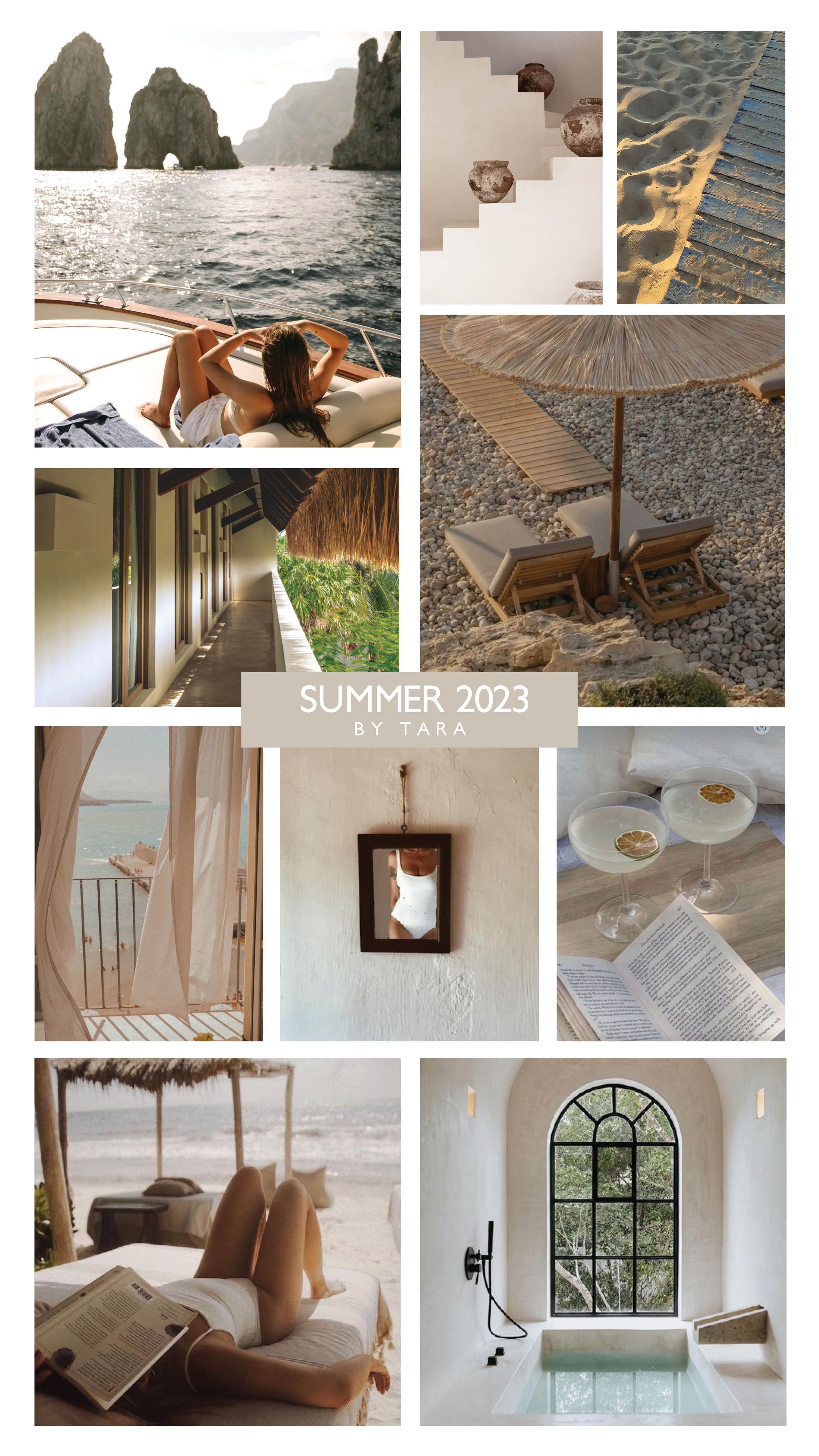
Summertime. What does the word “summer” make you think of? For me, it’s heat. Heat and humidity. It also makes me think of sun-kissed skin, beautiful sunsets later in the evening, and sandy beaches. Last year we went to Greece and this year we went to Tulum so those two locations are heavily influencing my vision of what summer looks like. Check out our three summer mood boards below. I made one general mood board, one Tulum mood board and our team member Lara made one mood board as well. We hope you love it and get that summertime feeling.


Sources: Our Pinterst Page. A Little Bit Southern. Bali Interiors. Ann Lauer. Hotel Panamera. Altar Tulum.


Relaxation. Purity. Natural materials. Connection with nature. These are the things I envisioned while making the neutral Summer mood board above. I love the textural white plaster walls. I love the heavy shadows that a sunset casts on everything. I love a good book. Books literally feed the soul and help us grow as human beings. Relaxing by the water with a book is the epitome of a luxurious relaxing vacation to me. Thick thatched roofs and thatched beach umbrellas is a textural vibe I’m loving. Linen drapery blowing in the ocean breeze with the smell of salt in the air is such a vibe too. Everything in my neutral Summer mood board is about ease, relaxation and connection with nature. Do you dig it?


Sources: Photography by Ryan and Tara Miller


Tulum, Mexico. Have you been? Do you plan to go? It was a MUST see on my bucket list and I’m so glad we were able to go. Not only is it a place with an abundance of natural food, the architecture and interior design is phenomenal. There are a few different styles in Tulum but I was drawn to Hotel Panamera because they seamlessly blended texture, color and nature together in a way that felt balanced and invigorating. The views were amazing, the subtle green color fed my heart, and simplicity made me feel at ease. The pool is over-the-top with tons of color and pattern and I love it! Everything from the tiles to the lounge chairs is vibrant and fun. But that is balanced with the entire rest of the property being laid back and chill. I love that there are different areas depending on what mood you’re in. Wanna relax? They have a space for that. Wanna socialize? There’s a space for that. That is good programming. I love Hotel Panamera, this is not sponsored, but if you’re going to Tulum, I highly recommend you stay there. (They have AC, the staff is super nice, the food is SUPERB, etc etc etc.) Enjoy!

Summer 2022

Here at The Heartland Interior Design, we are excited about summer! We like the vibrant colors and all of the seasonal outdoor activities. We also noticed how much we love summer foods! :) We put together two mood boards that give us ALL the summer feels. The funny thing is, we did NOT tell each other WHAT we were putting on our mood boards, however they both came up with a YELLOW + PINK theme. How cool is that!? Enjoy!


“Summertime vibes make me think of vibrant colors, fruit and time spent outdoors.” - Tara Miller

The above mood board was created by Tara Miller, the owner of The Heartland Interior Design. “The first thing I think of when I hear the word ‘summer’ is the HEAT,” said Tara. “Then I think about ways I cool down from the heat. Pools and lakes come to mind, followed by cold drinks and sweet treats. Then of course spending some time in air conditioning haha. I love bright and saturated colors for summertime. Warm tones like yellows, oranges and pinks remind me of summertime Barbie editions and for some reason I still vibe with it today.”

“I picked the shower image specifically because of the feeling of showering off chlorine or lake water after a long day in the sun. The yellow mosaic tiles made me think of the yellow sunshine and I LOVE how the tile visually connects the wall with the floor. I chose the ombre staircase shot because it is INCREDIBLE. But also because it progresses from warm tones at the top of the staircase to cooler town down at the bottom and that makes me think of how heat rises. Lemonade is my go-to summertime drink, but when I saw that lemon/ lime frozen drink I thought ‘I have to try that!’ so I included it in the board along with watermelon, and ice cream. Why? Because watermelon and ice cream are summertime staples for me!” :)


“Summer makes me think about going to ice cream shops, since that’s what I did a lot with my family during this time of year.” - Chelsey Segura

The above mood board was made by Chelsey Segura. When talking about her summer mood board, she said, “I created this mood board around ice cream since that is what reminds me most of summer. I was inspired by the many ice cream shops I would visit with my family where I grew up in Upstate New York. The experience of going out for ice cream bring back a lot of happy memories for me. Isn’t making happy memories what summer is all about anyways?

I’ve always wanted to design an ice cream shop, so I had a lot of fun making this mood board. Getting ice cream is a really happy and fun experience for many people, so I wanted to reflect that in the colors I used. Shades of bright yellow, pink, and blue work great together and feel super fun and uplifting. The light sconces I found made me think so much of ice cream cones, and the countertop I used was inspired by the very popular cookies and ice cream flavor. I stuck in many references to looking for shade and cooling off, since I feel like that represents both summer and ice cream so well!”


SOURCES for Tara’s Summer Mood Board

1. Yellow Shower. 2. Cowgirl Shadow via Pinterest. 3. Ice Cream via H&M Kids campaign. 4. Watermelon via Pinterest. 5. Ombre Staircase. 6. McAlpine Pool Courtyard. 7. Beach Babe via Pinterest. 8. Restaurant Louie Louie. 9. Pineapple Margaritas.

SOURCES for Chelsey’s Summer Mood Board

1. Plaid Tile Flooring. 2. Bar Height Table. 3. Bar Height Chair. 4. Gallery Wall Art. 5. Beach Painting. 6. Countertop. 7. Wall Sconces. All remaining images via Pinterest.